シゴト
WORKS 163みやがわエンゼルパーラー
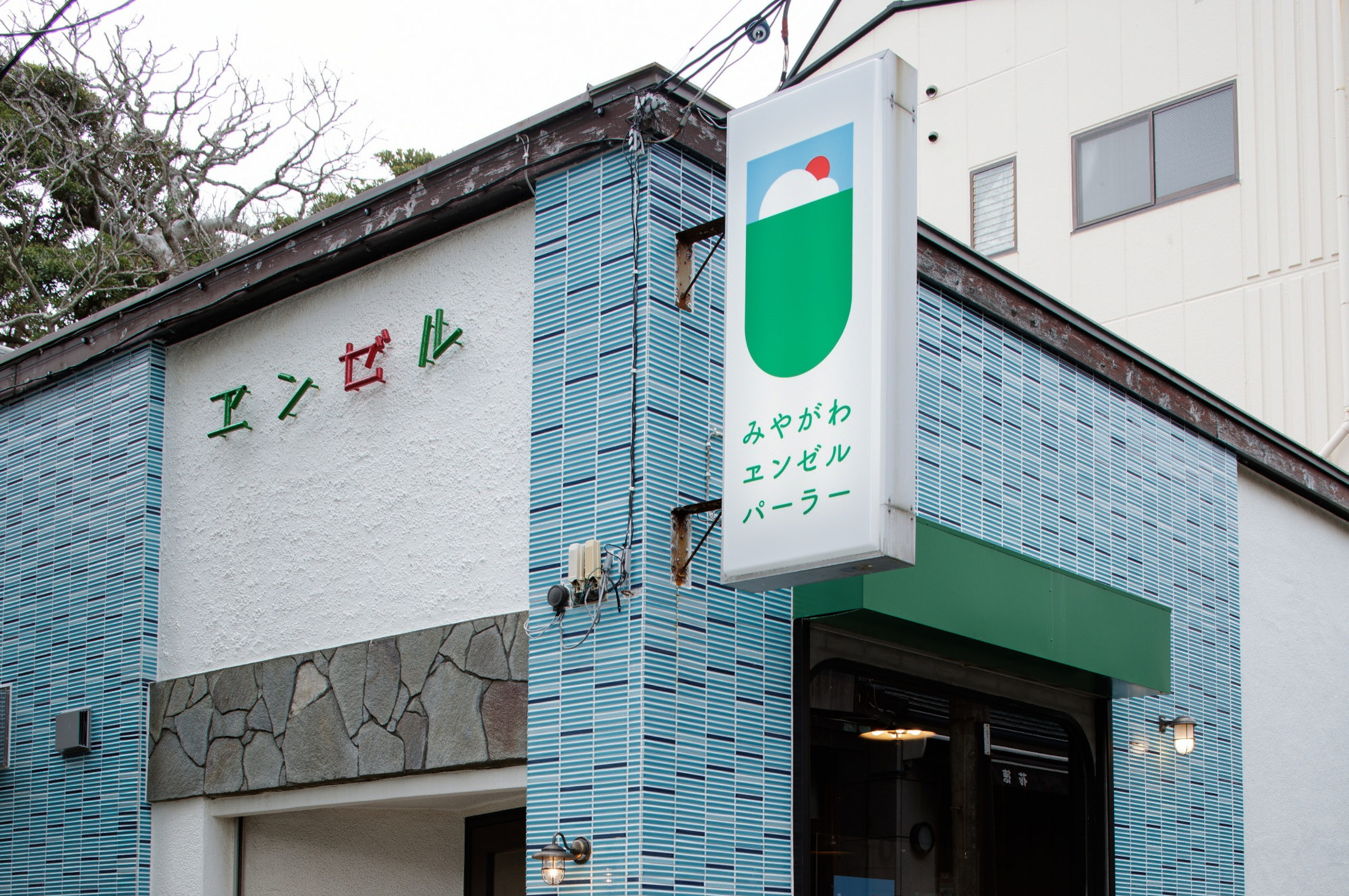
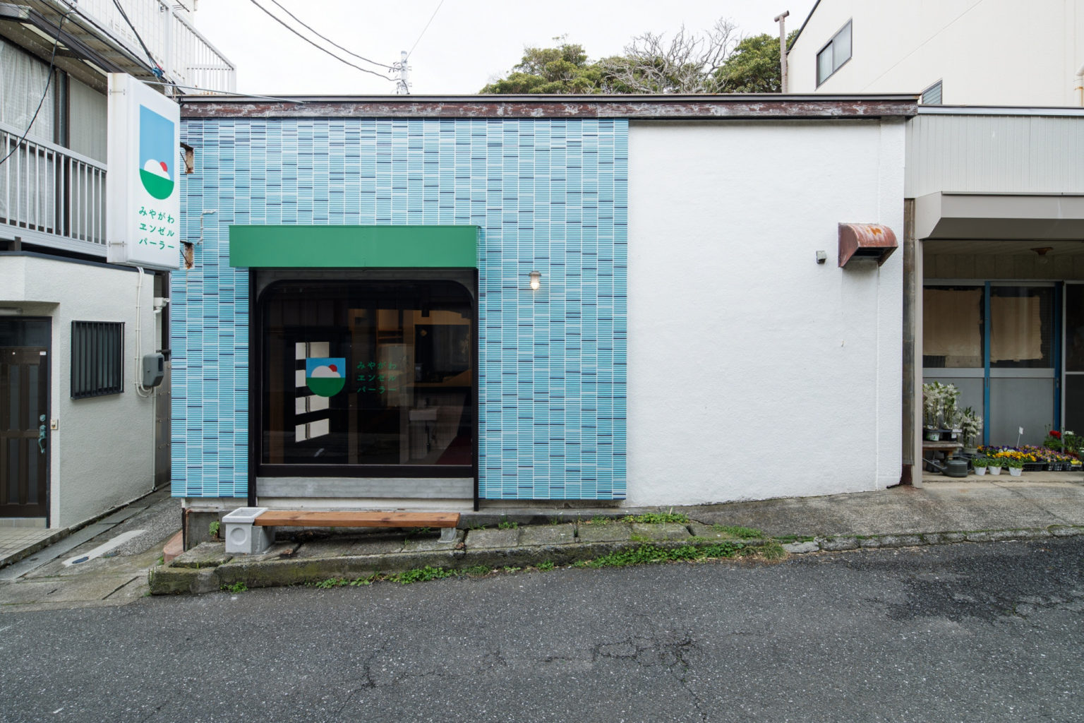
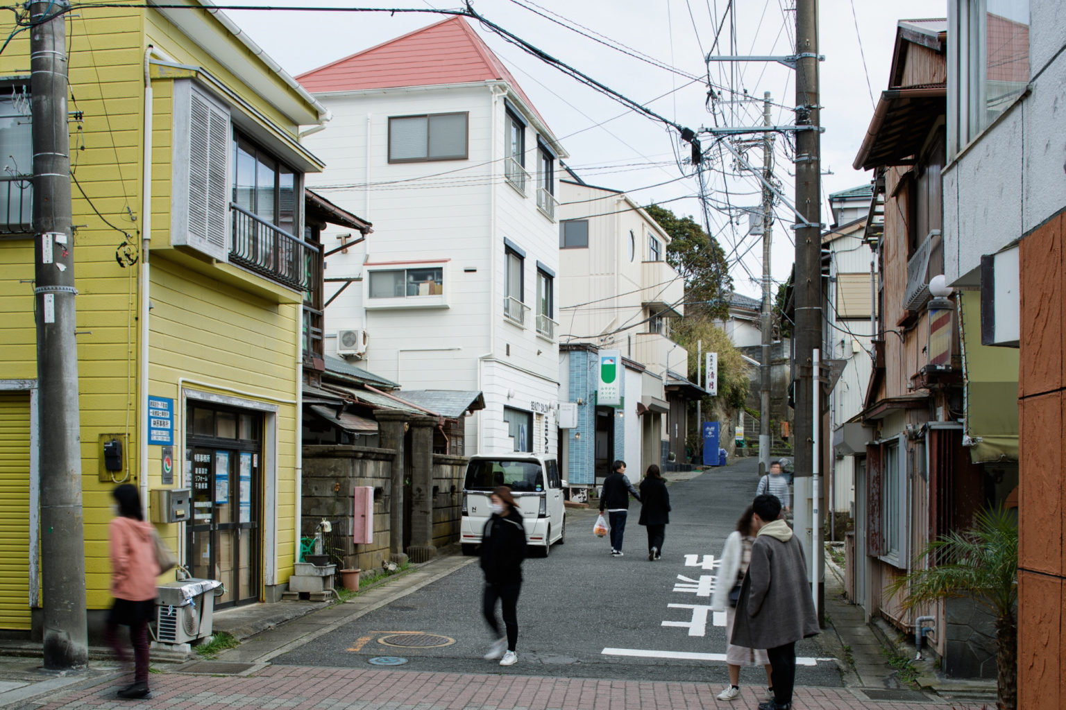
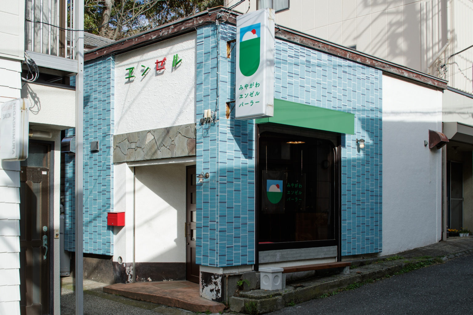
「みやがわエンゼルパーラー」は神奈川県三崎の商店街の外れにある喫茶店で、
台風の被害により惜しまれつつ閉店した「みやがわベーグル」の2号店となるお店です。
この店の前身であるマグロ定食屋「エンゼル」の屋号を継承し、
「みやがわエンゼルパーラー」と名前を変え、再出発のプロジェクトとなっています。
「エンゼル」は地元のファンも多く、
多くのまちの人から愛されるマグロ定食屋さんでした。
まちの人に愛されていたこの場所を工事中はあえて解放し、
見守られながら工事を進めて行きました。
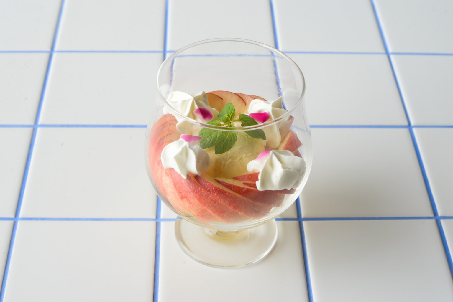
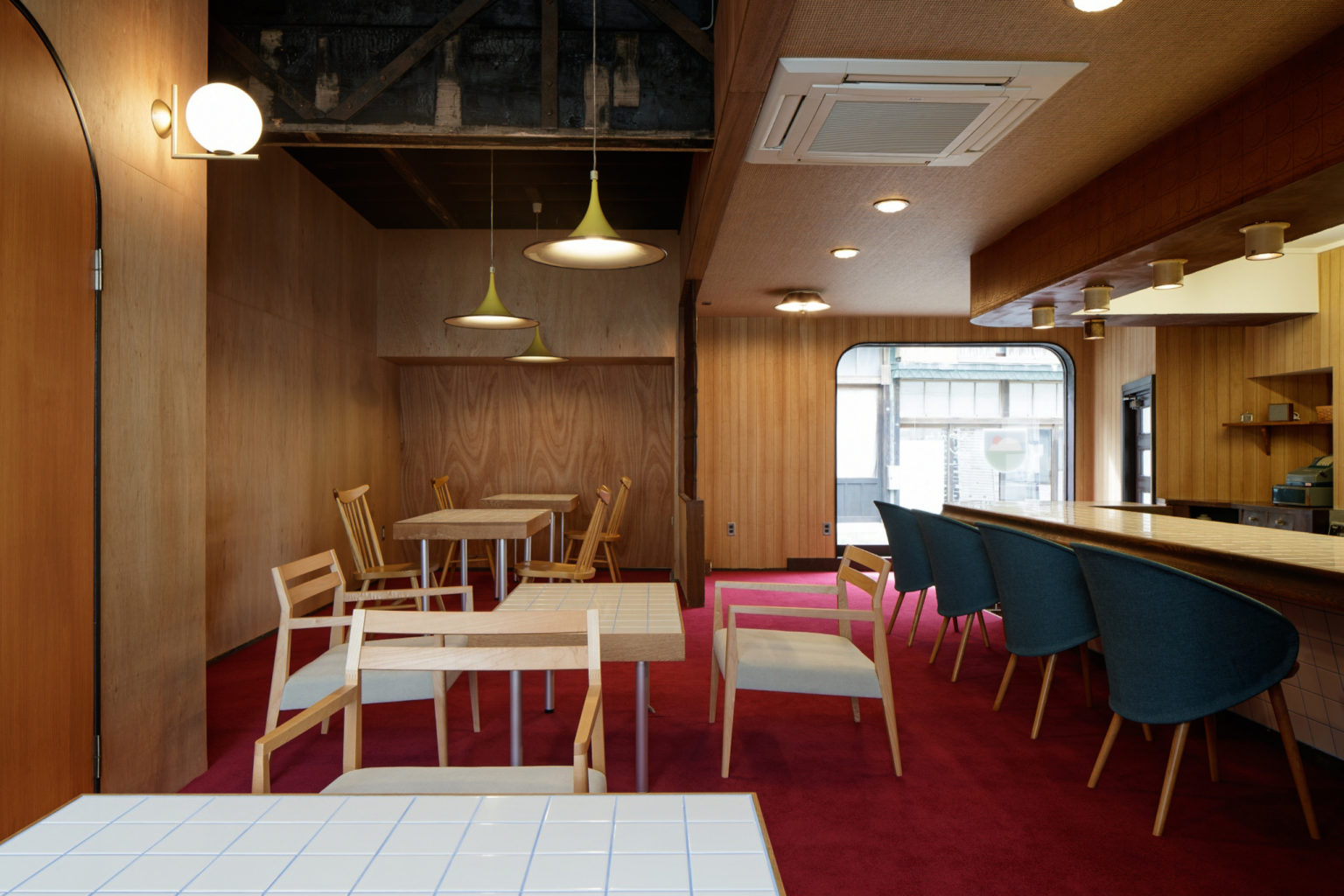
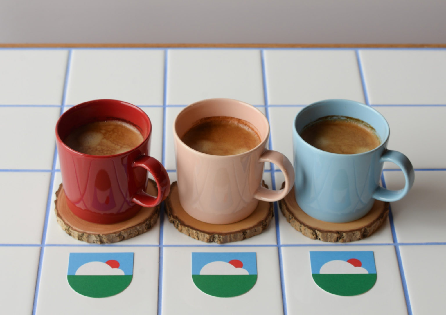
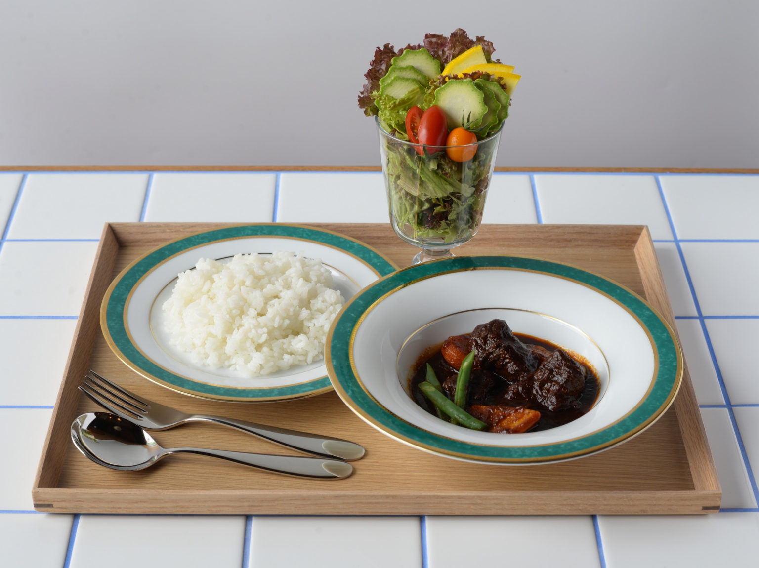
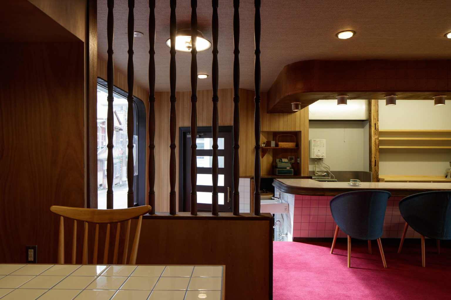
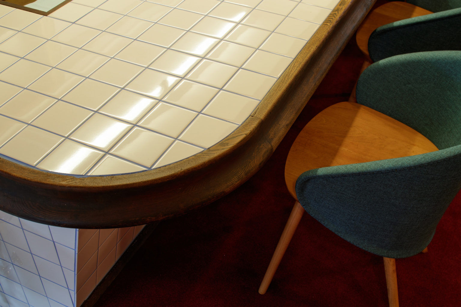
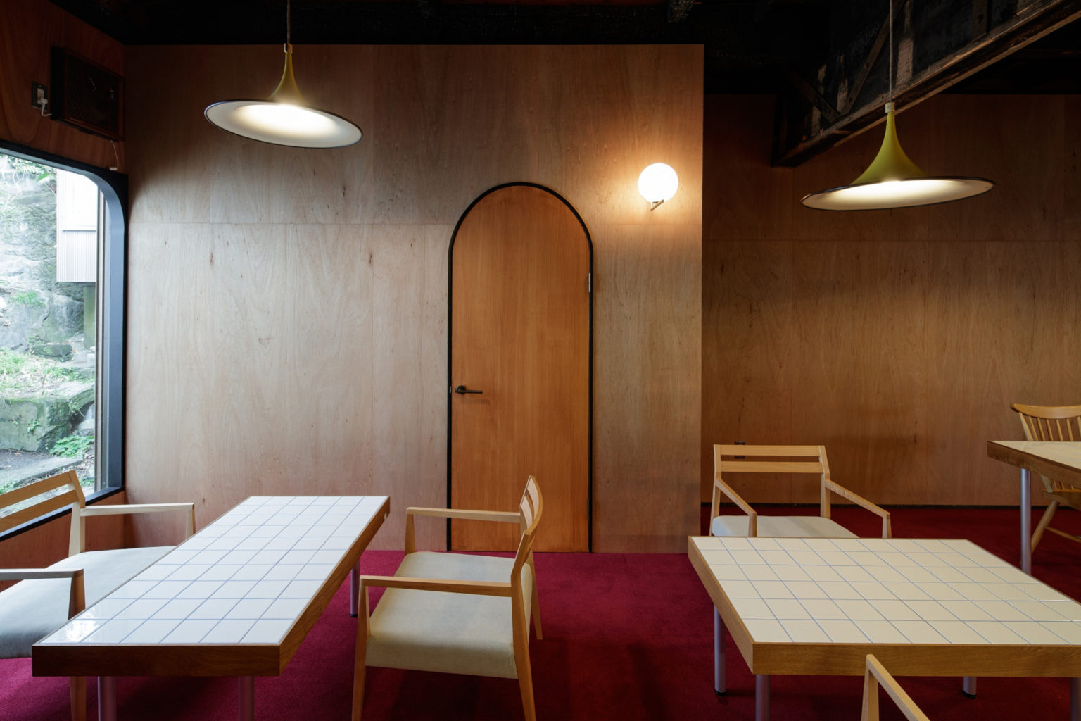
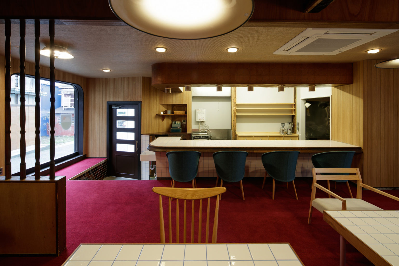
完成した店内は「エンゼル」そのままに、特徴的な白いタイルで仕上げたカウンターとテーブルはどこか「みやがわベーグル」を彷彿とさせます。
そんな「エンゼル」と「みやがわベーグル」の懐かしさを感じるこのお店が今後も三崎に愛されるお店となることを願っています。
エンゼル (Angel) was a popular tuna restaurant of Misaki, south end of the Kanagawa Prefecture. It was known and appreciated by the whole community, thanks to its location next to the harbour which provided a daily supply of fresh quality fish and seafood products. It wasn’t a mere spot where to eat: it was the gathering place around which the locals of every generation spent their time and created the foundations for the village to build its identity. Unfortunately though, the restaurant closed several years ago, leaving a void in the town that was seeking for a replacement.
The resulting context was very similar to another renovation project completed by Roovice in the nearby town of Miura; in that case a bagel shop was refurbished to become the social space from where the rural community could start its development. That project is called Miyagawa Bagel and was taken as the main reference for the Angel’s rebirth.
Hence, the new Miyagawa Angel Parlor was established in 2020, with a slightly modified name and a new program: from a tuna restaurant it turned into a coffee shop, wanting to bring attention to the collectivity aspect.
While inheriting the name, the location and the history of the former restaurant, the new Angel also shared part of the interiors: the disposition remained pretty much the same, since the design team wanted to keep the ambience of the predecessor.
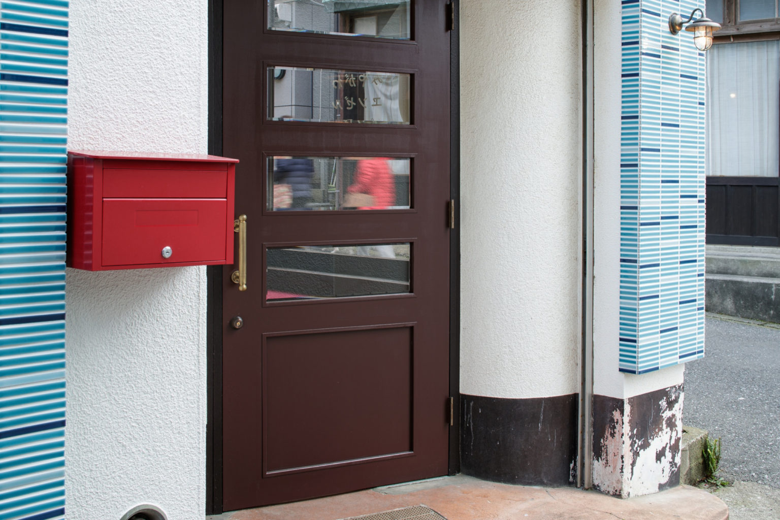
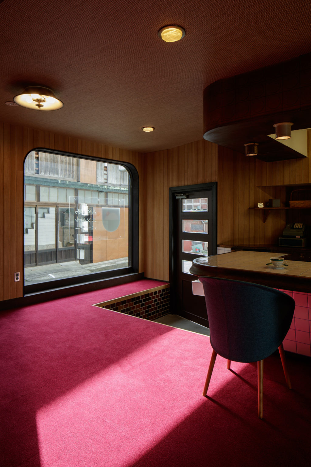
A toilet has been added in the corner behind the kitchen, while a storage room in the south side replaced the access to the back alley. The dividers once used to separate each table have been removed, in favour of an open continuous space. Right past the entrance door two benches are placed symmetrically, respectively inside and outside of the window, with the former one acting more as a shelf than a seat.
The pavement surface is covered with a red moquette meant to highlight the wooden textures of the interiors.
The kitchen counter and the serving tables are still the original ones in their core and dimensions, but their top is now covered with a white 10cm tile: the same one used for the countertop of the Miyagawa Bagel shop. This choice, beside providing an affordable and neat looking, wanted to recall the “sister project” located a few miles away and that shares the same history and social aim.
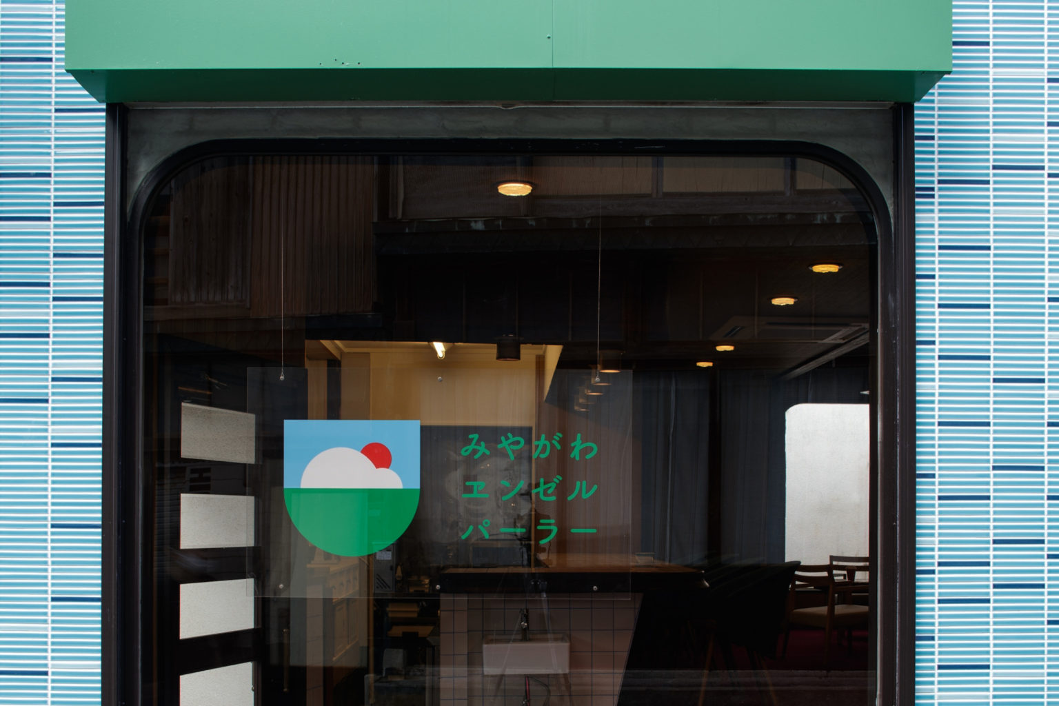
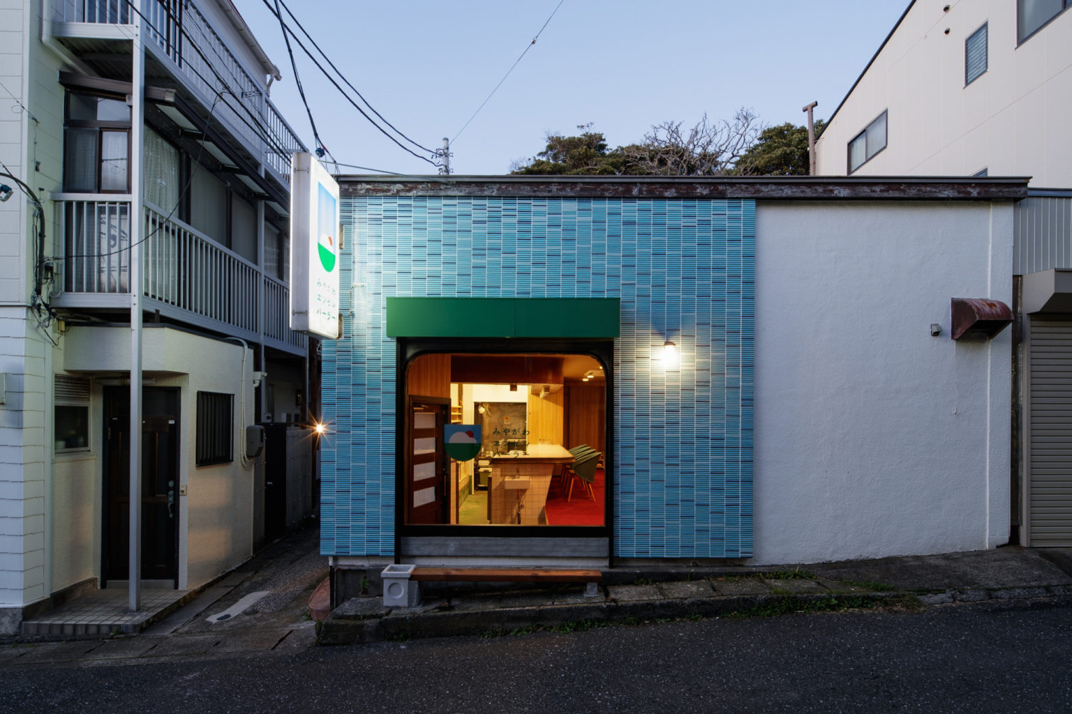
A significant role for the relationship of the two works is played by the wide opening on the street facade. This allows the inside view from the public passage and, as the bagel shop in Miura does, at night it glows like a lantern that emerges from the neighbourhood. This wants to attract the attention of the people as well as enlightening the surrounding.
ArchDaily.com
designboom.com
Divisare.com
Archello.com
Archinect.com


