シゴト
WORKS 166目黒本町の家
goooood gooood.cn/
DIVISARE divisare.com
archello archello.com
Forgemind forgemind.net
Archinect archinect.com
Architect Magazine architectmagazine.com
目黒区目黒本町、目黒・平和通り商店街から程近くの木造2階建ての戸建をカリアゲました。
昭和の雰囲気が漂う魅力的なお店が多く残る商店街。
物件もまた風呂なしで銭湯利用を想定した昭和の趣きが残る建築で、四軒密集した長屋を彷彿させる建物配置も特徴的でした。
建物所有者のご要望もあり、評点1.0以上の耐震補強を施しています。
新たに挿入される浴室のボリュームと耐震壁により、限られた既存の趣きと採光開口部の関係を検討する必要がありました。
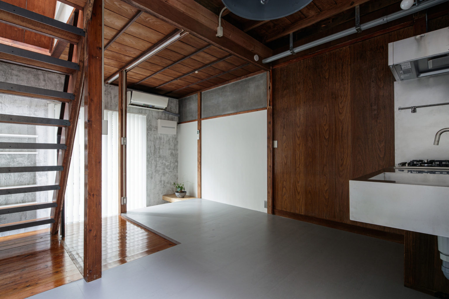
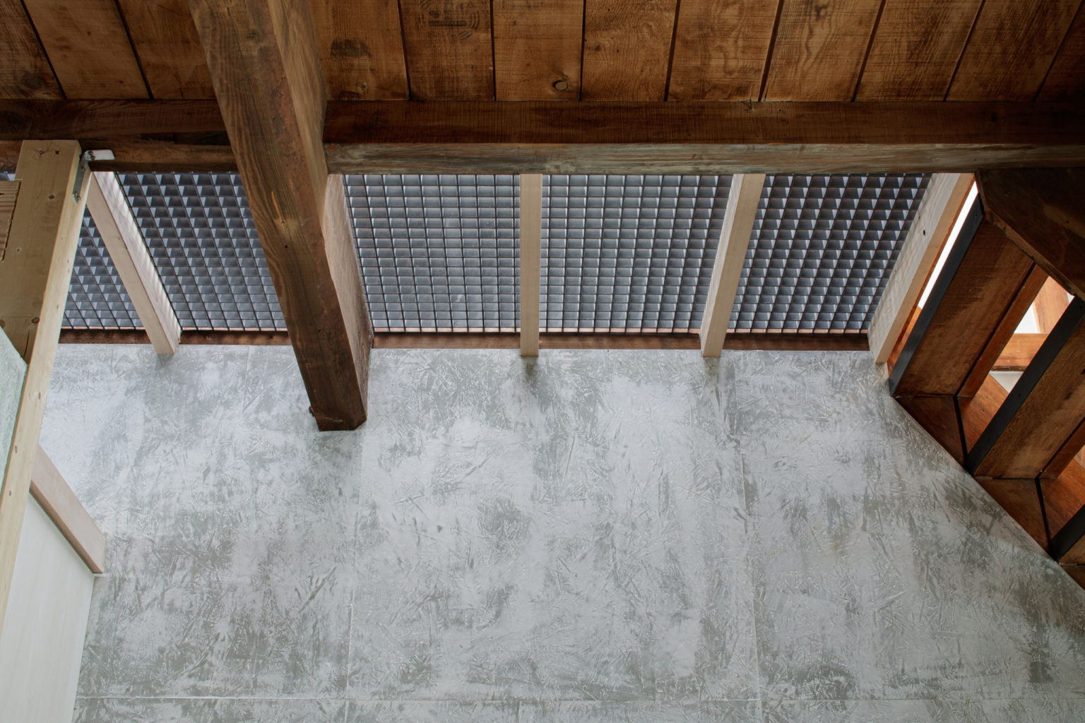
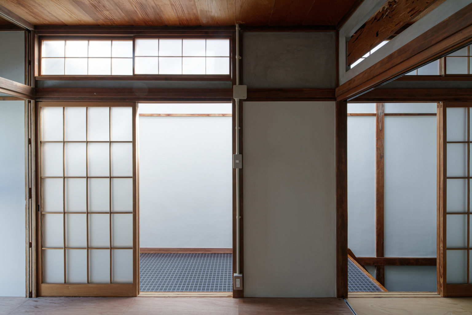
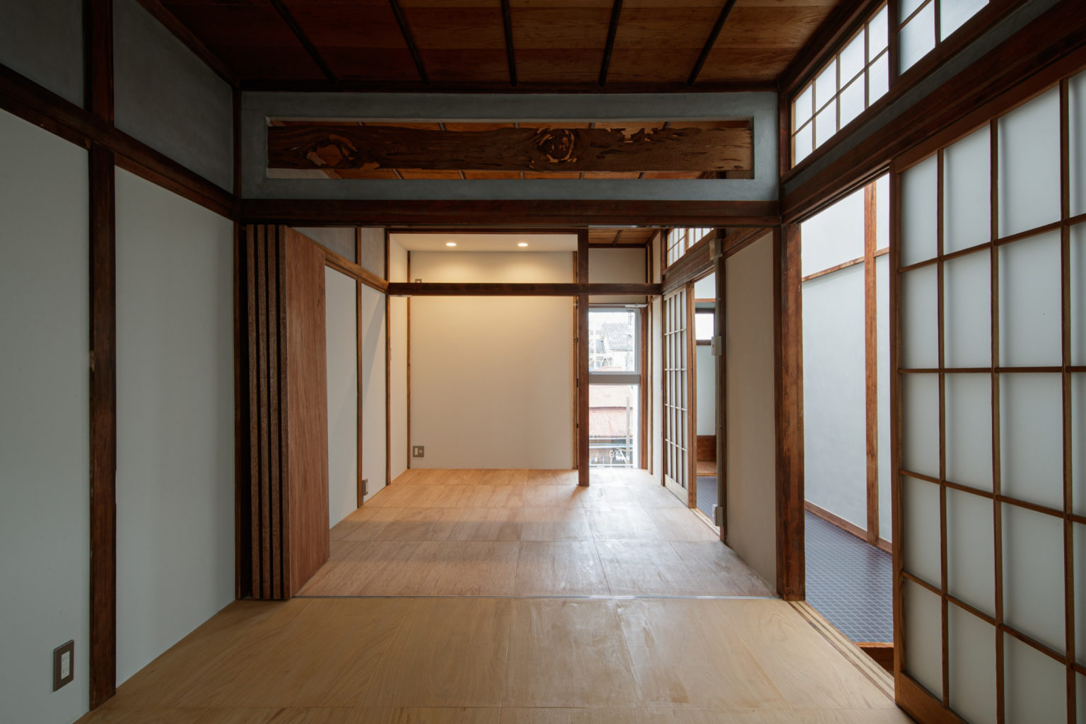
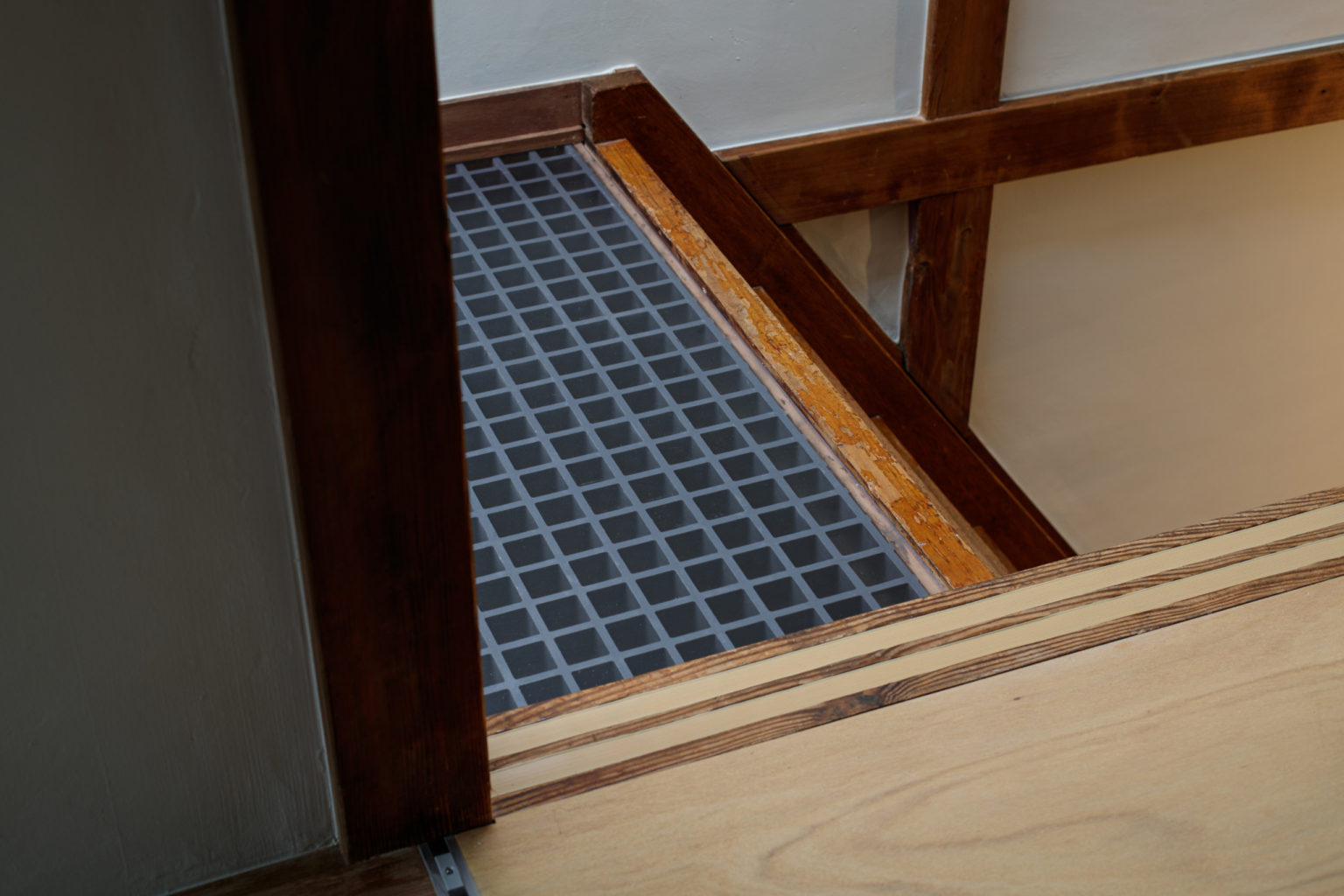
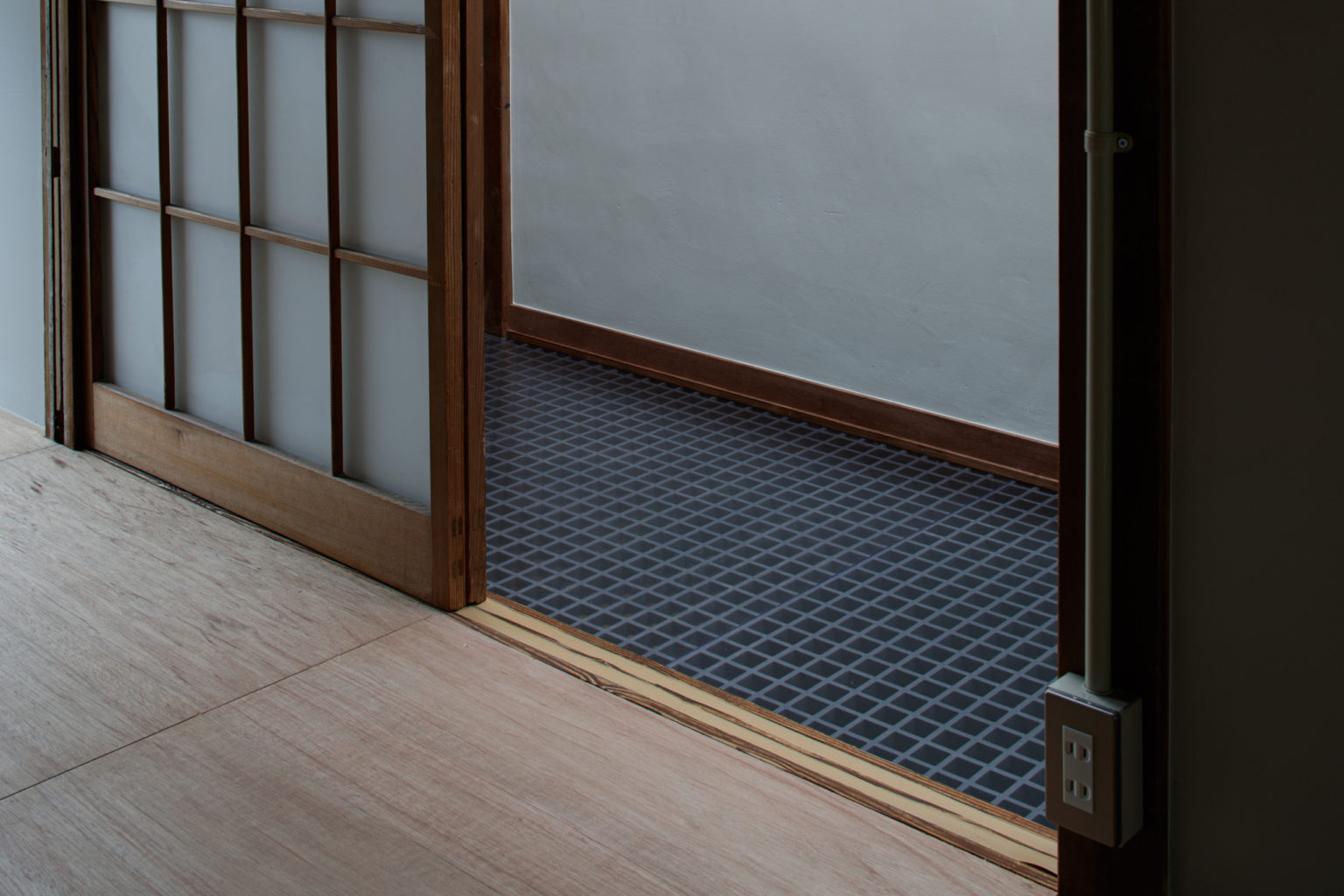
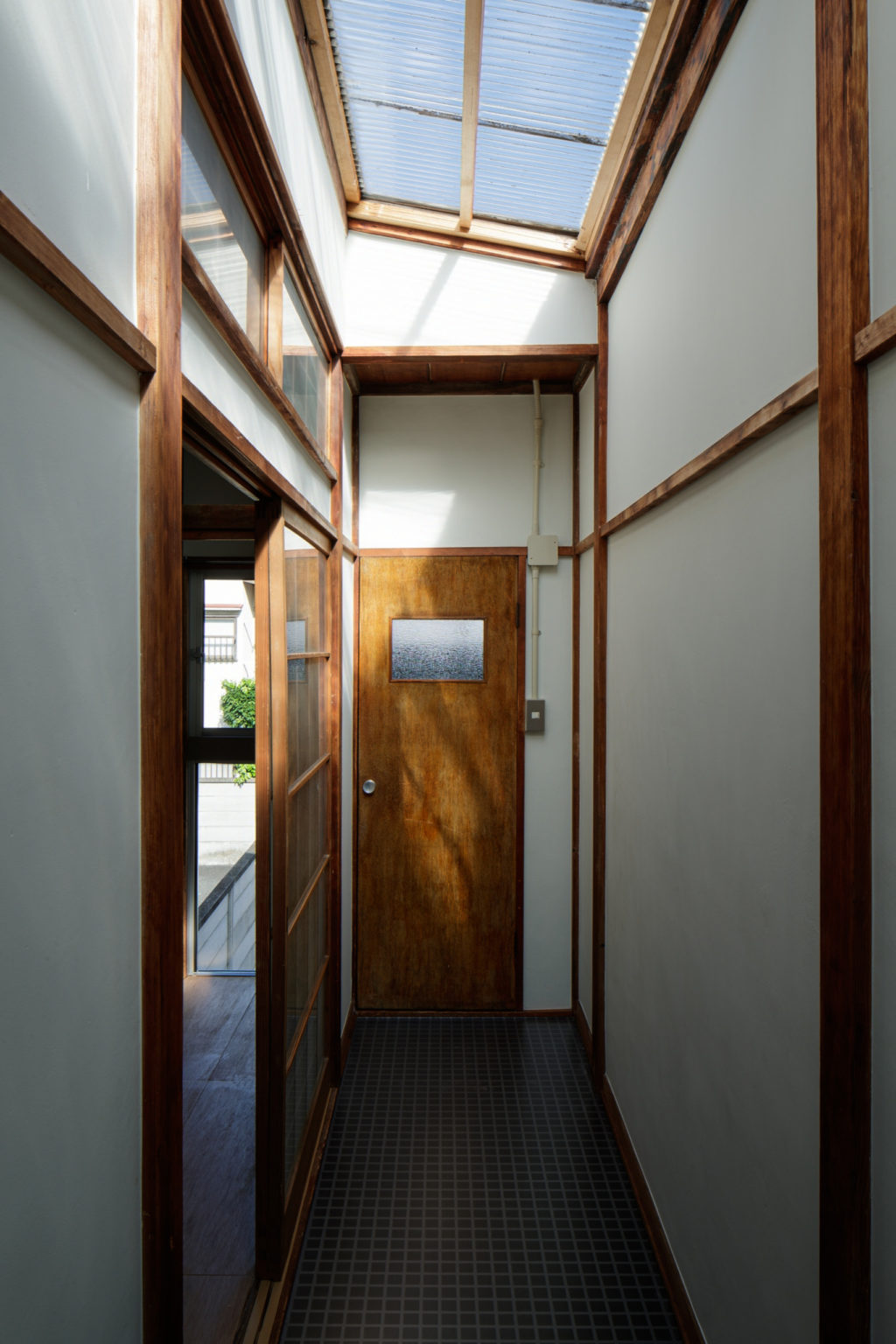
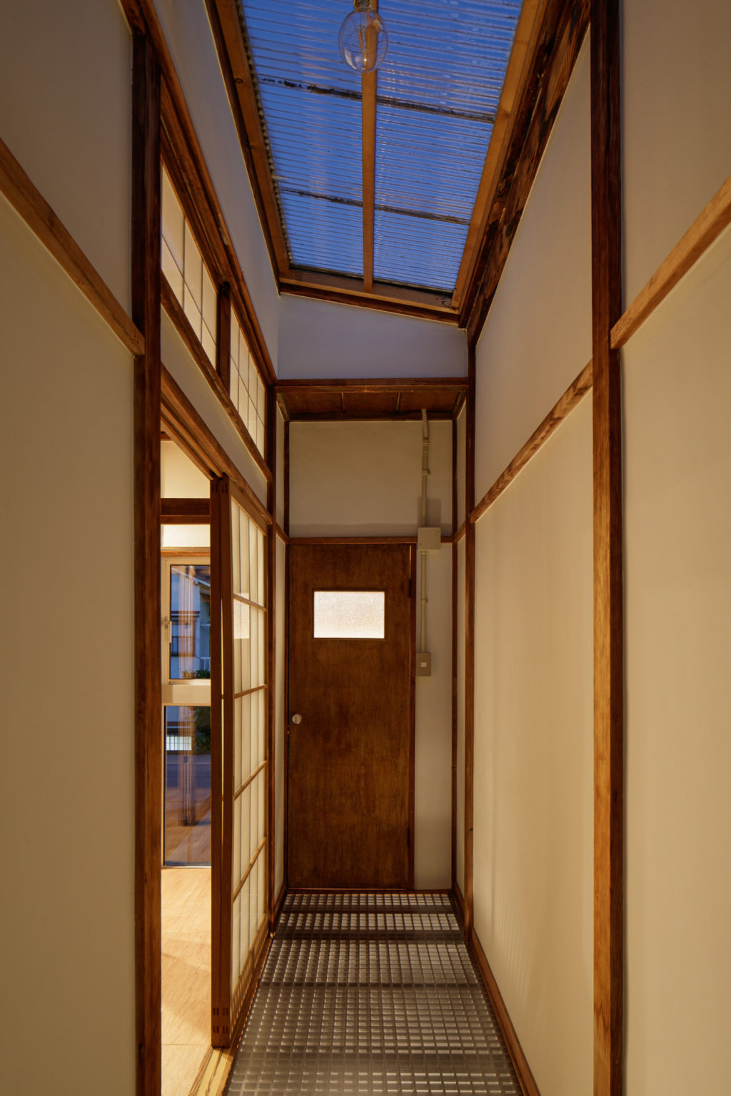
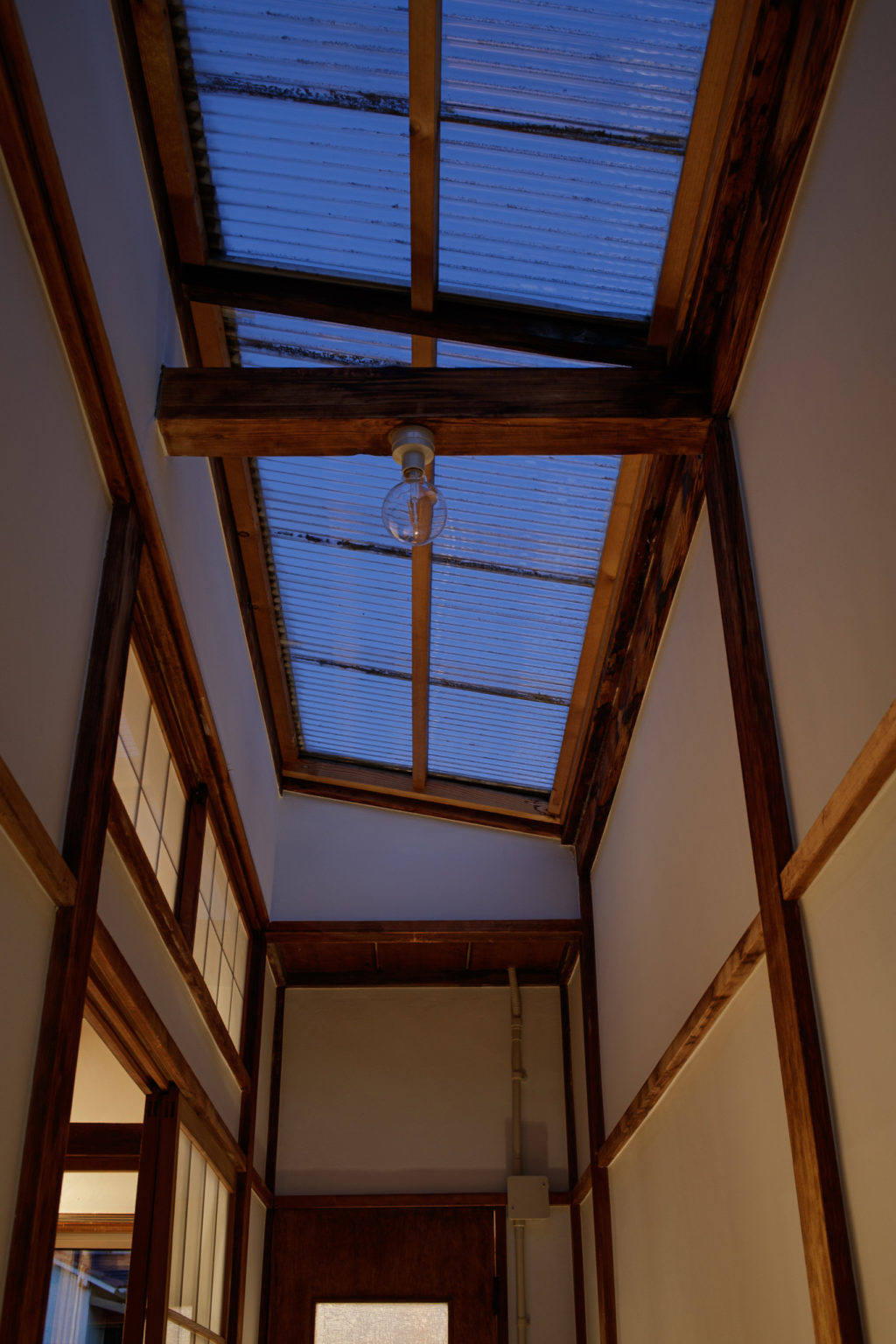
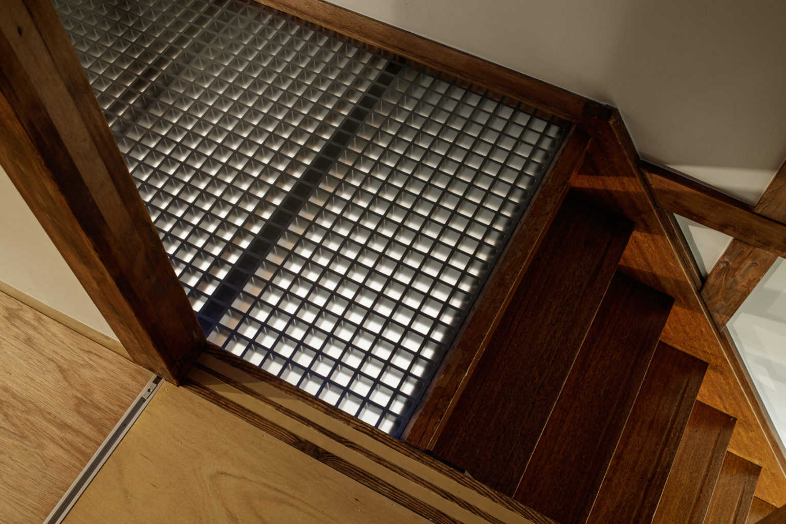
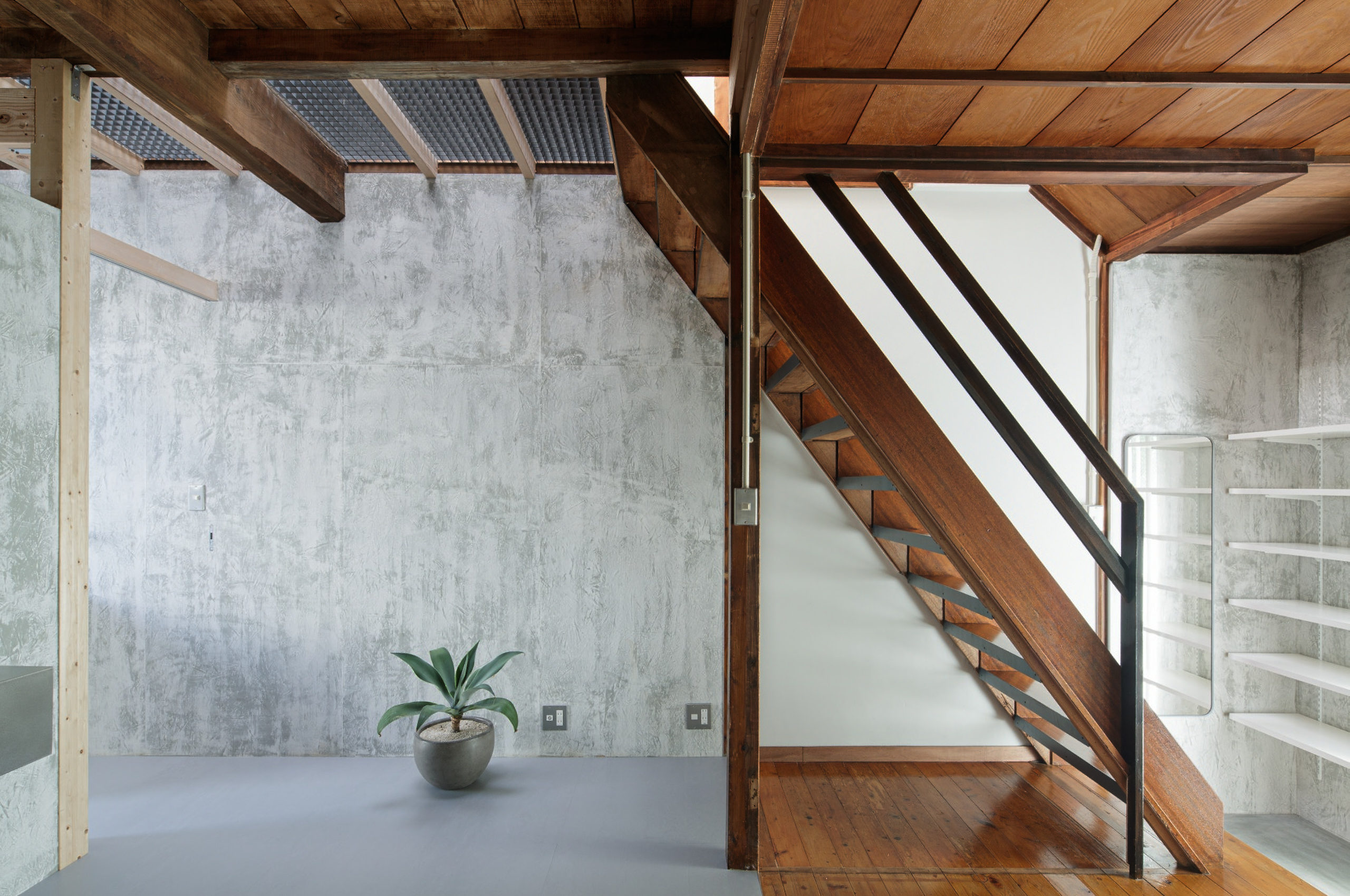
既存の一番の特徴でもある2階のトップライトから1階に光が落ちるように、床には光の透過する材料を選んでいます。
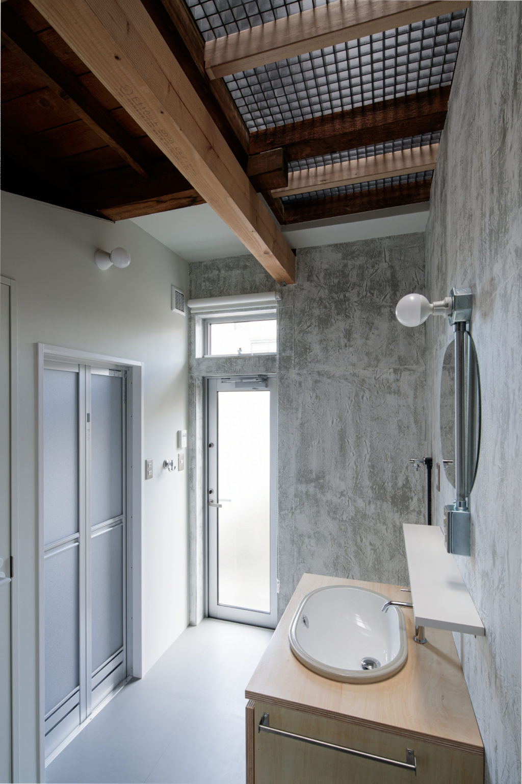
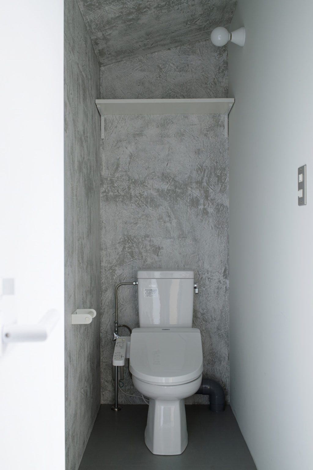
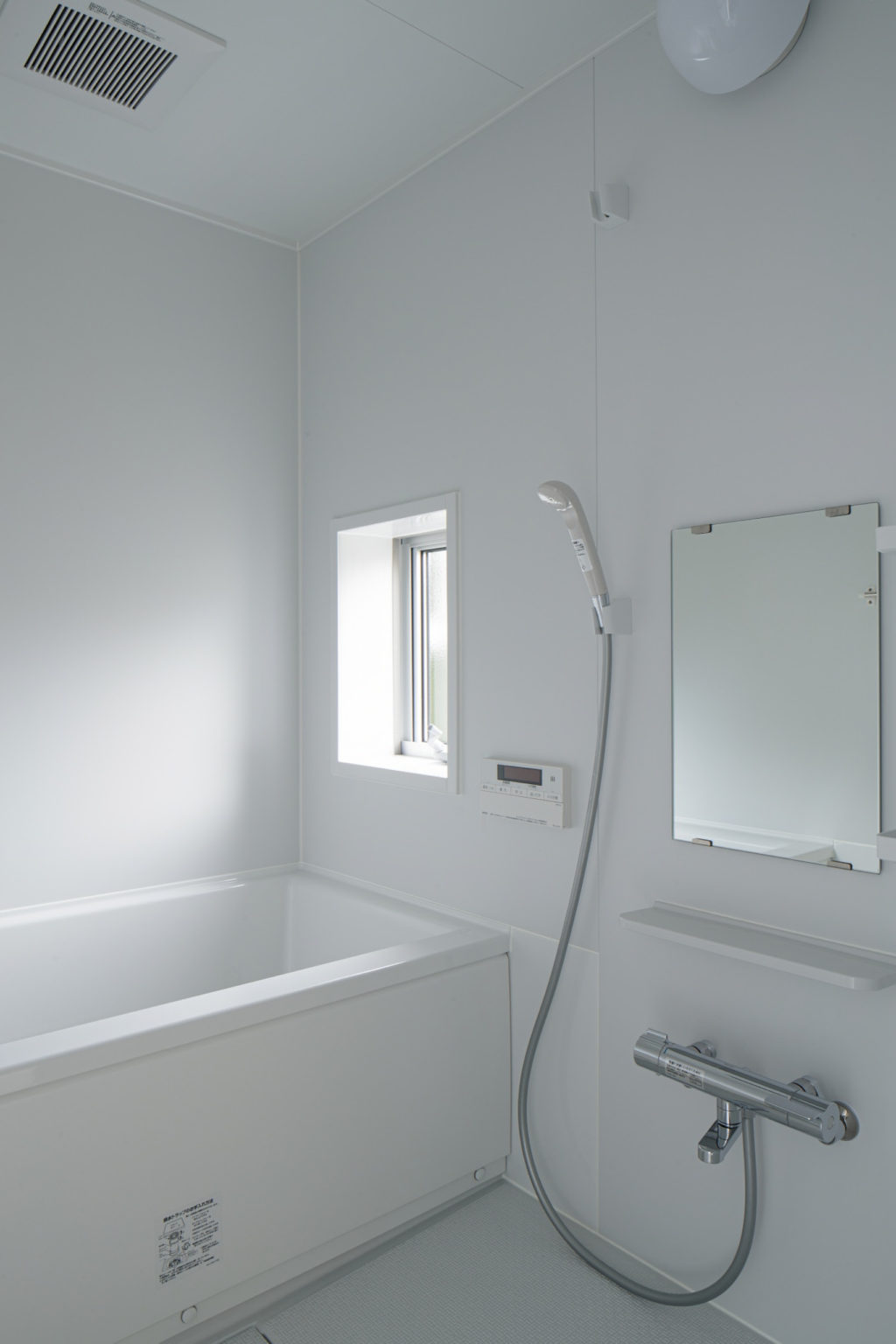
浴室とトイレの天井を下げて圧迫感の無い視界の広がりをつくりました。
透過する床、玄関と洗面所の開口からのあらゆる方面からの光により、明るくもどことなく落ち着いた雰囲気が感じられるようにしました。
こちらの物件は弊社が提供する新しいサービス「カリアゲ」にて運営しています。
築30年以上の空き物件を、オーナー負担ゼロで再生、転貸するサービス
カリアゲ 専用ホームページ
http://www.kariage.tokyo/
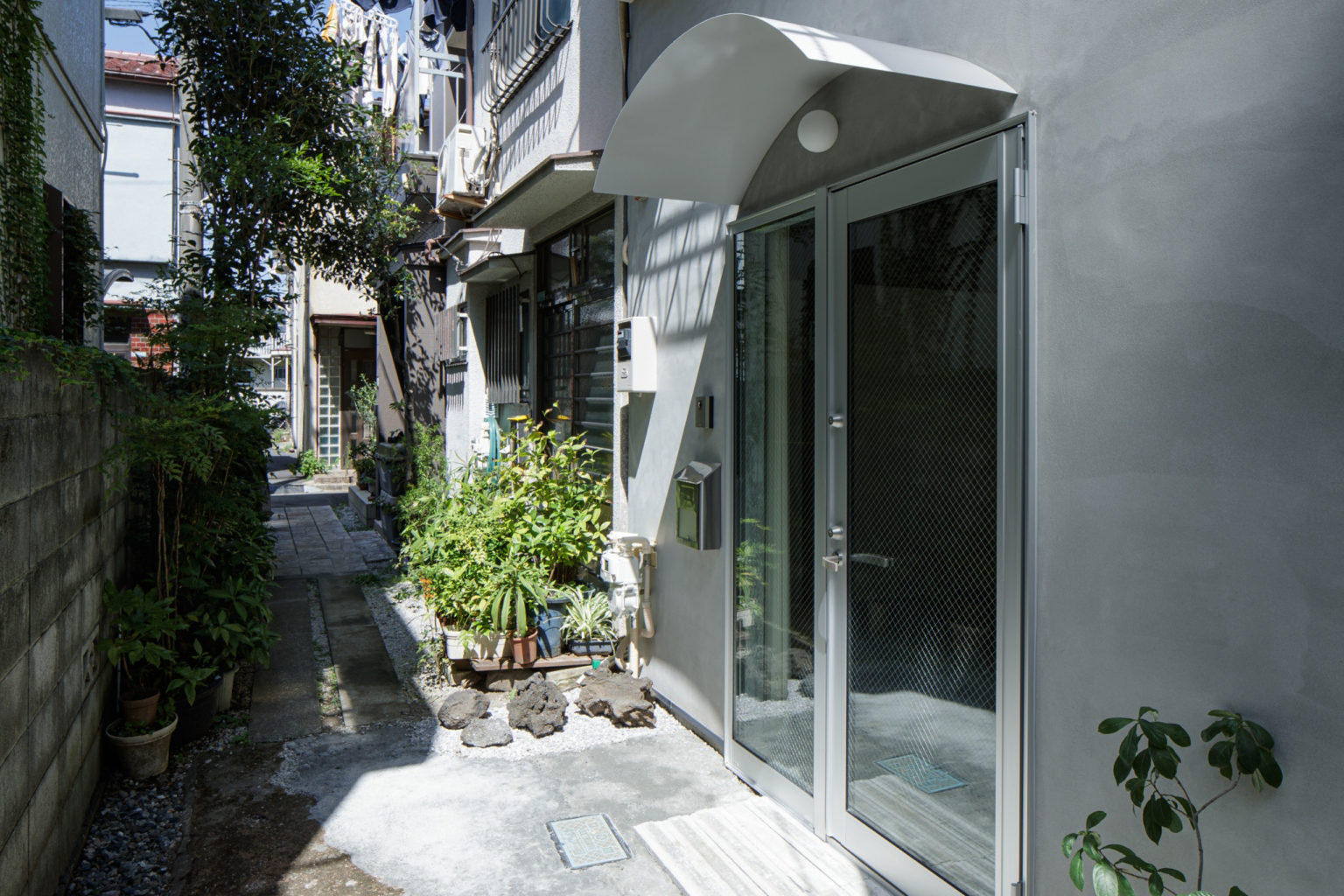
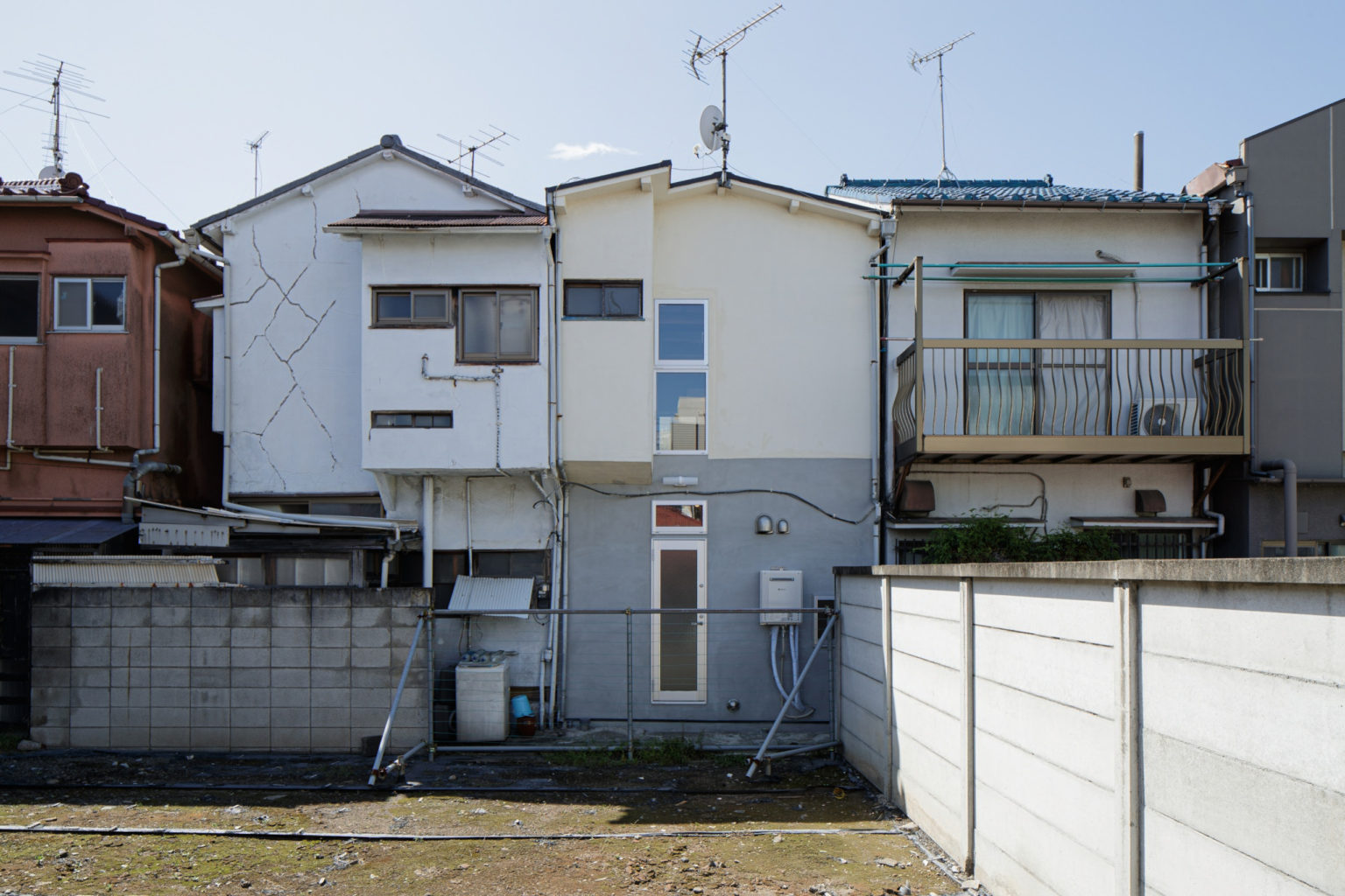
This renovation project takes place in the Heiwa Dori, a famous shopping street of Meguro, in the heart of Tokyo. The semi-detached two-story house is a part of a block of 4 row houses, typical of the Showa era (1926-1989) , in which it was built and it resembles a lot of that vintage atmosphere together with the dense surroundings.
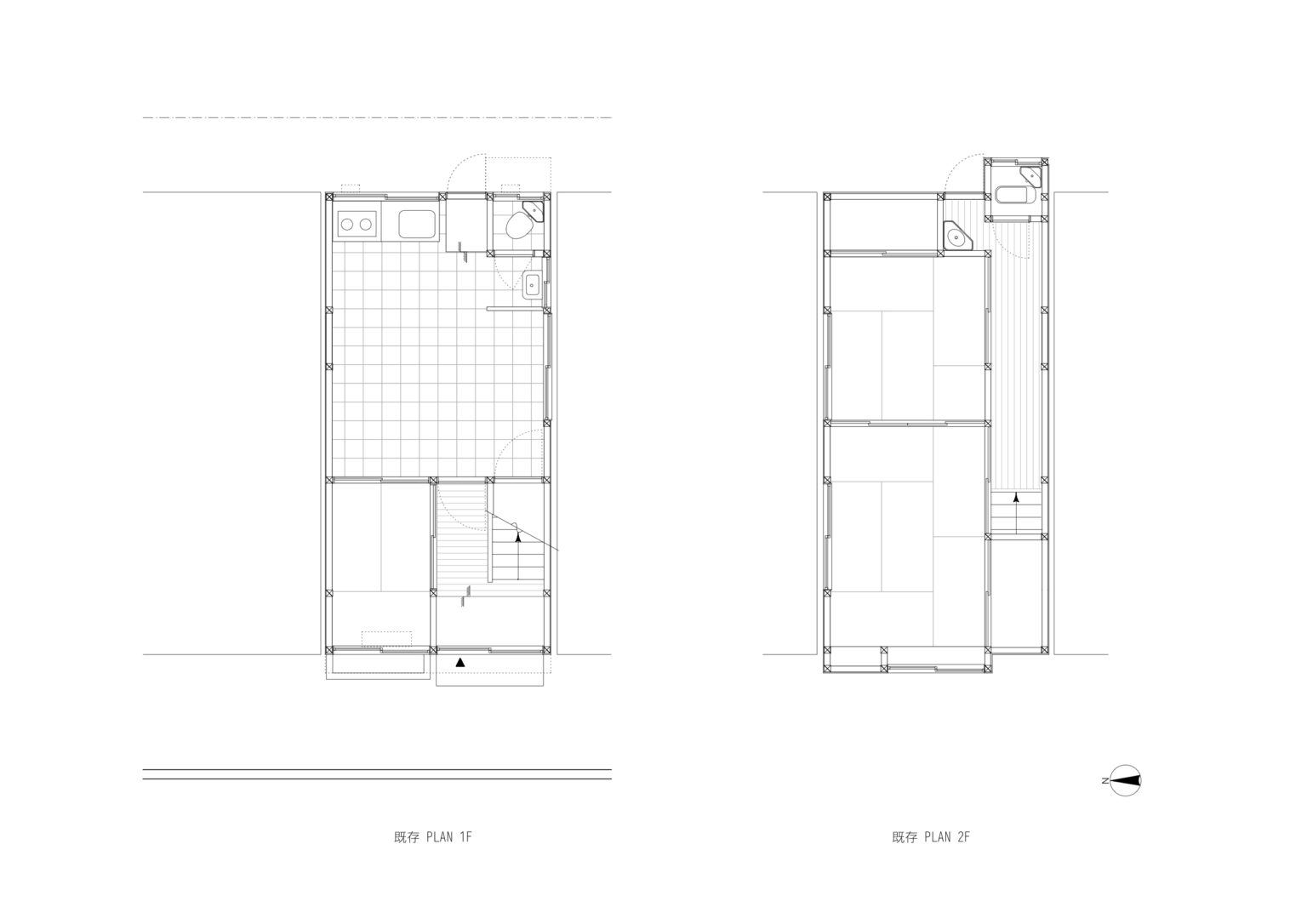
The oldest record of the original construction is dated December 1953, and since then the house came with no bathtub due to the nearby public bath that provided the necessary facility. Now that the public bath is no longer in use, the client made some requests starting from these aspects: the need to modernise the building adding a private bath and at the same time reinforcing the dated structure by seismic retrofitting the whole dwelling with a score of 1.0 or higher. Together with the necessity of essential contemporary facilities, the house needed to raise the amount of natural light in the lower level.
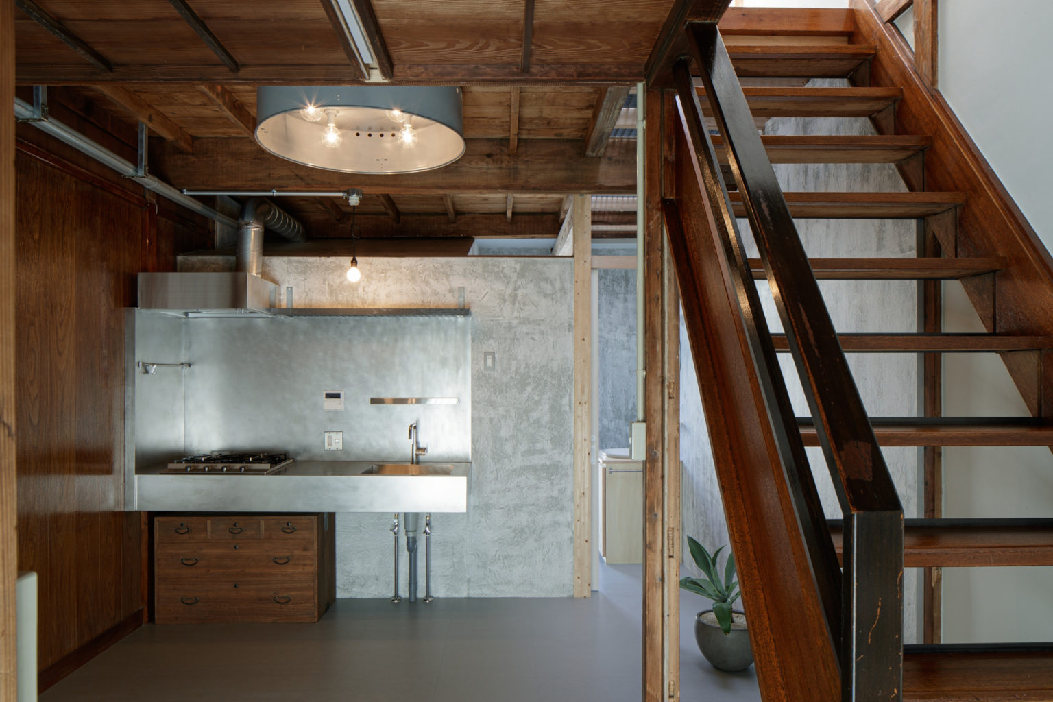
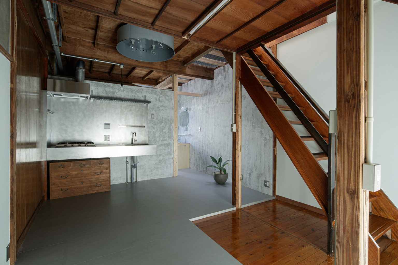
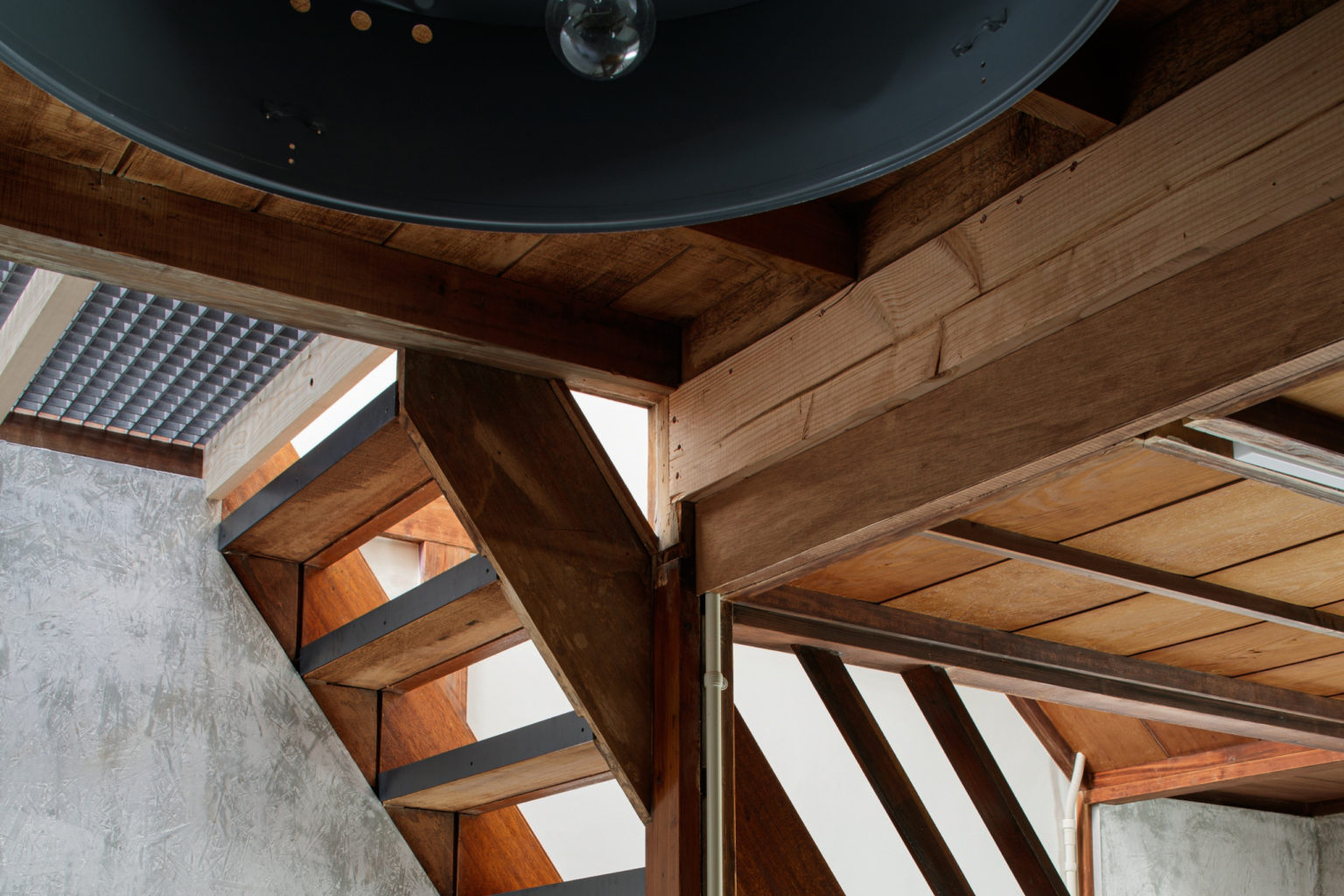
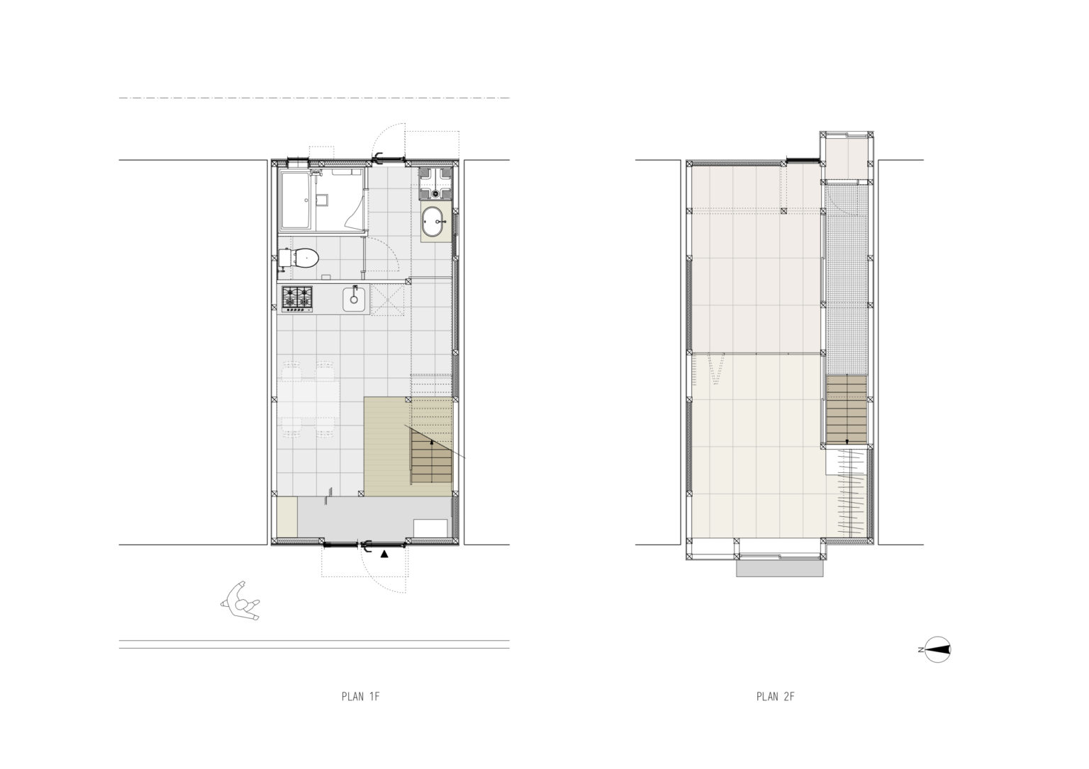
To solve all these problems, the project began with the reinforcement of the existing wooden structure in the first floor: new beams have been added on top of the existing columns, and a new column is now placed with a wall to separate the floorplan in two spaces. The new elements have a lighter wooden colour and texture, to differentiate them from the original structure. The space on the rear side of the house is now the bathroom: the private bathtub, as requested by the owner, is placed in the corner and the toilet now moved in front of the tub, thus giving more privacy and making the use of the sink much more accessible and immediate. On the other side of the wall we put the kitchen with all its facilities, leaving enough space in the room for a dining table if needed. As a storage for kitchen tools we chose to use a traditional Japanese chest, a leftover of the original furniture.
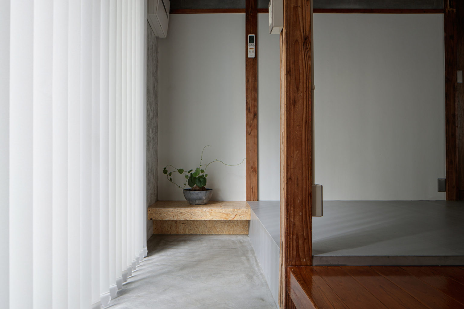
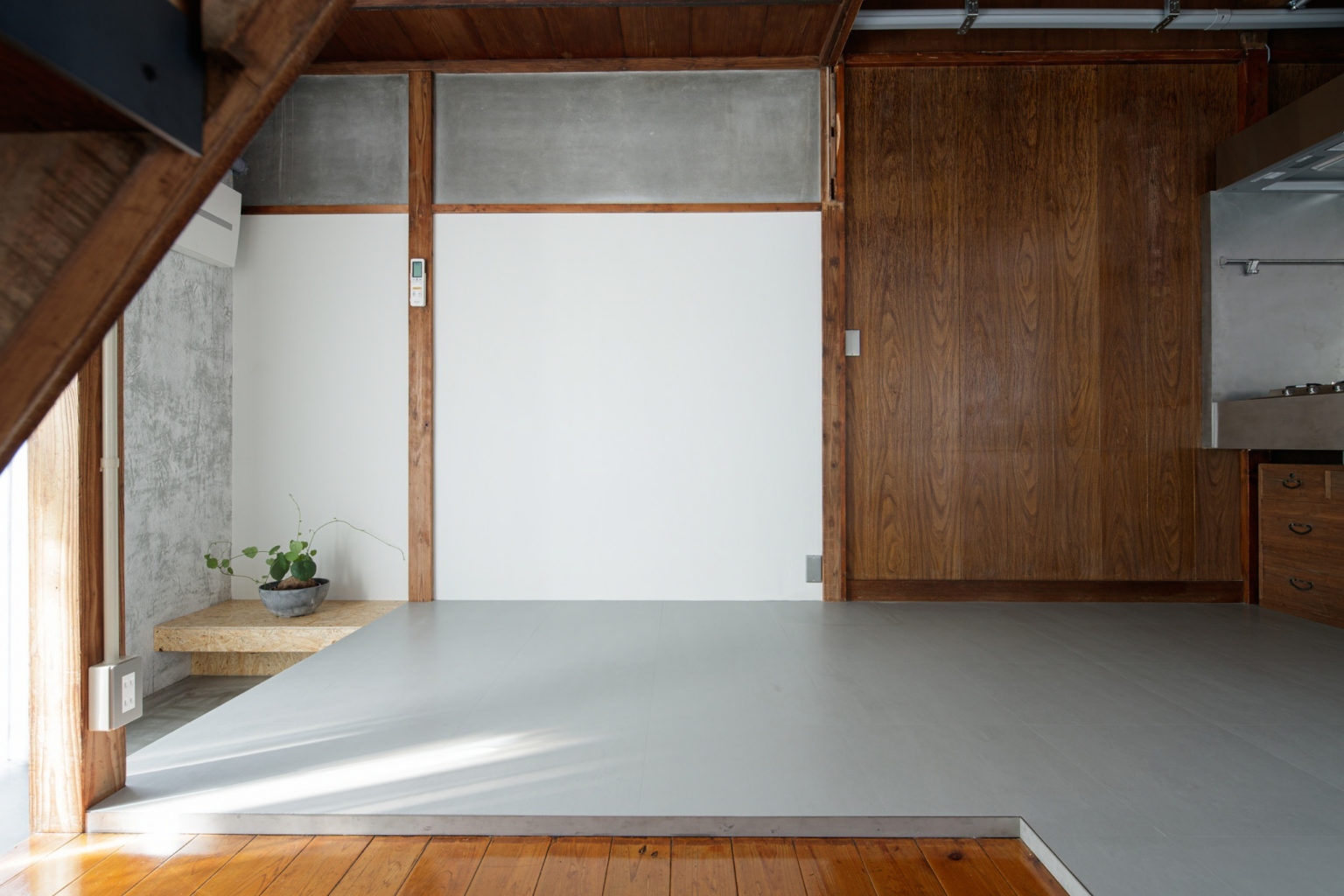
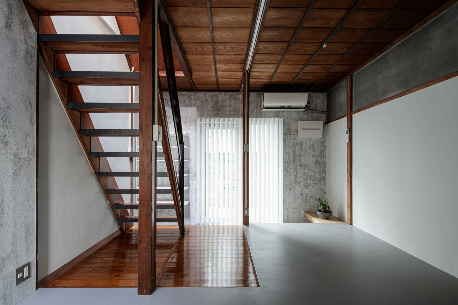
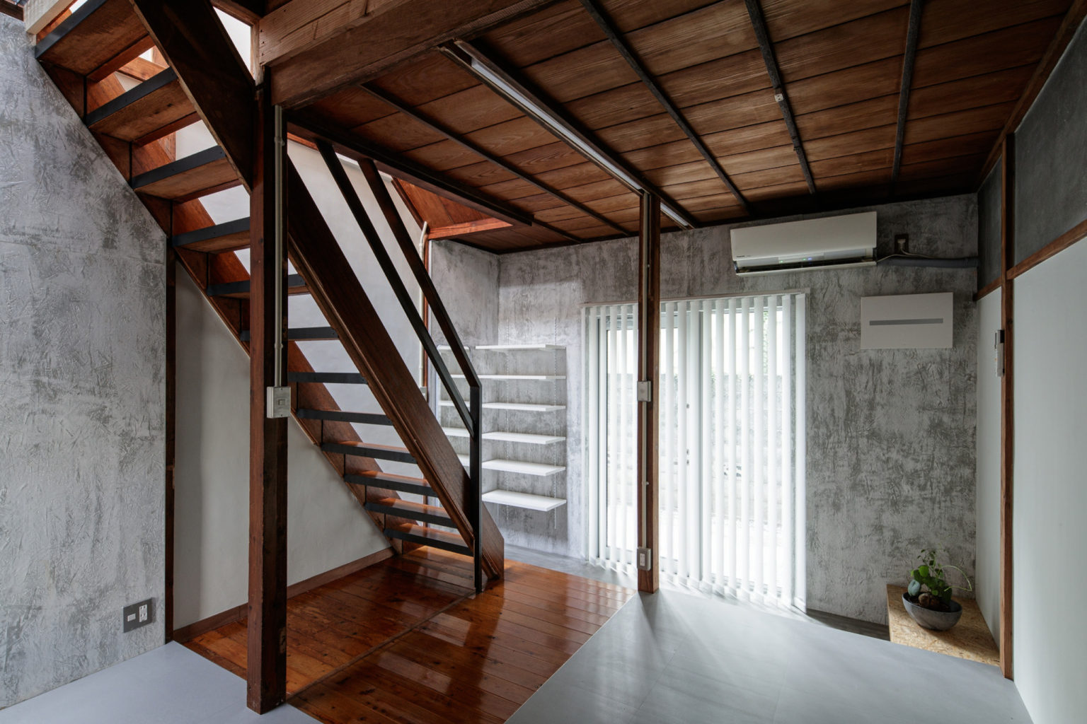
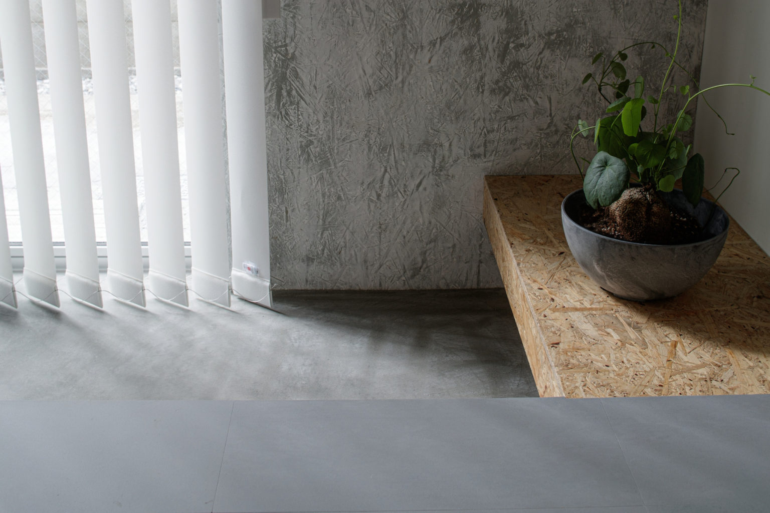
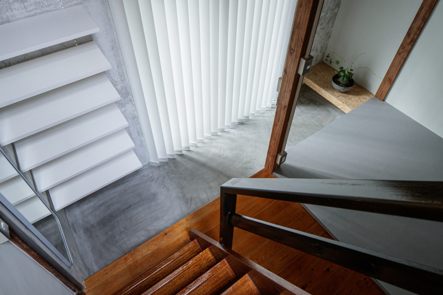
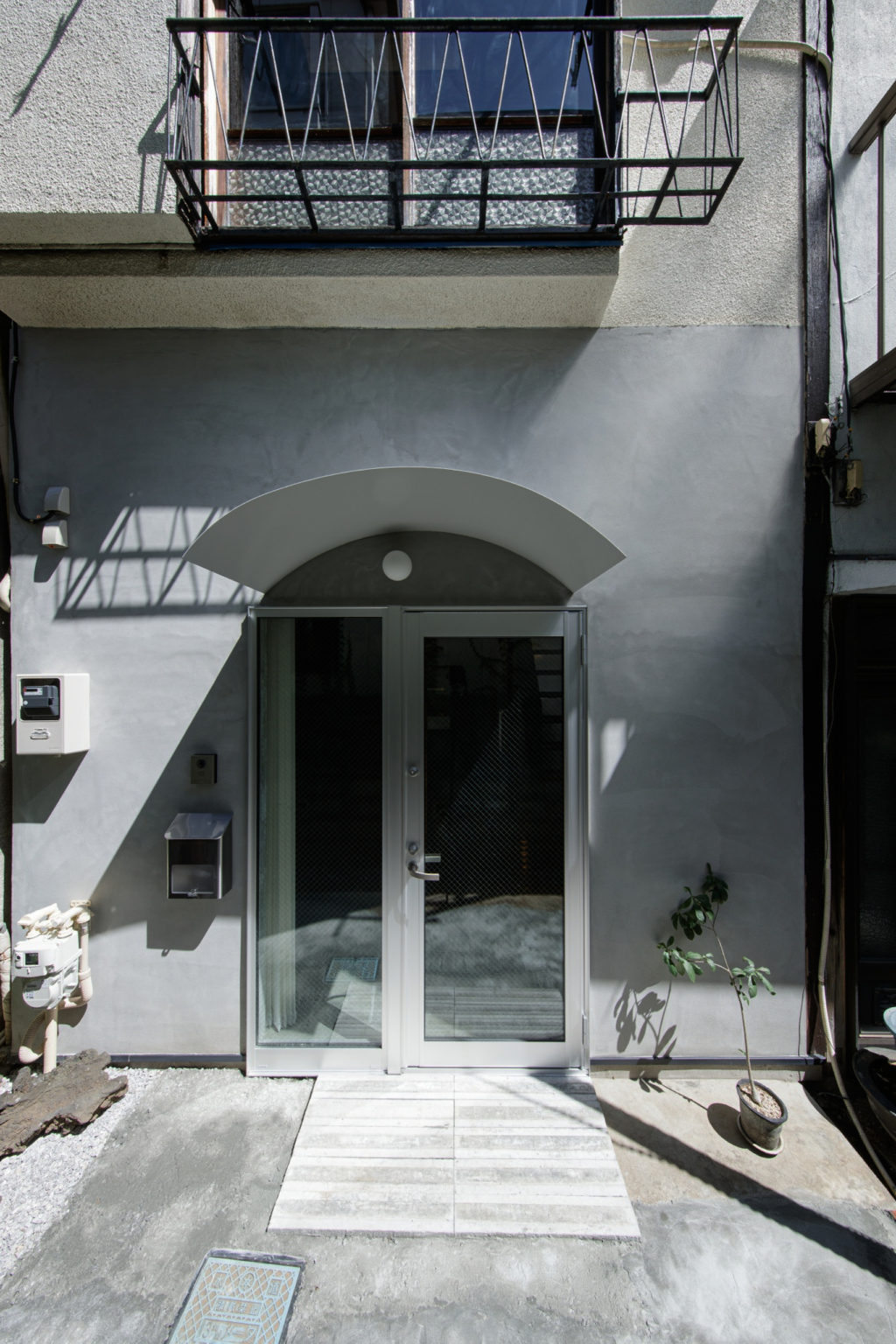
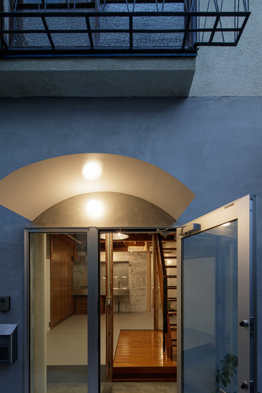
The modified layout and the reinforced structure of the first floor allowed us to remove the pillar placed in the centre of the original plan, creating a more open and flexible space. At the same time, the wall that was defining the entrance hall in the original building has been removed, the previous entrance door got replaced with a wider one made of glass, bringing much more natural light inside the home, contributing to make the first floor feel more pleasant and healthier. The new entrance hall is now divided in three different levels, each one with its own materiality: the Doma, Japanese traditional space where to take off the shoes before stepping on the floor, made of polished grey concrete as the lowest one; the stairs landing as the middle level, made of wooden boards re-pasted from the former corridor on the second floor; and the dining room floor covered with PVC tiles that remained one step higher than the stairs landing from the original building.
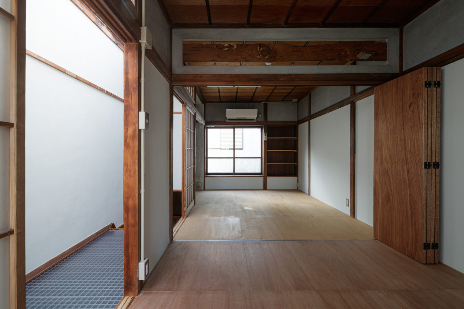
Even if the amount of light has increased a lot already, we were still feeling like it just wasn’t enough yet: being in the middle of row houses means that you can’t open the walls as much as you want and especially in a high dense area like Heiwa Dori, there’s the high risk of having the first floor with a dark and shady atmosphere. Since we already opened the only two directions available, we thought that the only way to bring more light was to do it from above. Therefore, the second floor was designed mainly with the aim to enlighten as much as possible the space below: this is why we decided to use a FRP (Fibre-reinforced plastic) grate for the hallway that connects the stairs and the bedrooms. On top of the corridor, a zenith window helps to capture and let light pass through the floors, creating a lightful yet calm atmosphere pretty much everywhere around the house.
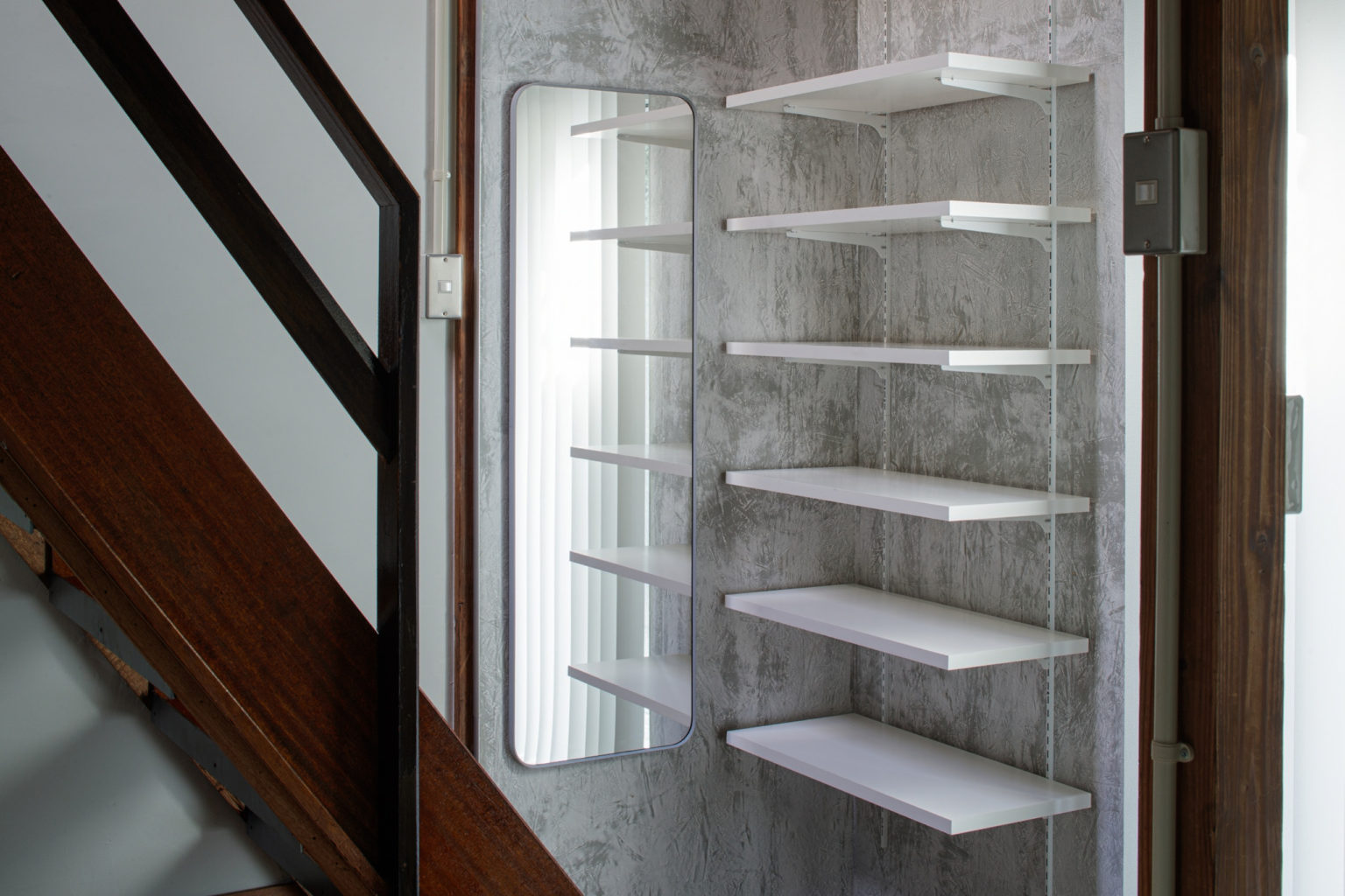
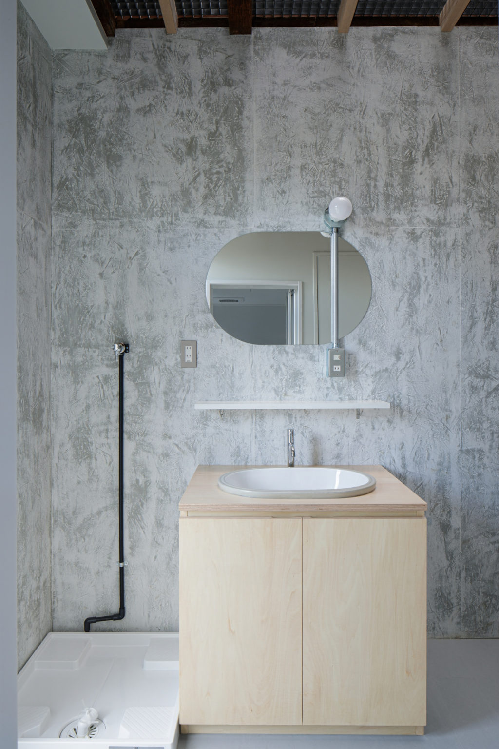
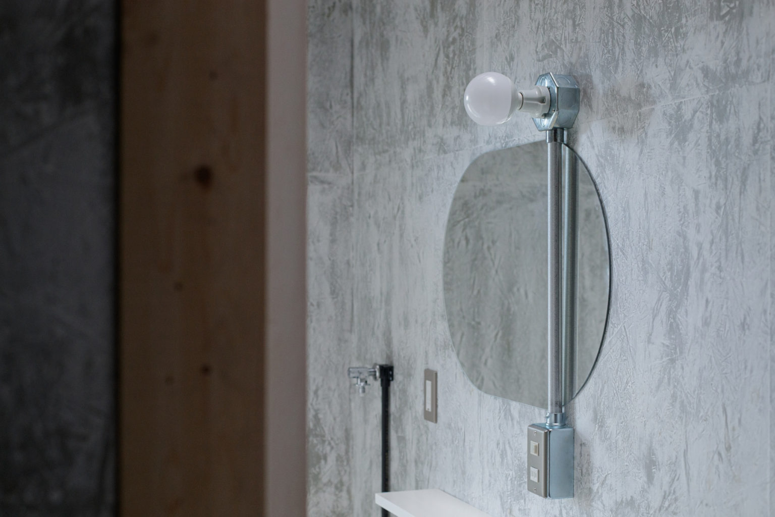
Being the first floor made with a strong opposition between the dark and bright parts, we wanted to increase this idea of contrast by applying a texture on the walls that would make the natural light appear even brighter and evocative. To achieve that, we made use of OSB panels, applied a first and rough layer of grey paint, then a layer of white putty to make them even with each other, and as final step we added just one layer of clear paint. The result is a unique texture for the wall that was surprisingly cheaper and quicker than a wall made of plaster board and painted with a white coat would have been.
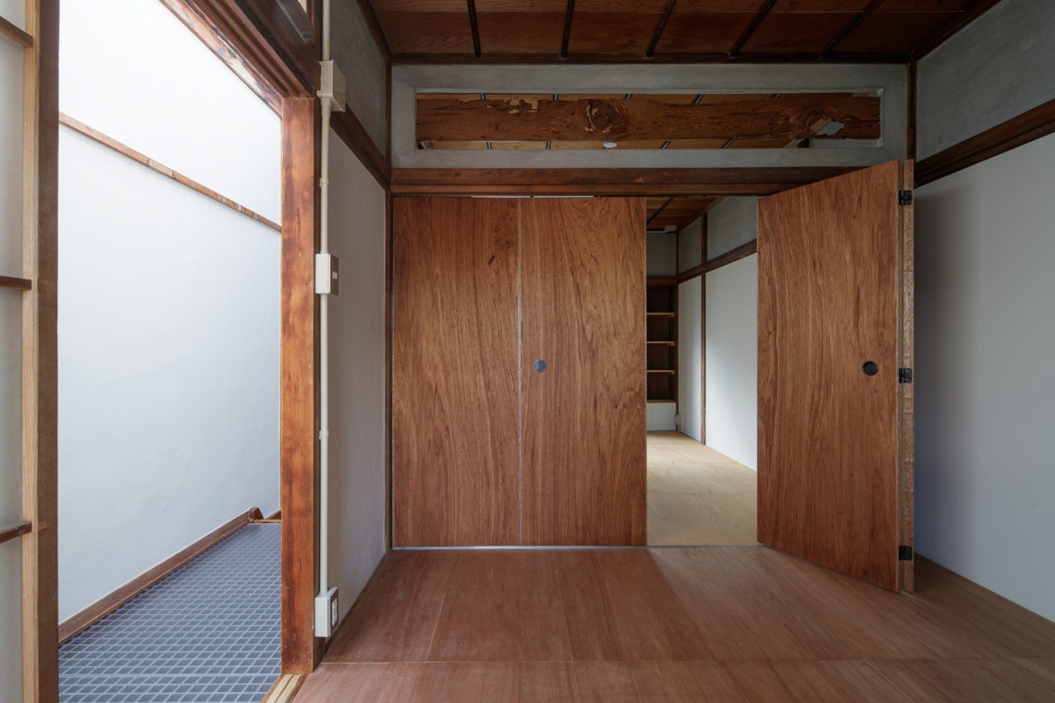
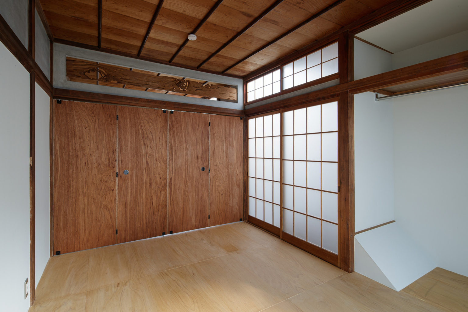
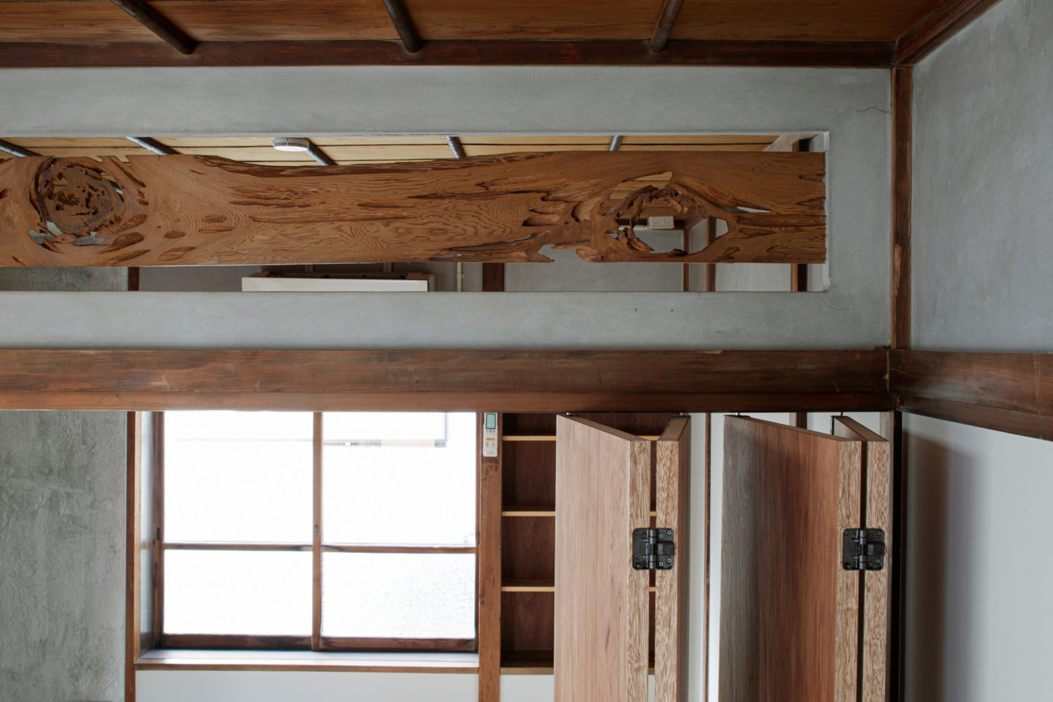
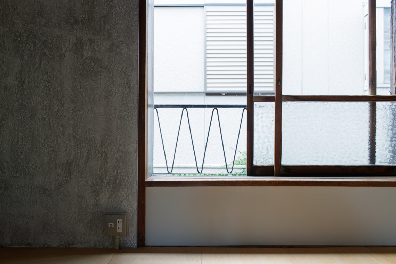
Talking about the second floor, the renovation brought minor changes. The toilet at the end of the corridor has been replaced with a storage room, because we thought that having two toilets in a house of this size is unnecessary and downstairs there’s now a new and totally equipped bathroom. The two bedrooms now have a new floor material that comes in wood panels, instead of the typical Japanese-style house tatami floor. The division between the two rooms is made of light movable panels, instead of the previous sliding doors, making it much easier to have one continuous space if needed. On top of the movable panels, we chose to keep the original ranma, an element of the traditional Japanese architecture that allows ventilation and lightning between two spaces divided by a wall, that works as a threshold when the panels are opened.


