シゴト
WORKS 225荒川の家
Gooood.cn gooood.cn
DIVISARE divisare.com
Archello archello.com
Architizer architizer.com
Archinect archinect.com
ArchiLovers archilovers.com
ArchiDiaries archidiaries.com
Designverse designverse.com.cn
Architect Magazine architectmagazine.com
Re-thinking The Future re-thinkingthefuture.com
荒川区荒川にて二軒長屋をカリアゲました。
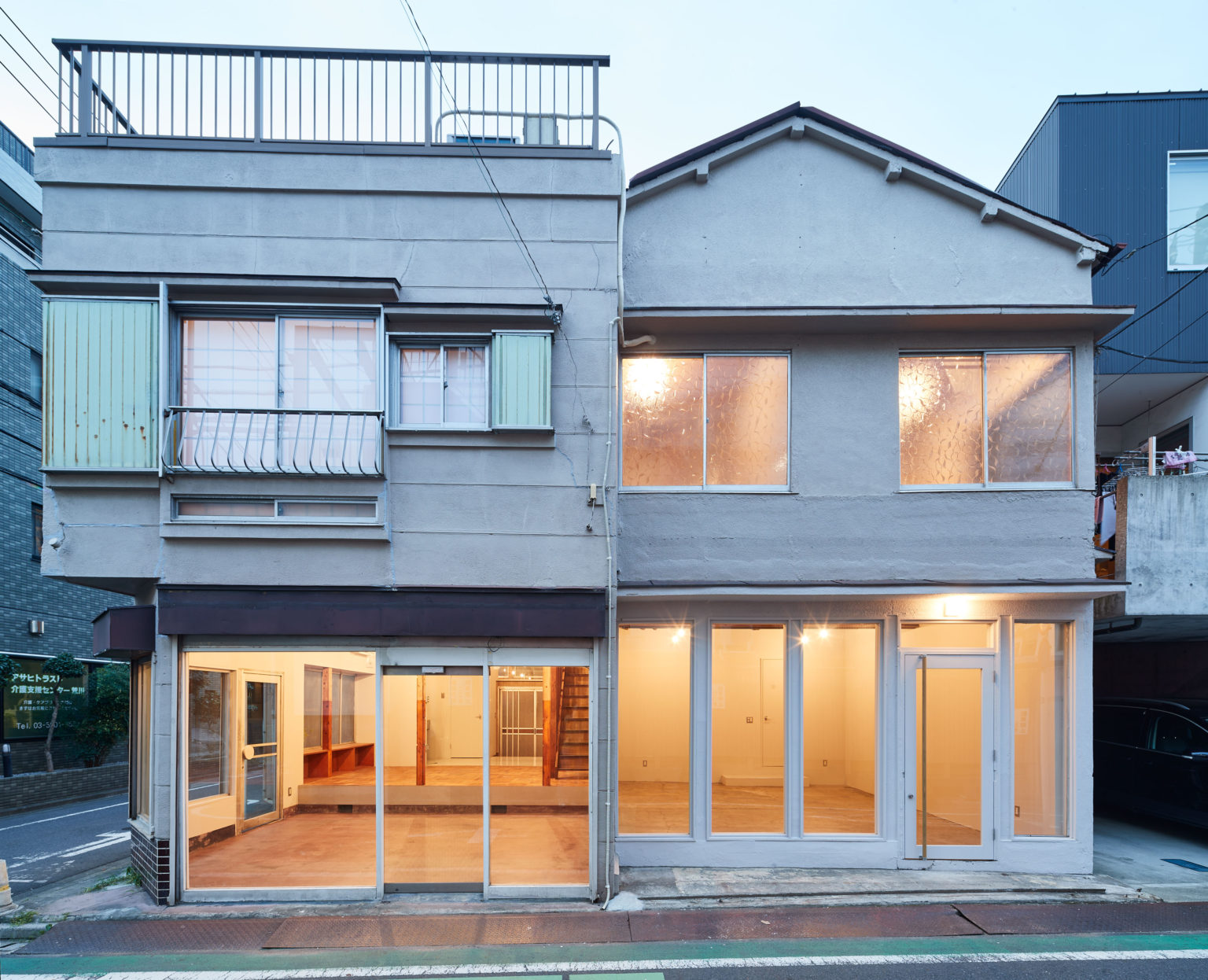
二軒長屋を2つの店舗兼住居としてリノベーションしました。 元々は、1階の前面道路に面する部分は2軒またがって一つの店舗として使われておりました。 その他は、2軒が2階で行き来の出来るつくりで、キッチンもそれぞれ1階2階に1台づつあったり、部屋割りも細かく、学生寮のようなプランでもあり、実際どの様に使われていたのか想像がつかないつくりでした。
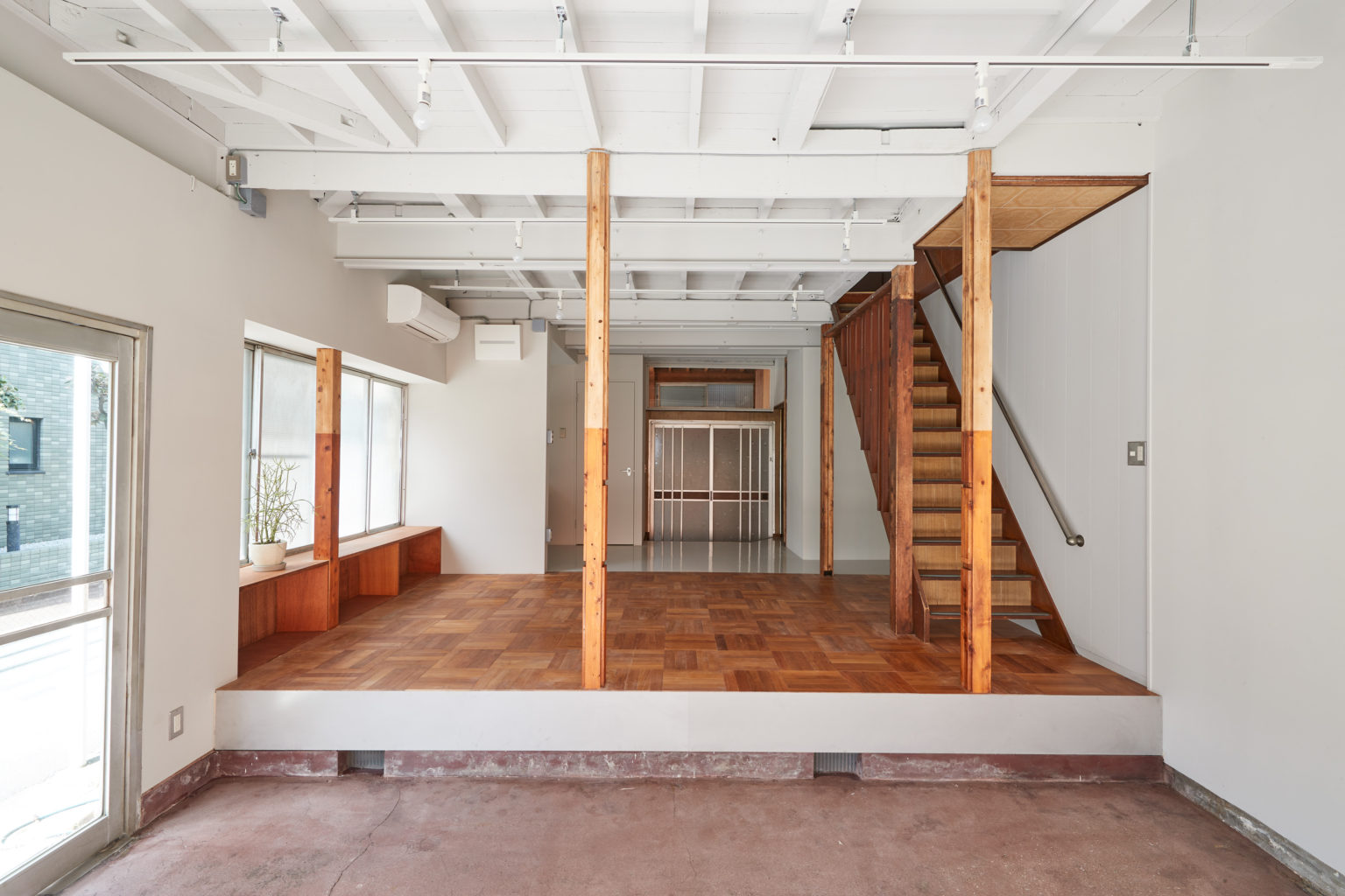
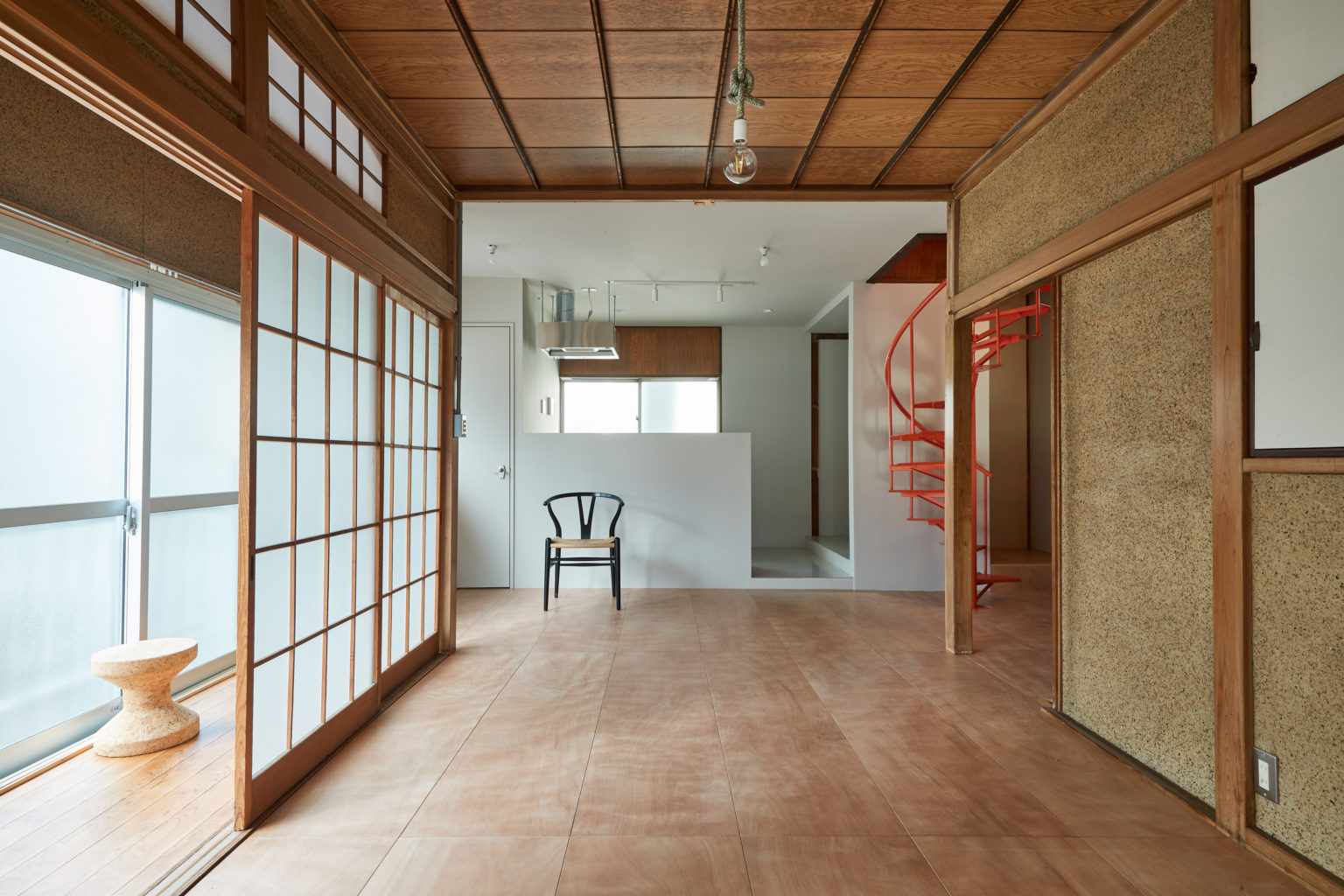
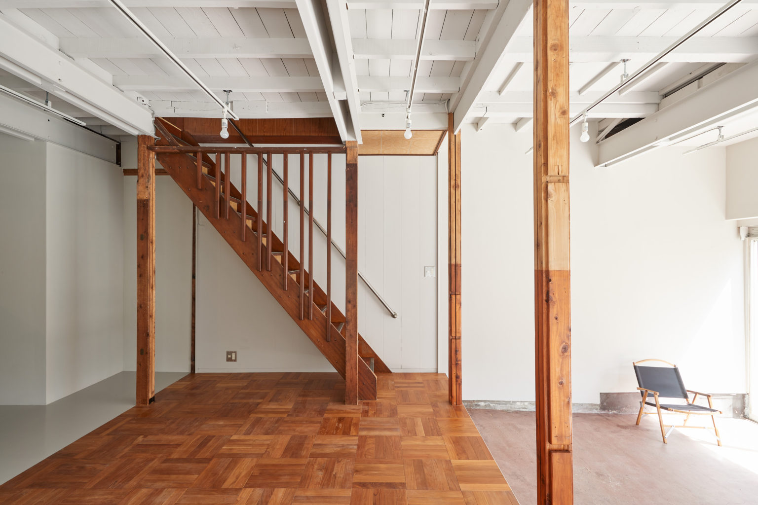
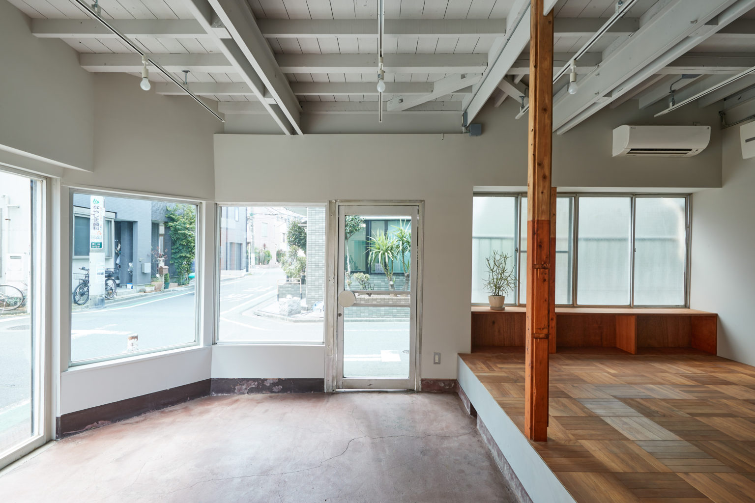
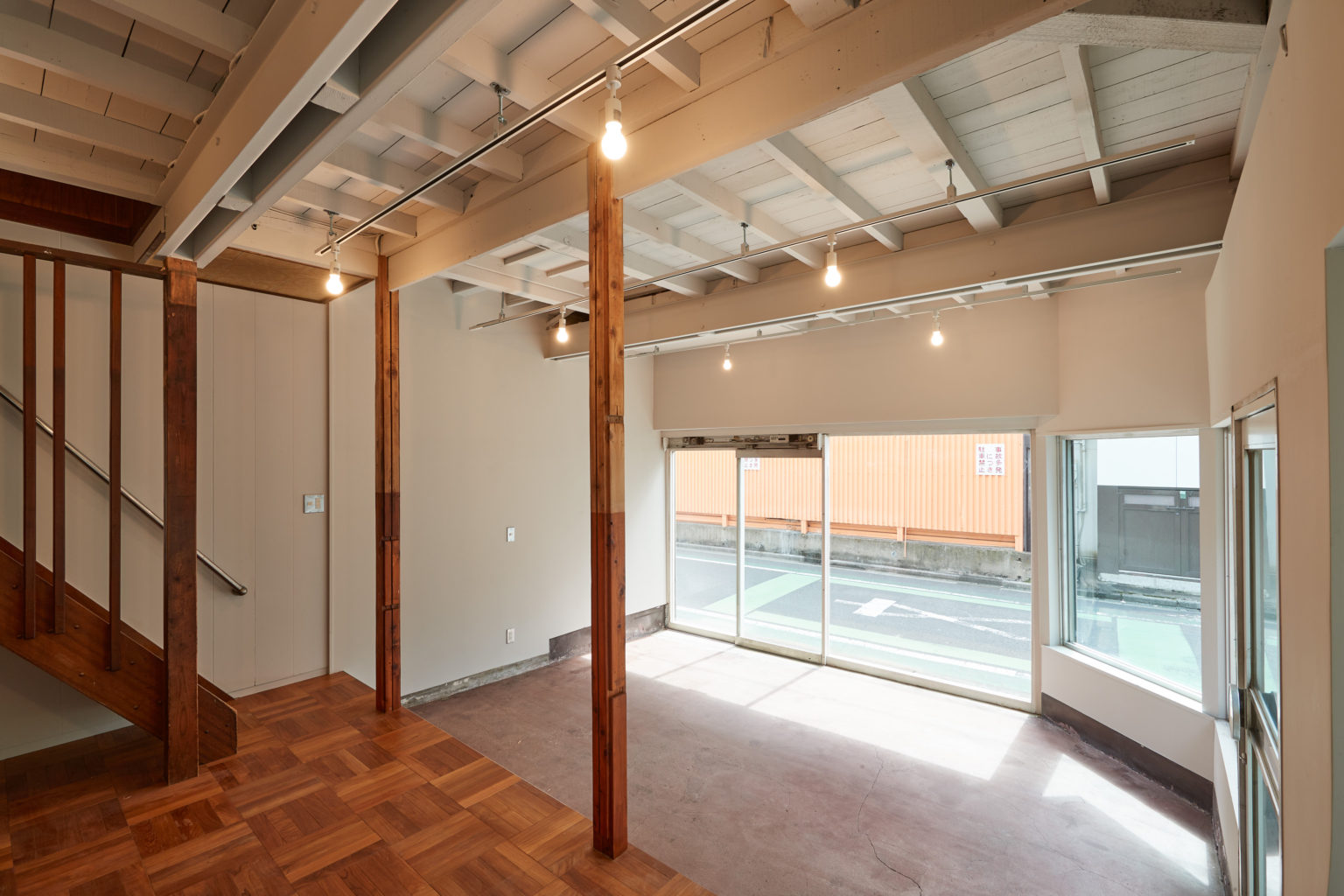
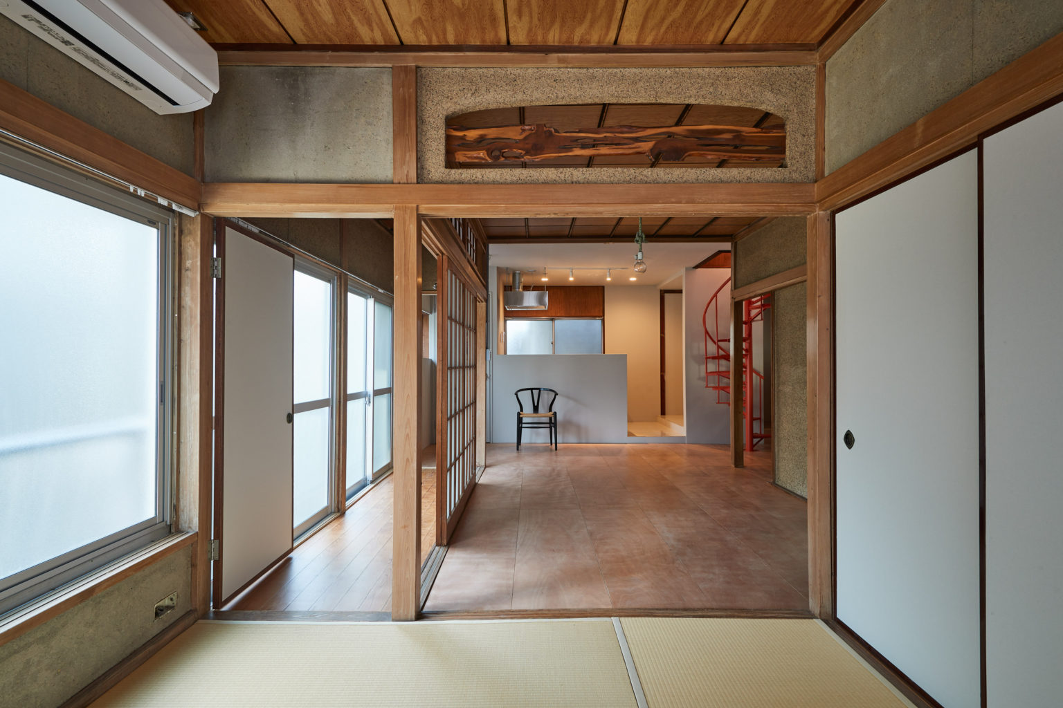
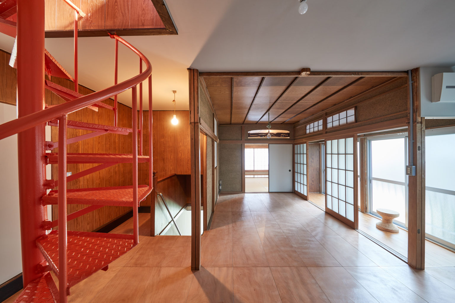
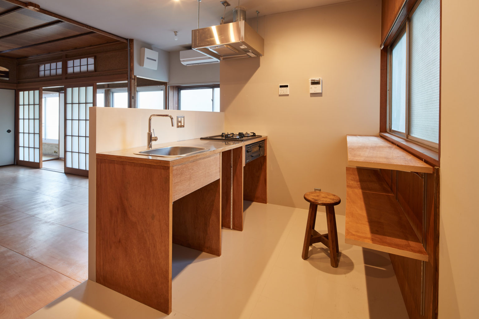
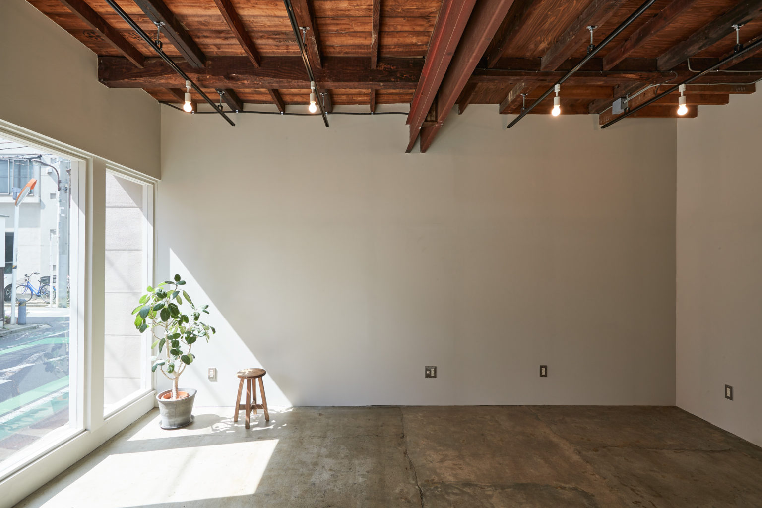
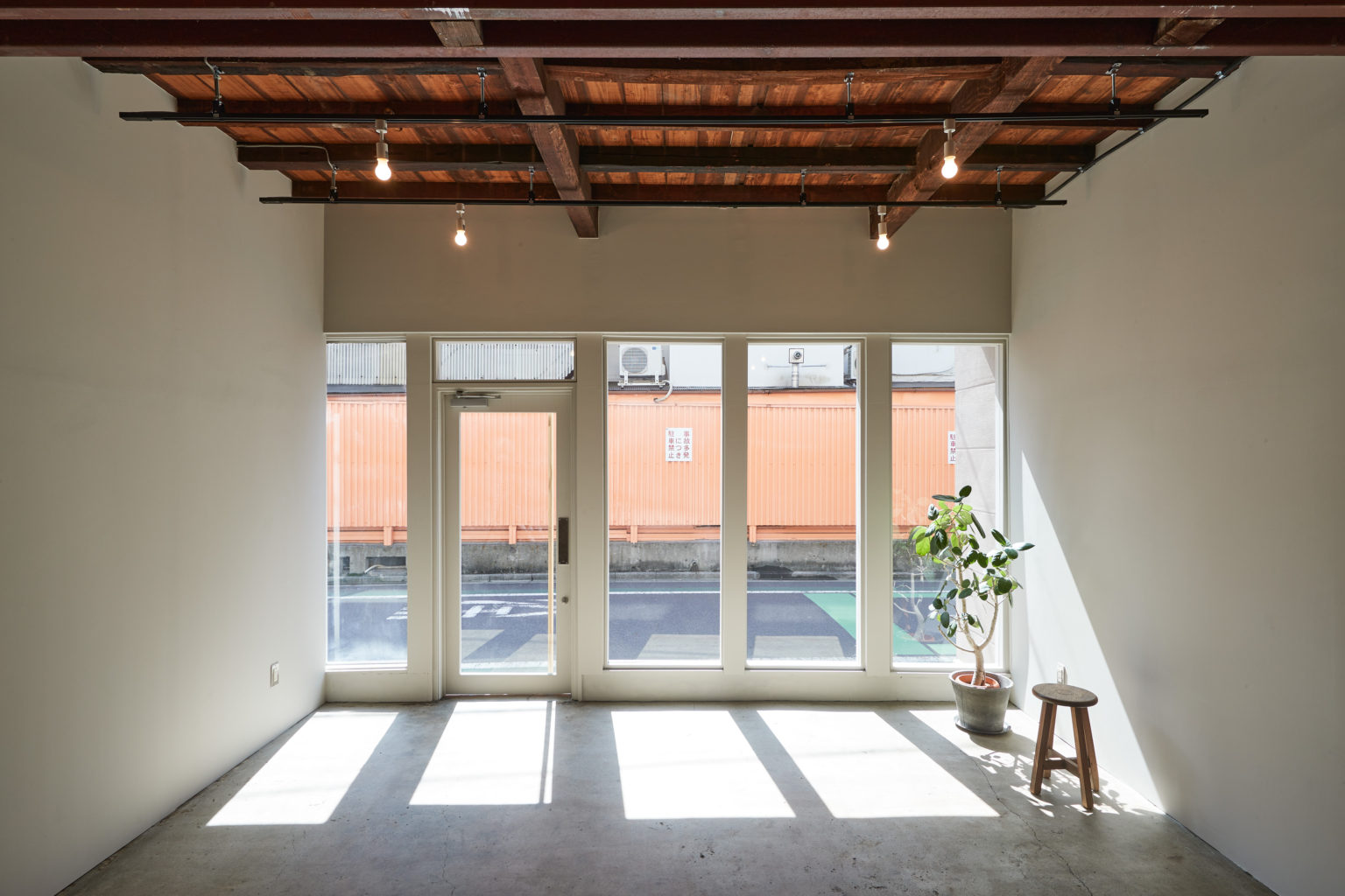
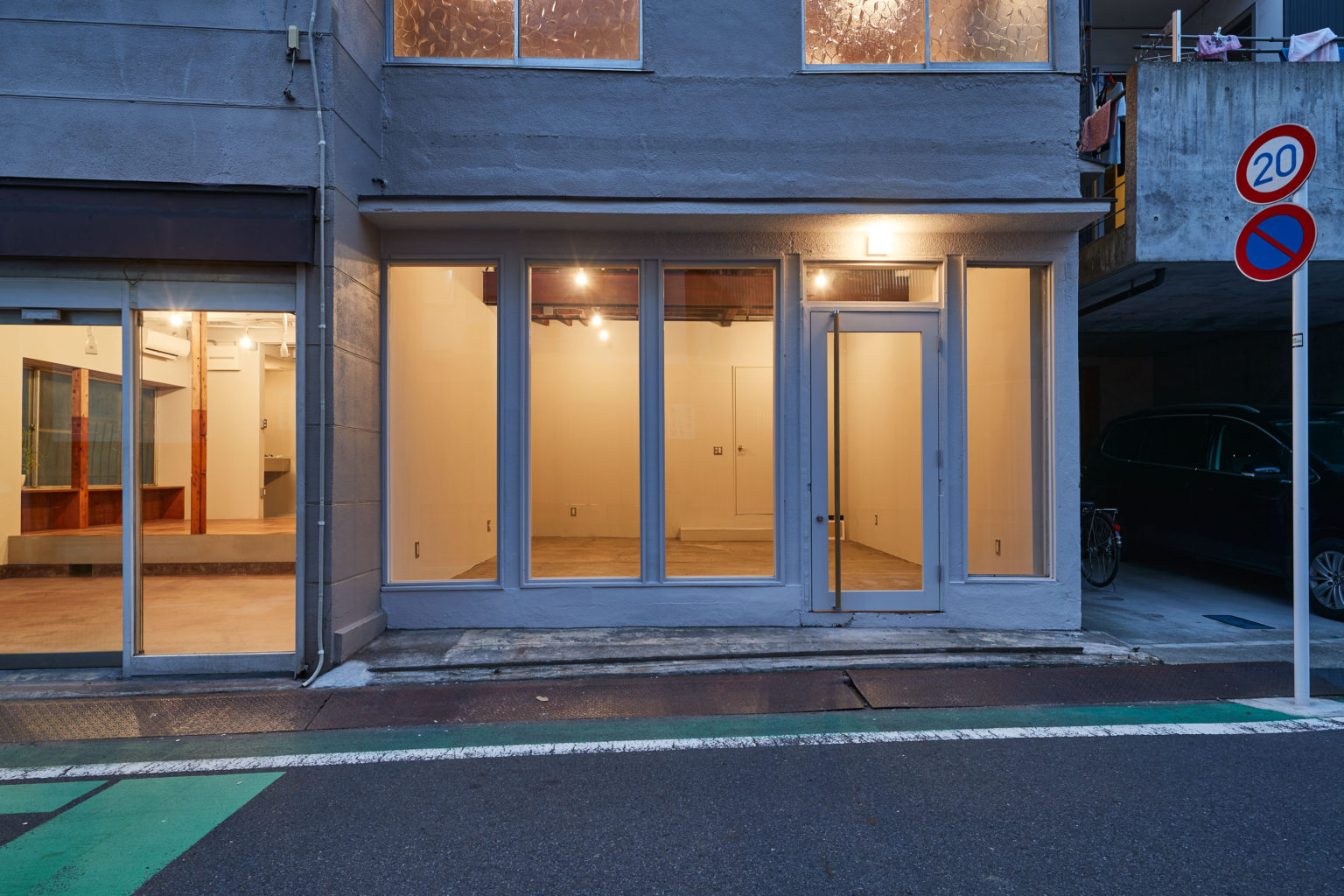
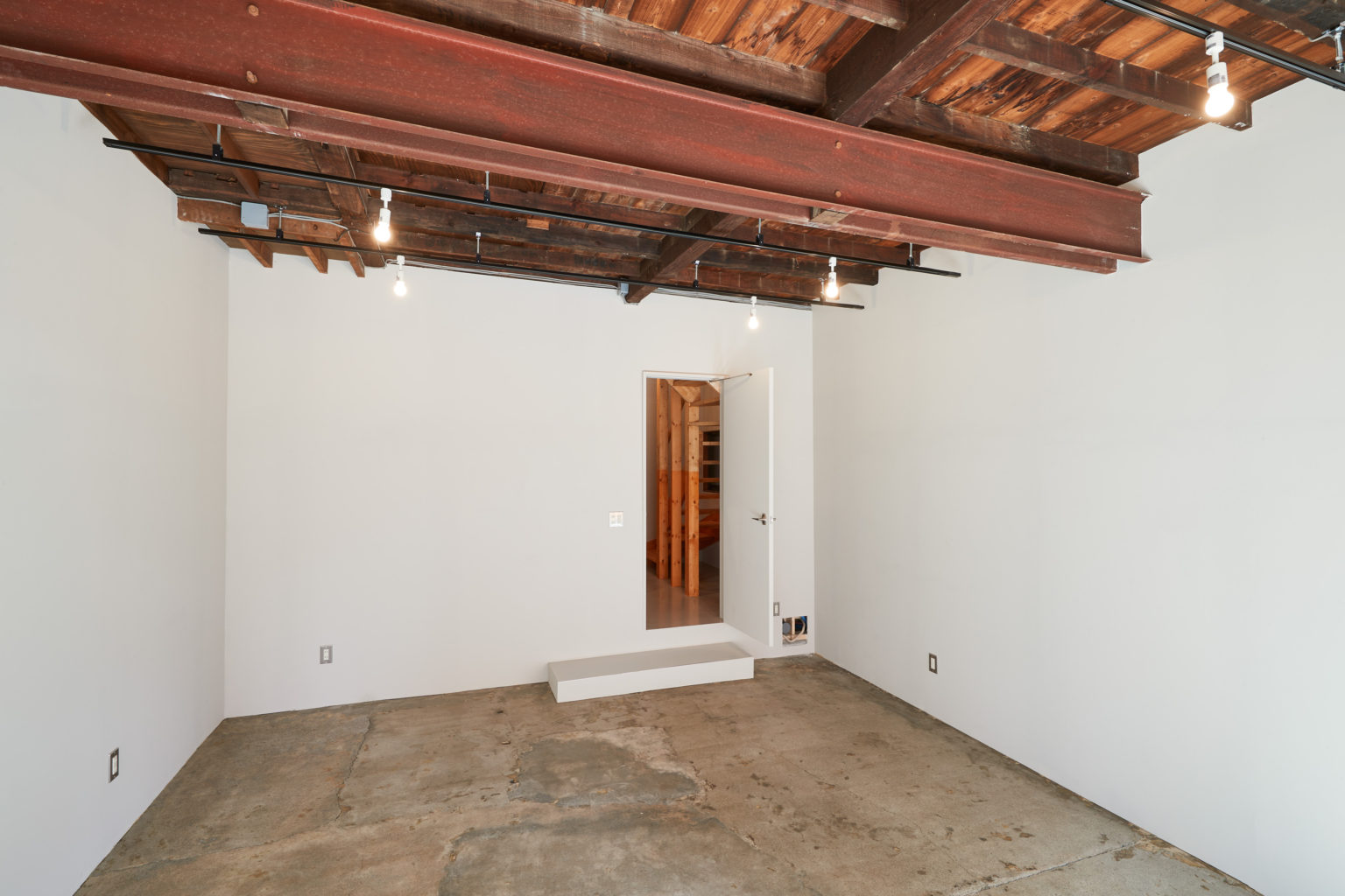
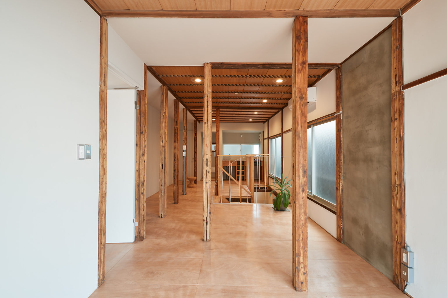
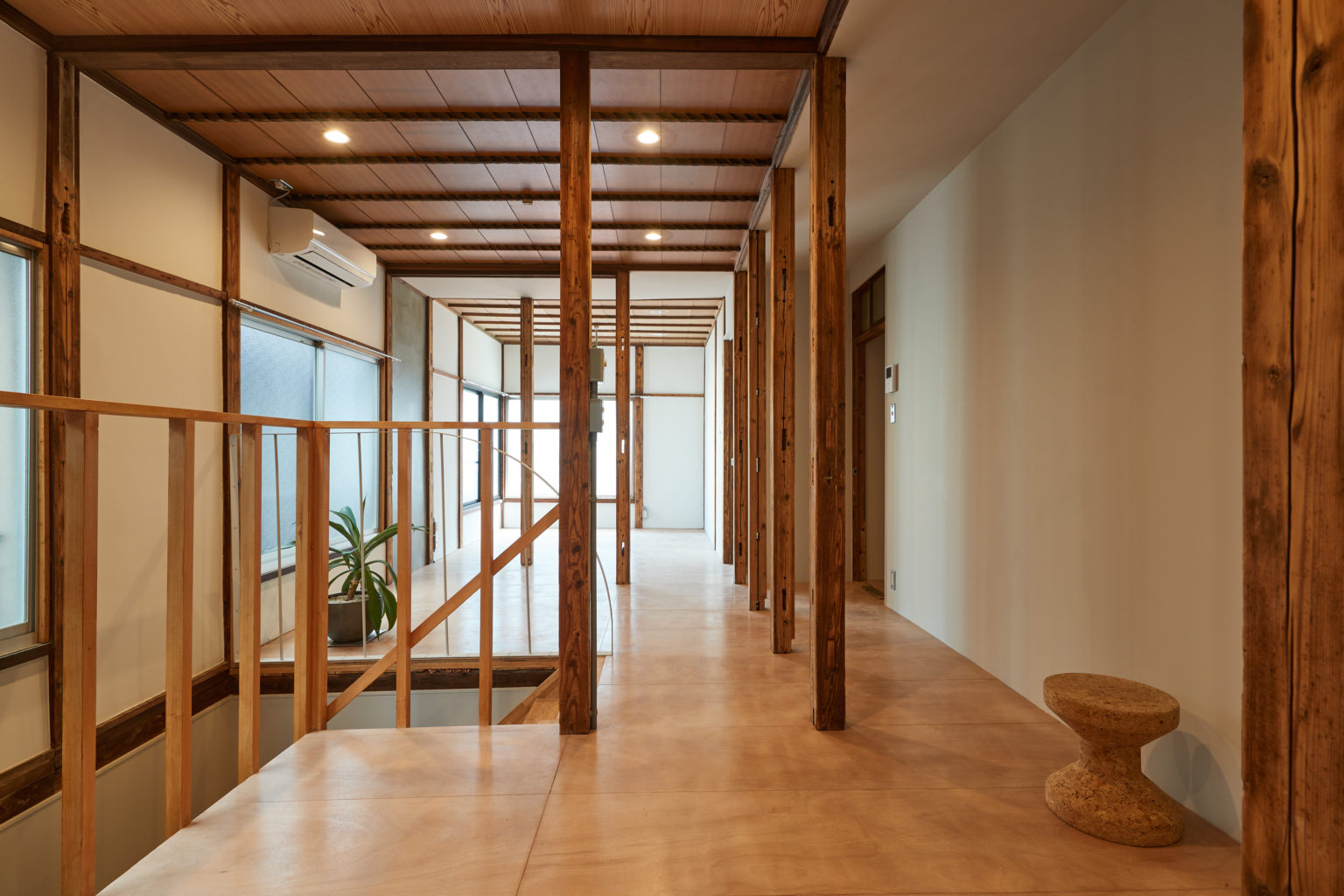
現状の広さや用途を考えると、綺麗に2軒を分断して店舗兼住居とするのが良いと判断しました。 一階は店舗、浴室と洗面所を配置。2階を住居スペースとしてリビング、ダイニングキッチンを配置しています。 1階店舗は広く見せるために天井を撤去し、それぞれの店舗に差異を持たせるため、片方は白塗り、もう片方はそのまま見せることにしました。 2階は木造和室の雰囲気はそのままで、床はラワンベニア貼りで仕上げています。 最低限の補修を行い、使える既存は積極的に仕上げとして残しました。
__________
Arakawa House project is a renovation of a two-story wooden building from the seventies located in Arakawa ward, on the north east end of Tokyo metropolis.
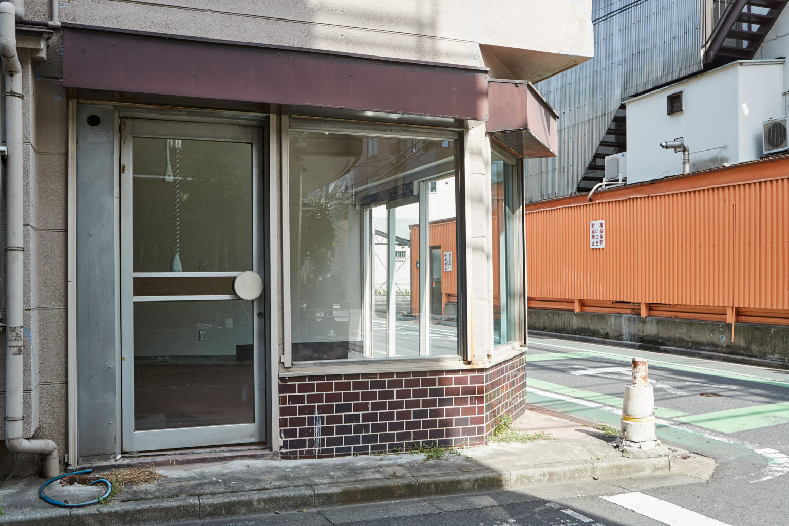
The ground floor used to be an electronics shop and the upper floor, judging from the disposition, probably served as a dormitory. It was vacant for more than 7 years before the new owner contacted us.
Given the property’s big dimensions and fragmented inconvenient floor plan, the owner struggled to find tenants and decided to renovate within our Kariage project. At zero cost for the owner Roovice renovates and then takes care of subleasing old vacant houses. The project started in 2015 as a reaction to Japan’s worsening akiya (空き家) problem, as there is more than 10 million empty properties in Japan.
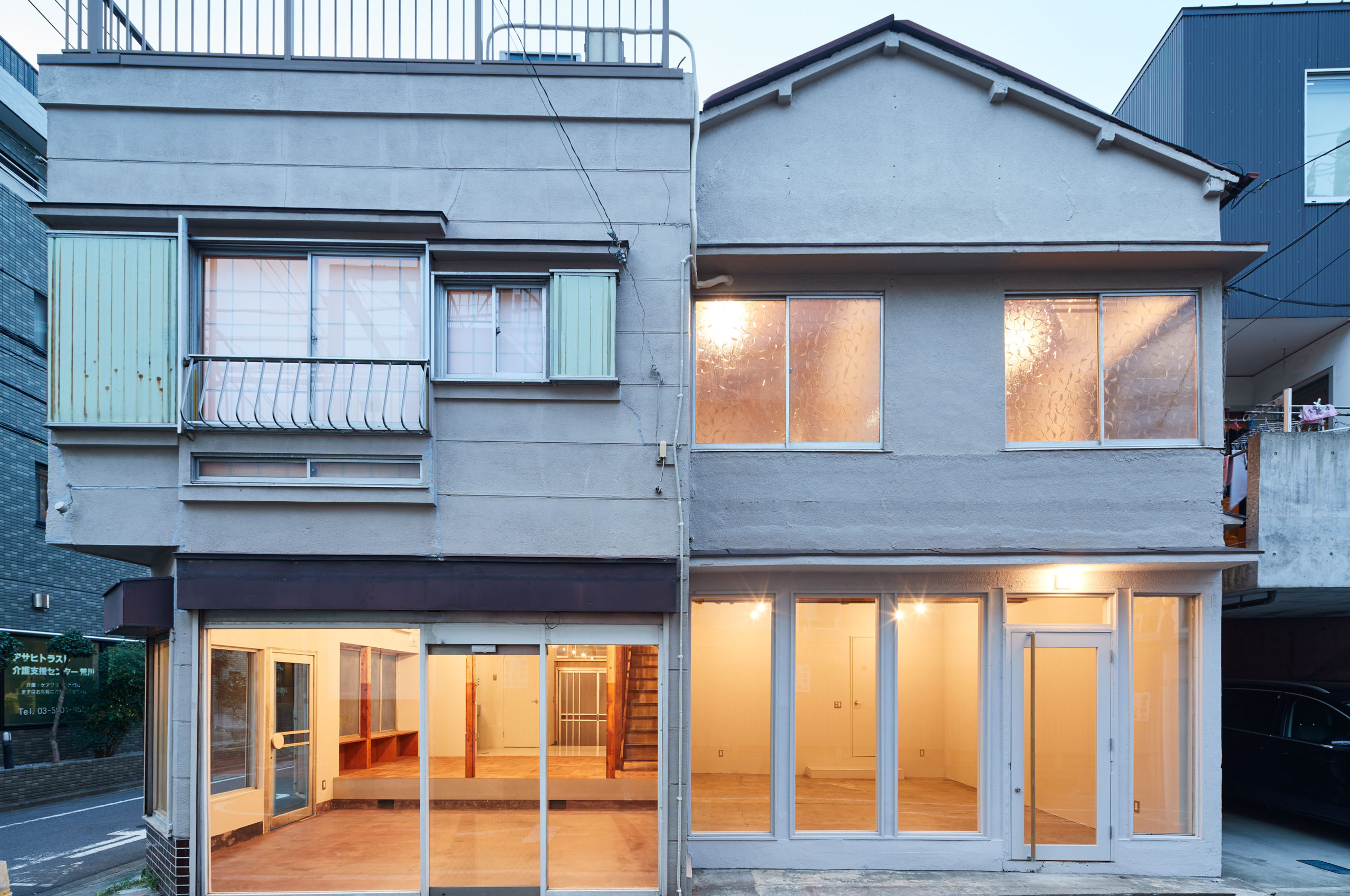
The house had very obviously been through many different modifications during the past years, which resulted in a very atypical layout and a missing external staircase. We started by rethinking from scratch the way the areas were divided and used and decided to design two independent vertical units – both featuring a shop or atelier space on the ground level and a residence on the upper one.
Unit 1
Unit 1 is located on the left side, when facing the building.
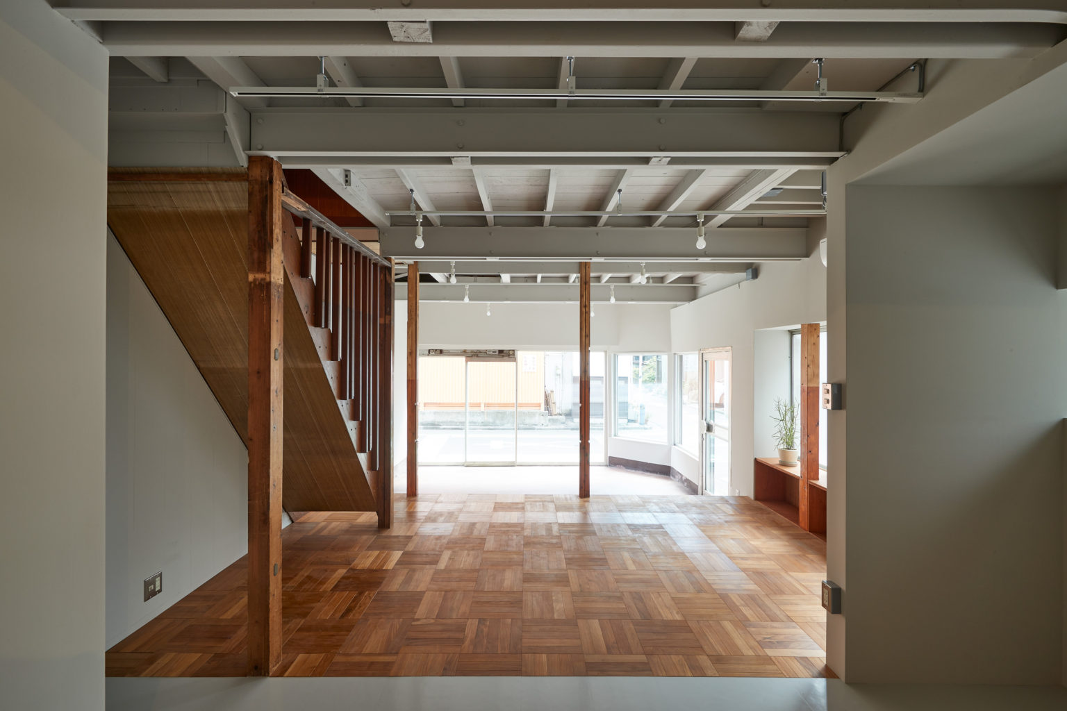
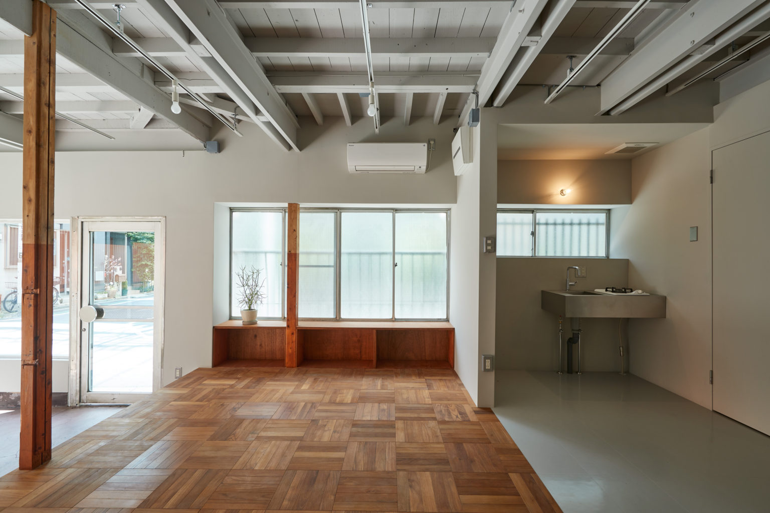
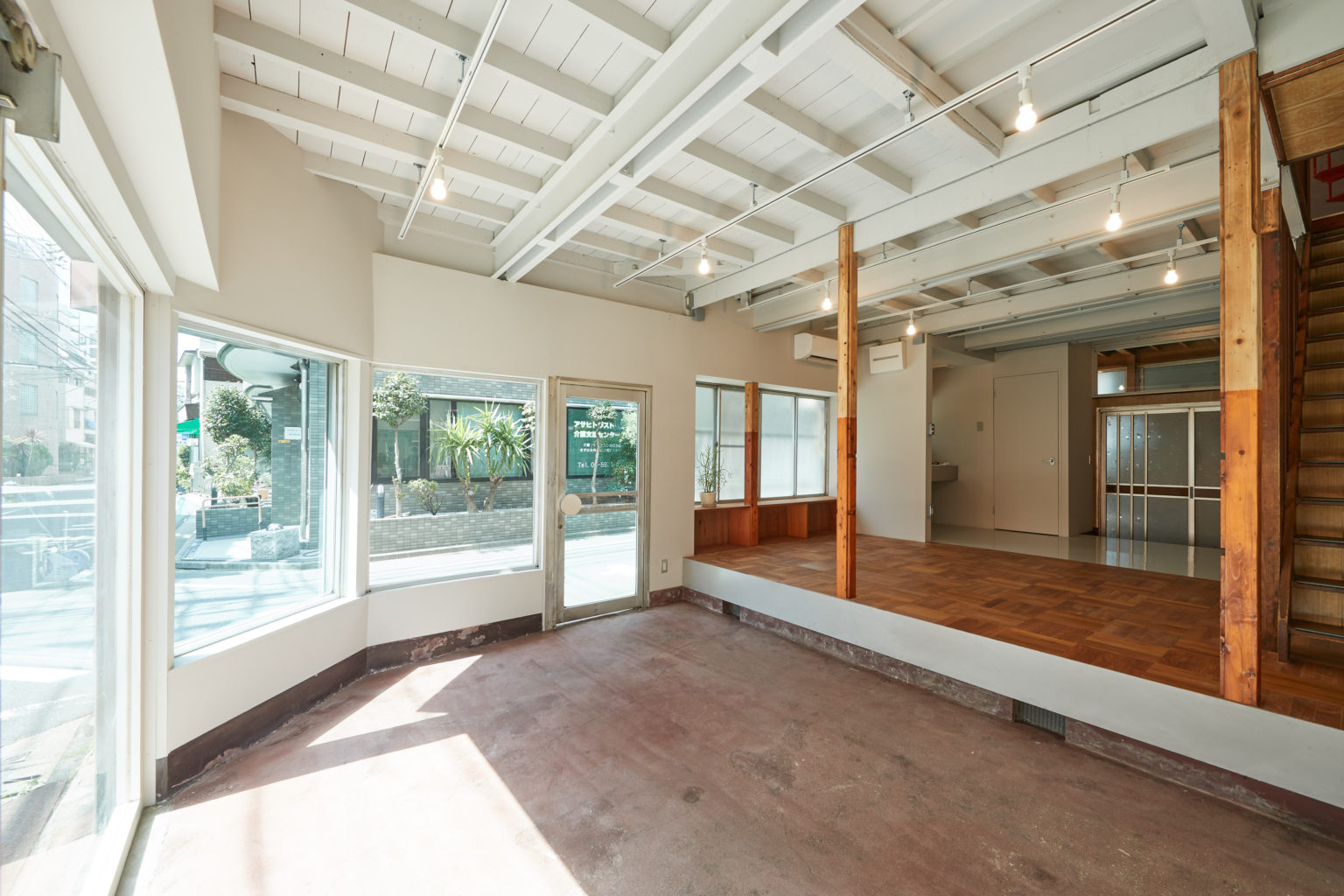
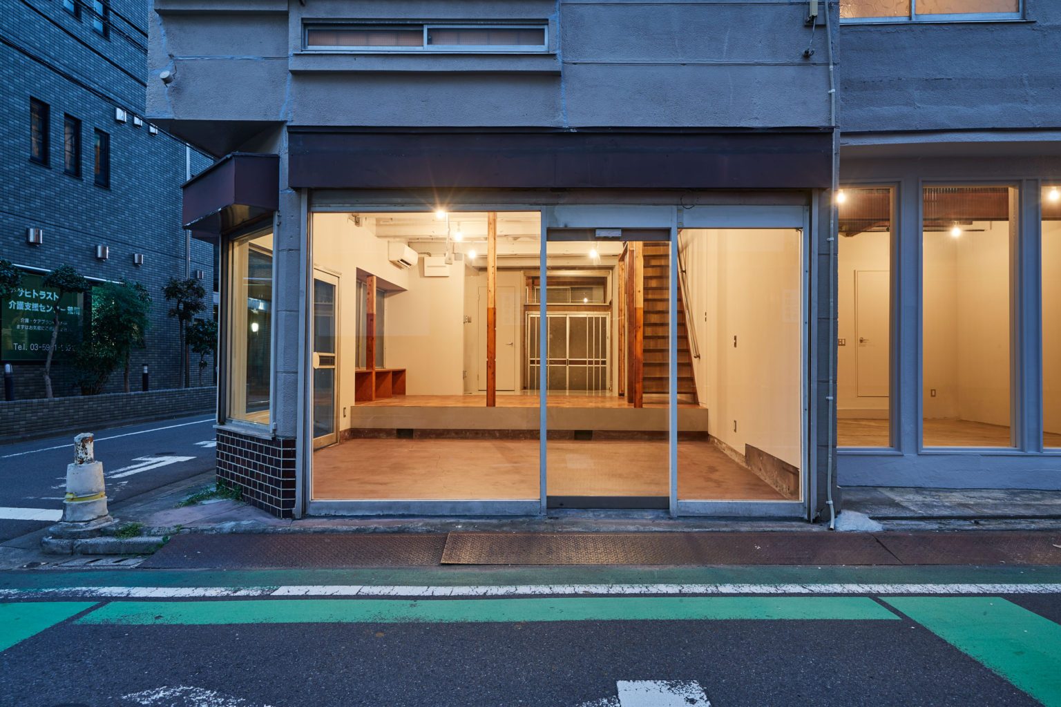
The shop facade and the lower level flooring in the front were left untouched. The higher level floor in the central part of the room marks the position of the wall that used to separate the two areas. We removed it and exposed the staircase and the utility area. A new custom-made lauan plywood shelving unit was installed under the central shop window. It can be used also as a bench. The ceilings boards were taken off, the exposed beams were painted white to enlighten the space and lighting rails were installed. A teak wood parquet was applied on the upper level area and a PVC sheet flooring was used for the kitchenette side. A partition wall was added to visually separate the kitchenette.
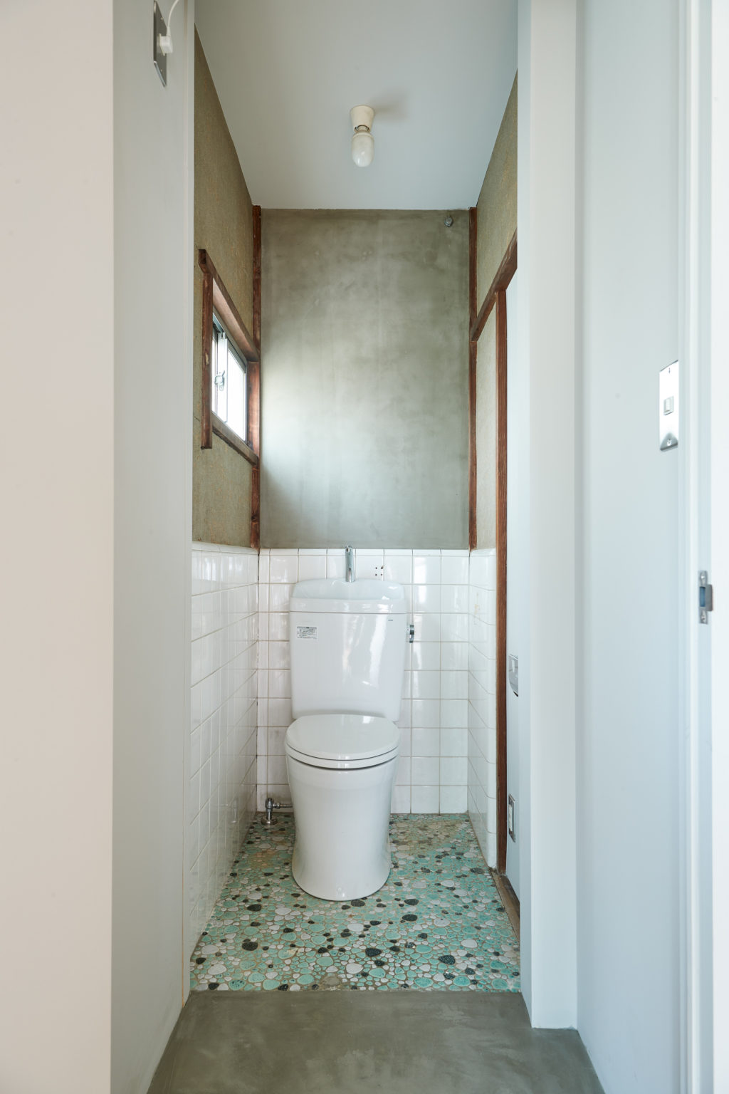
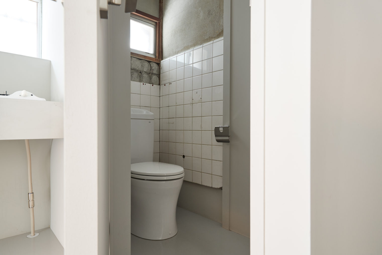
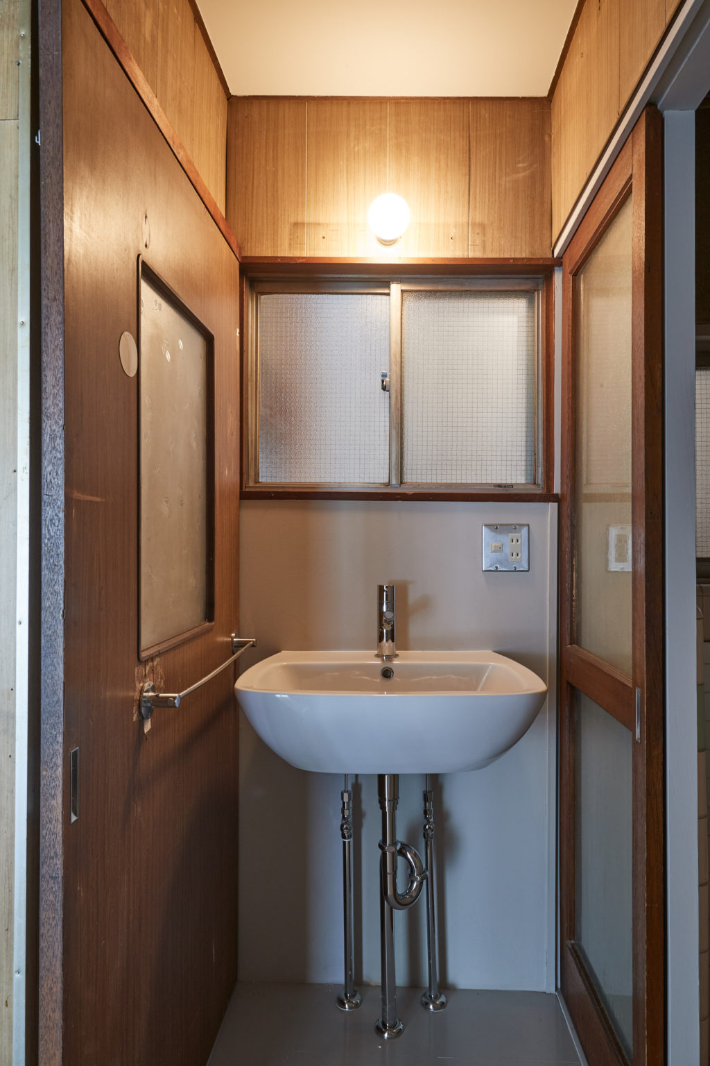
The washroom was renovated, but the bathroom and the toilet have been partially preserved with their tiles typical for the period in which the house was built.
We found there was a large opening in the wall on the top of the back entrance, made to access the space on the back roof, which was apparently used as storage. We decided to close it for better insulation and install a fixed window to bring more daylight to the shop.
The upper floor has been separated from Unit A by closing the connecting door with a white panel. Ceiling boards were removed on the kitchen side but preserved in the rest of the spaces.
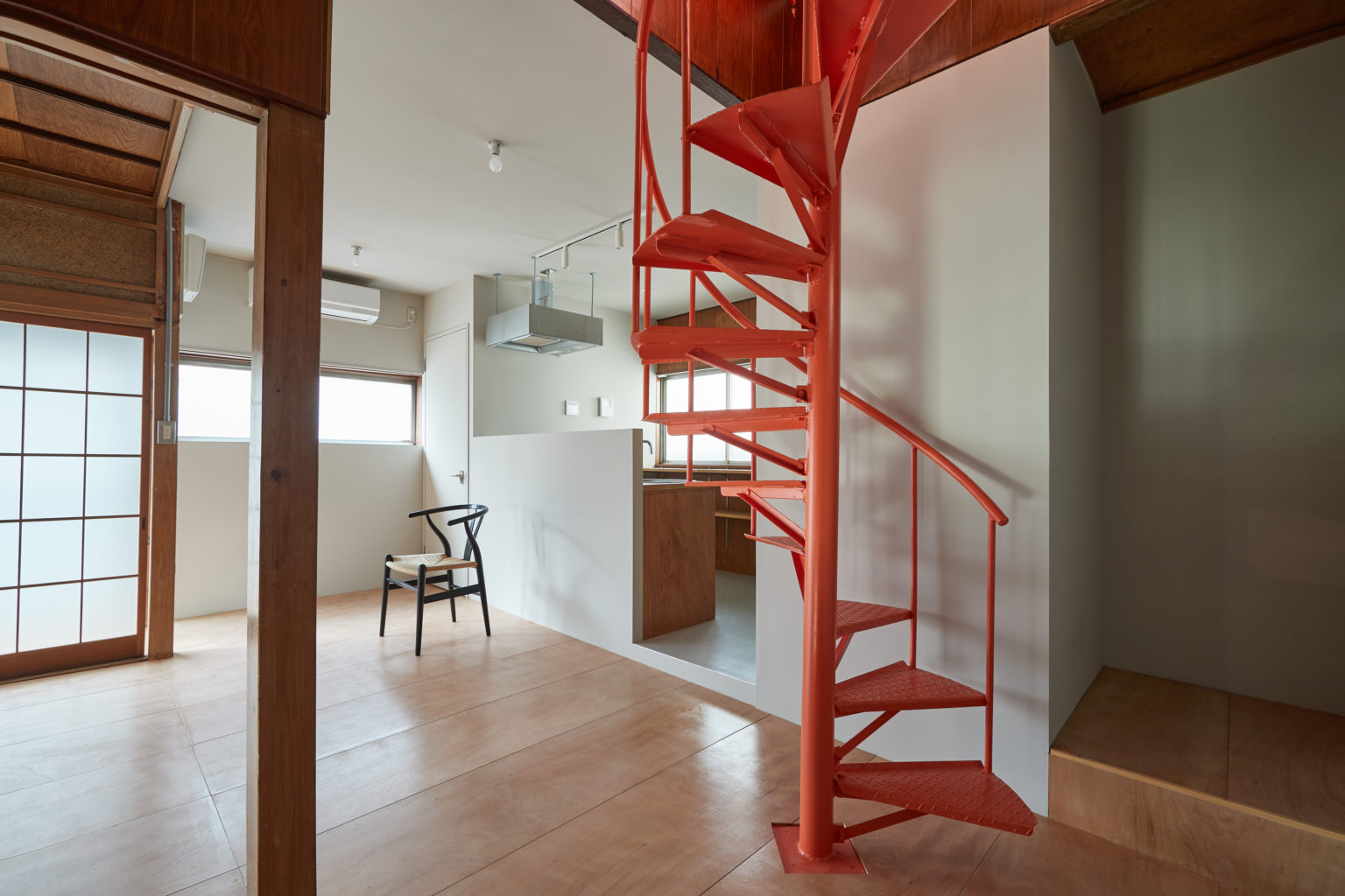
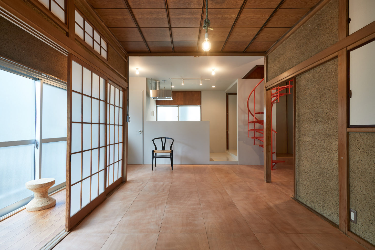
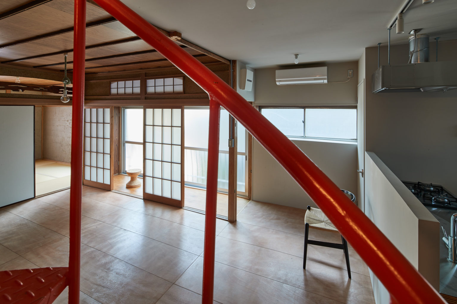
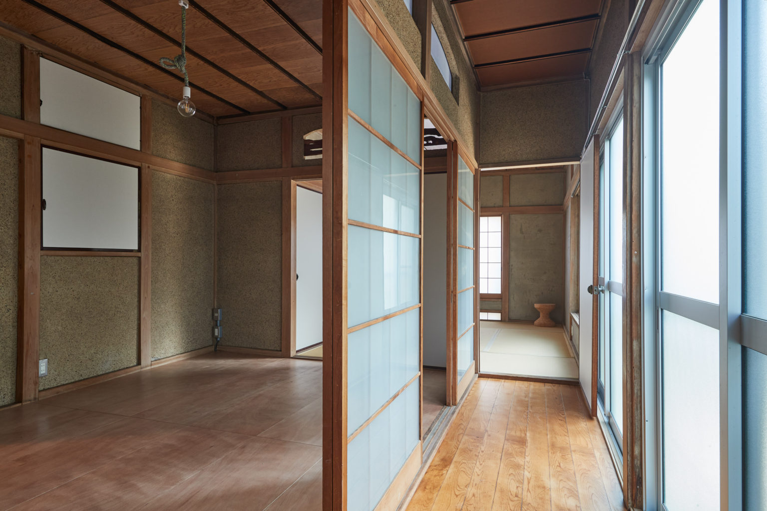
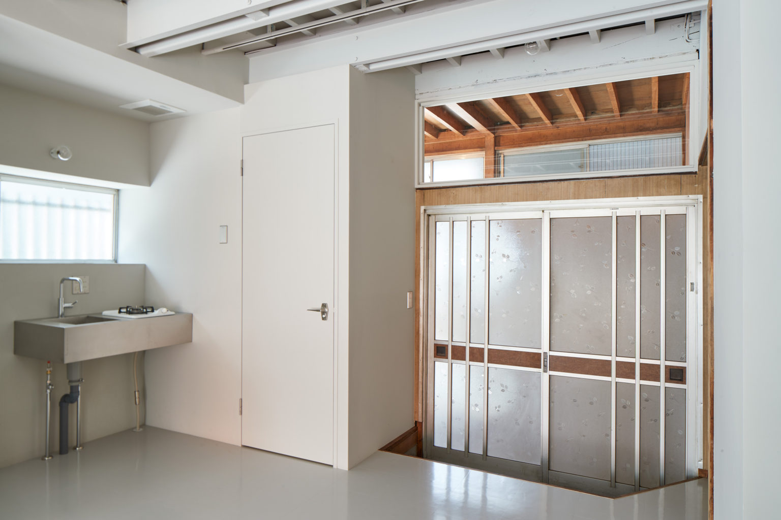
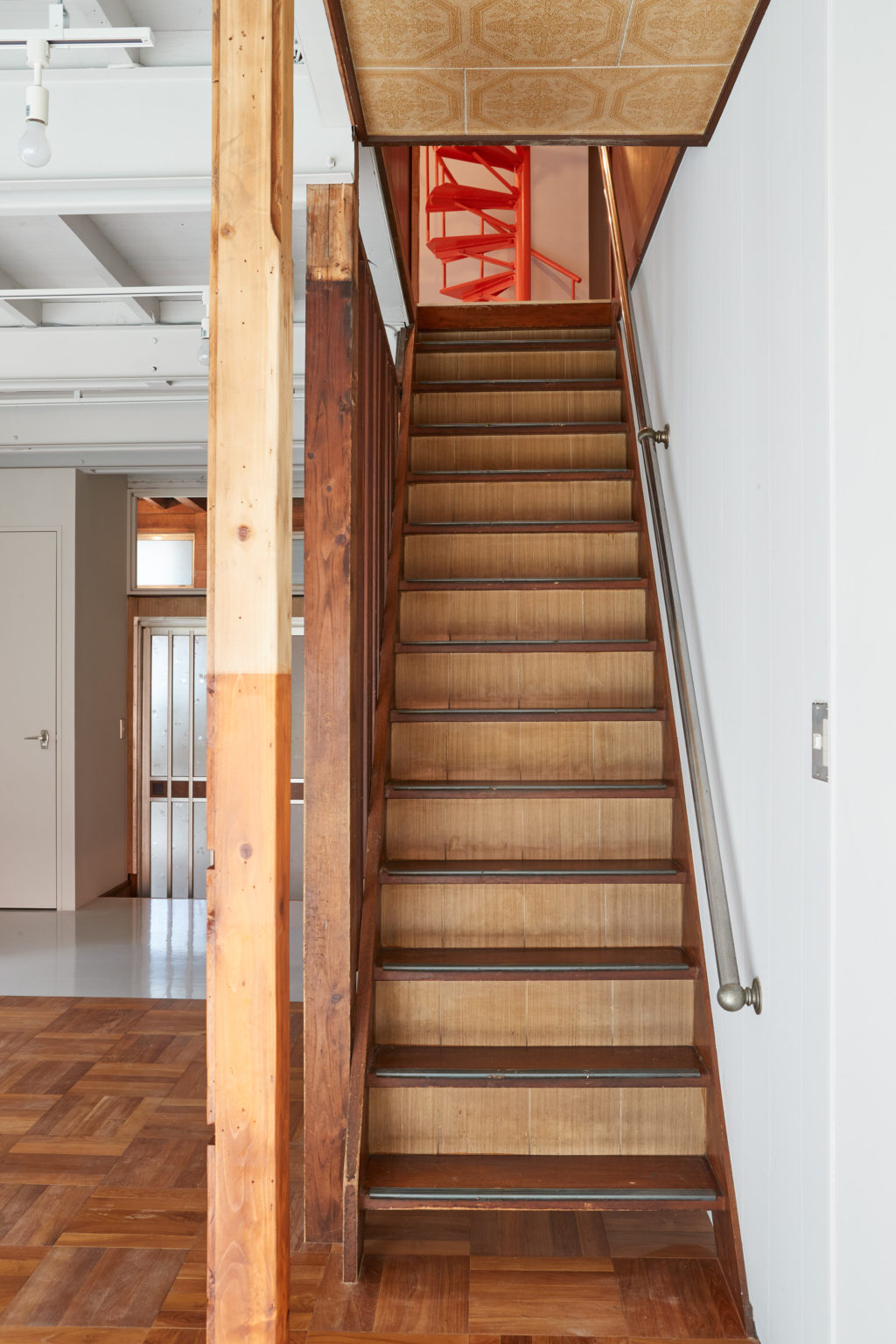
The traditional Japanese-style room with a ranma and a space usually dedicated for an altar worshiping the ancestors has been preserved as it was. The tatami have been kept there but in the rest of the rooms a new lauan plywood board flooring has been laid. On the kitchen side a PVC sheet flooring was applied. A custom-made lauan plywood kitchen was placed behind a half height partition wall. Custom made shelves from the same wood have been installed on the opposite wall, under the window. This unit had a round staircase to access the rooftop which we decided to accentuate by painting it red.
Unit 2
Unit 2 is on the right side, when facing the building.
Ceiling boards were removed in the shop area and walls and shop windows were painted white. Light rails were installed on the exposed ceiling beams.
We kept the original flooring and created one step at the entrance to the back area, which we reduced in size to gain more space for the shop. Contrary to Unit 1, where there is no separation between the commercial and residential areas on the ground floor, in Unit 2 these two areas are firmly divided by a wall and a door. This allows the residents to access the bathroom and the staircase leading to the upper floor directly from the back entrance.
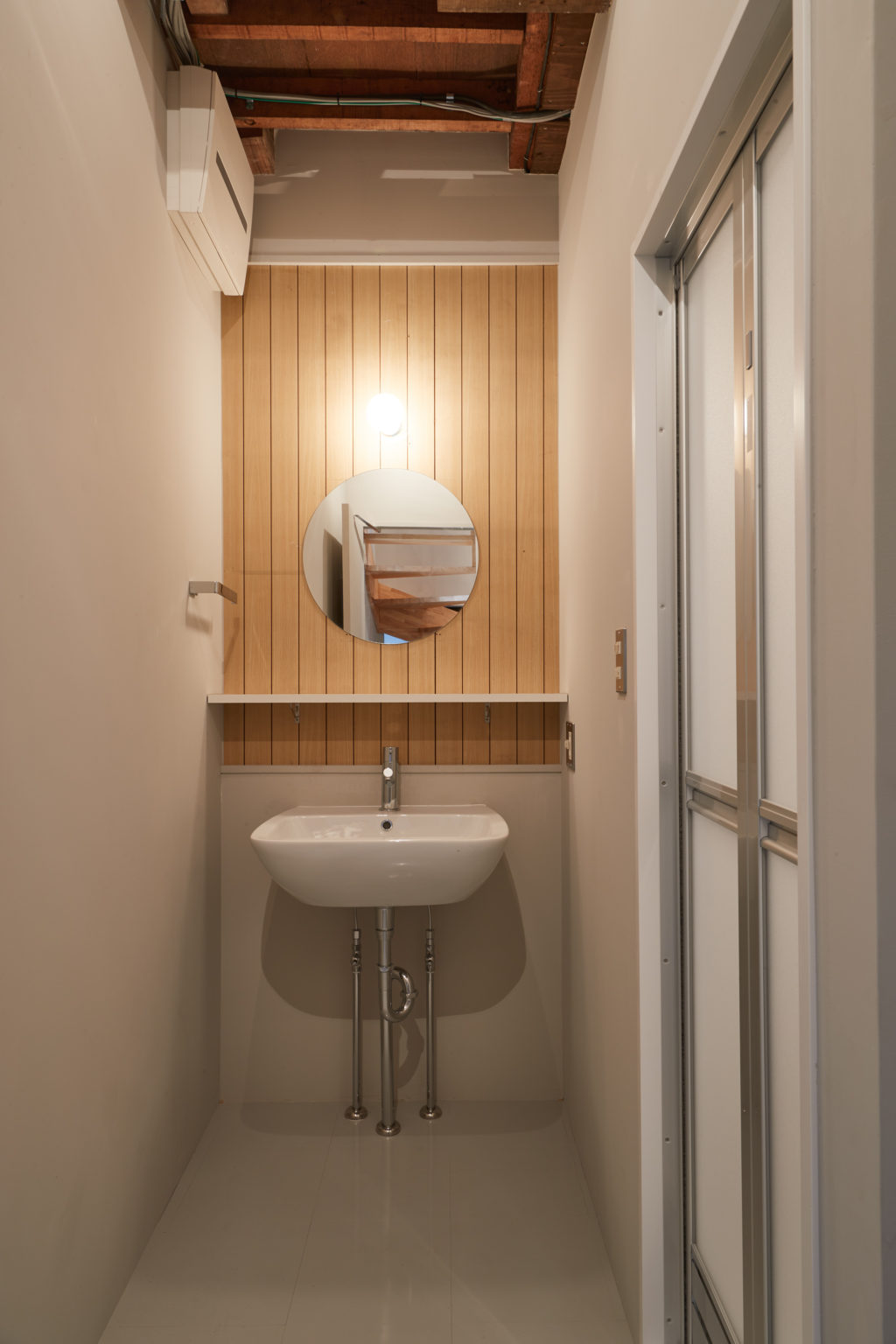
In the washroom, the wooden boards applied behind the mirror were recycled from walls of other rooms, to perpetuate the connection with the building’s past.
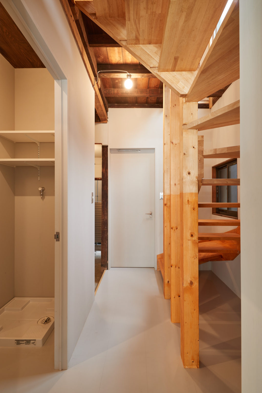
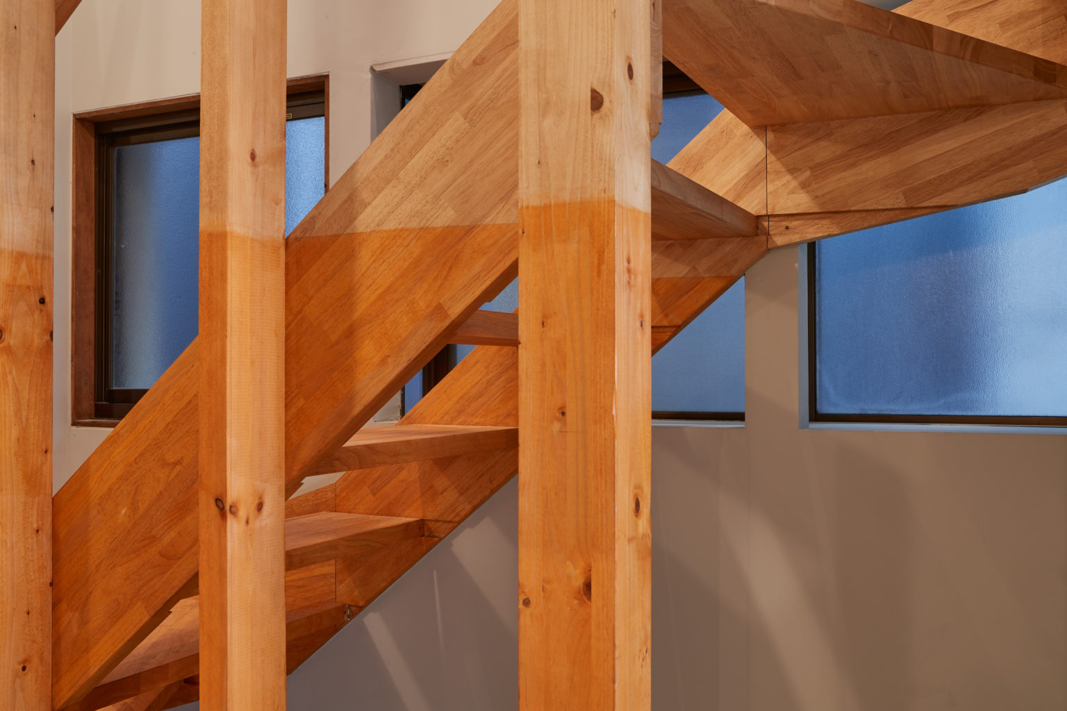
To access the second ground we had to build a new staircase from rubber laminated timber.
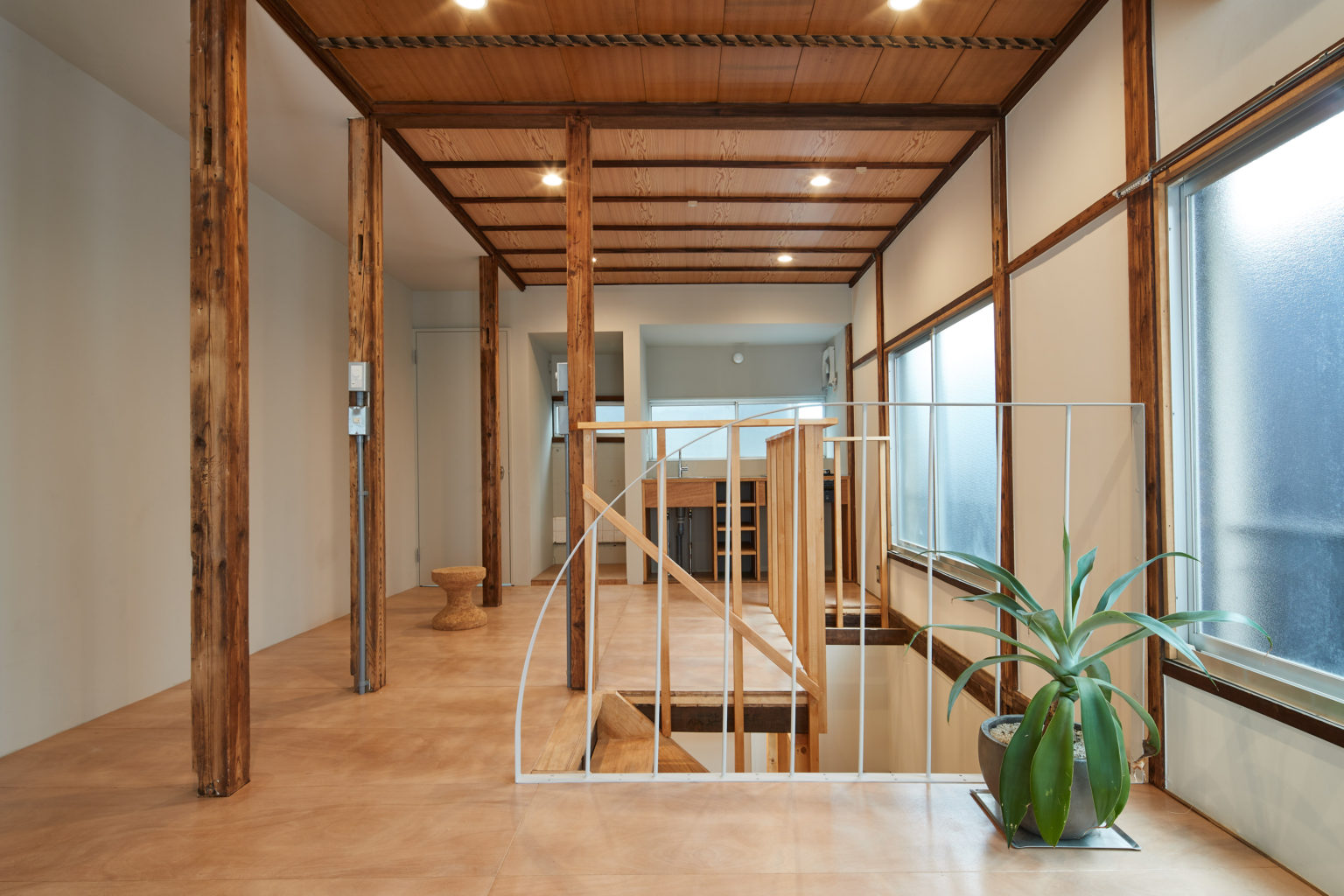
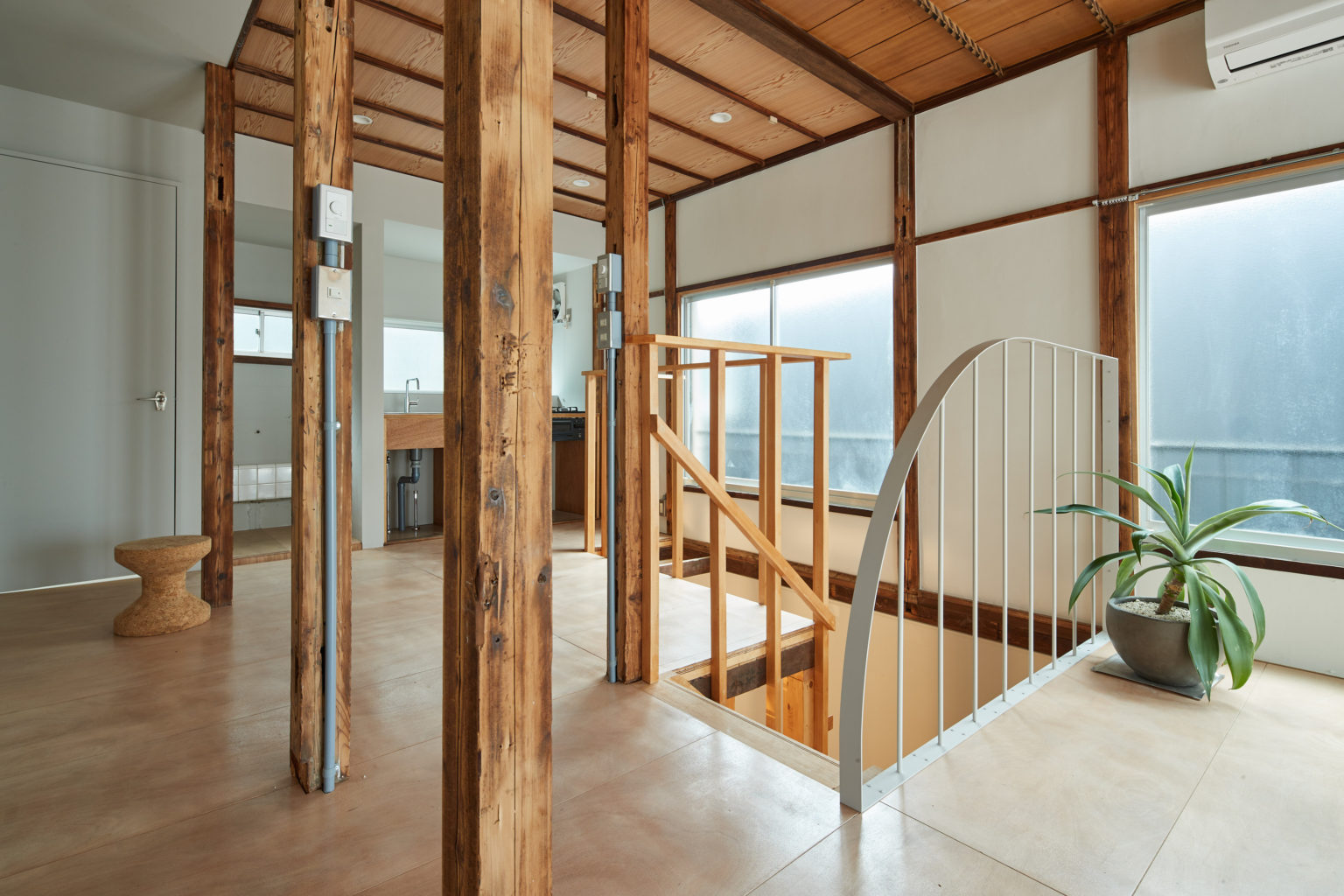
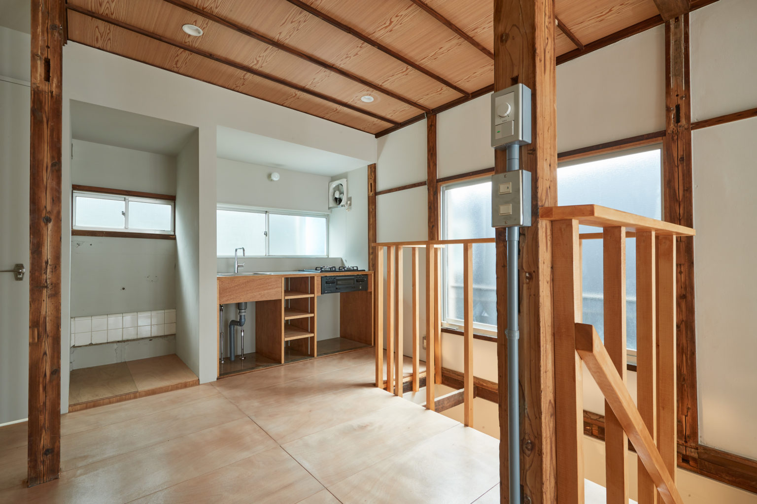
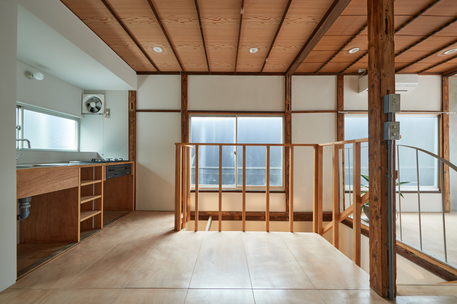
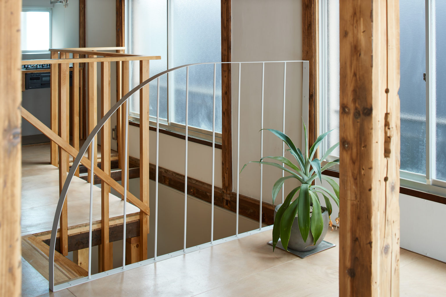
Same as in other areas, the wood was treated with an anti termite solution and covered with a layer of clear finish, to protect it while preserving the raw look of it. On the upper floor we added a decorative light cream color metal railing, inspired by the red metal staircase of Unit 1.
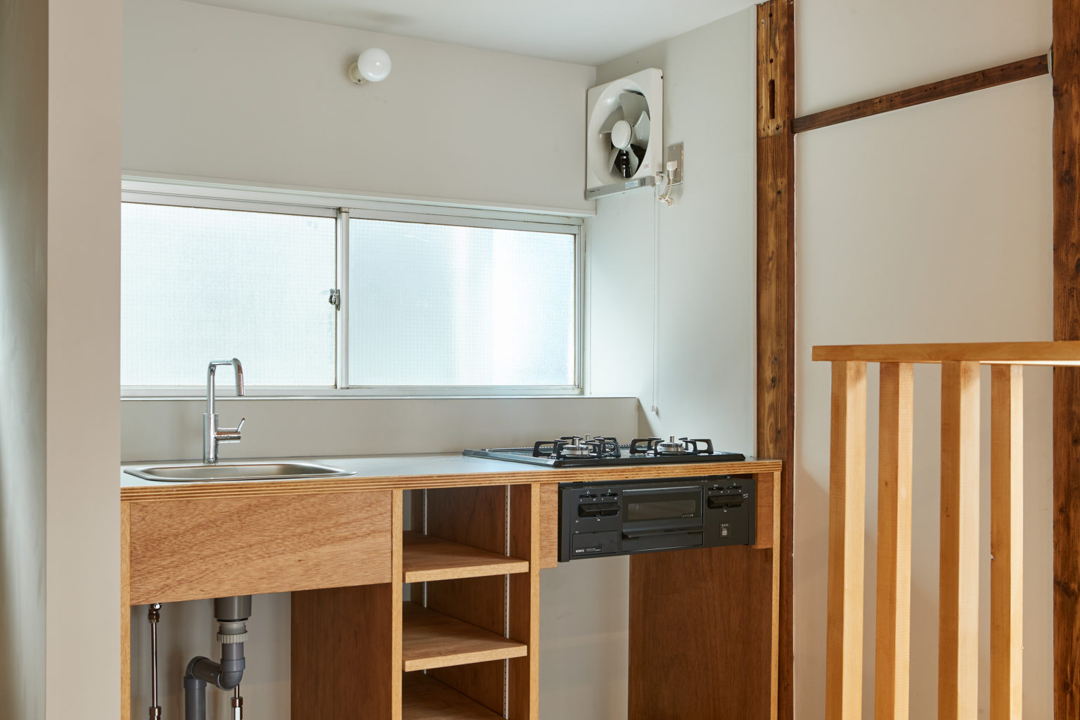
Lauan boards flooring was laid on the whole upper ground and a custom made simple kitchen from the same wood was installed. The former walls fragmenting the space into many rooms were put down to create an open living dining space, leaving only the bedroom separated.
Ceiling boards were preserved and new lights were installed in them. Most of the walls were newly painted white but we decided to keep some with the traditional gray paint.


