シゴト
WORKS 122赤坂のタワマン
domus domusweb
Archello archello.com
Archinect archinect.com
Architizer architizer.com
ArchiDiaries archidiaries.com
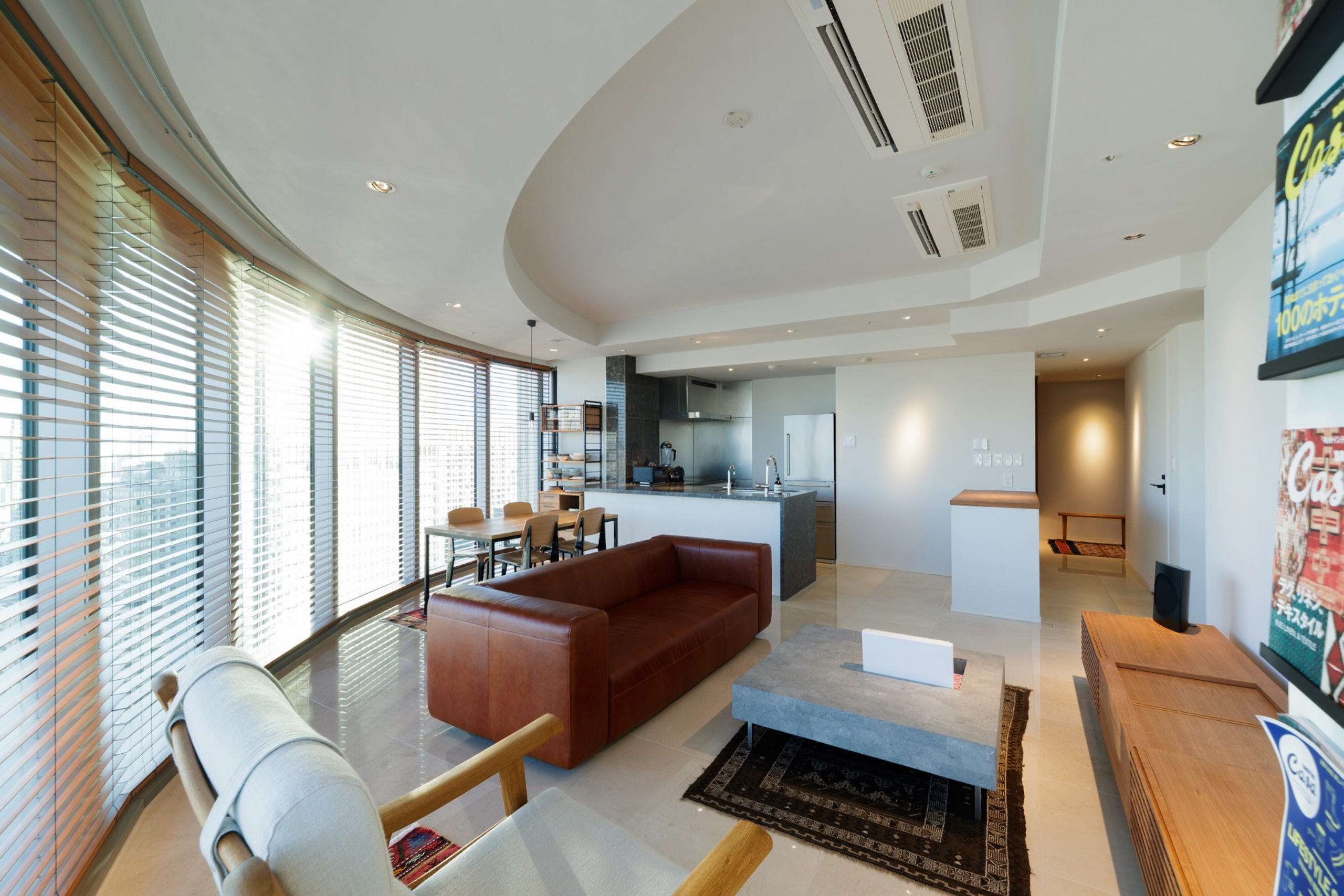
新築のタワーマンションの内装をリノベーションしました。
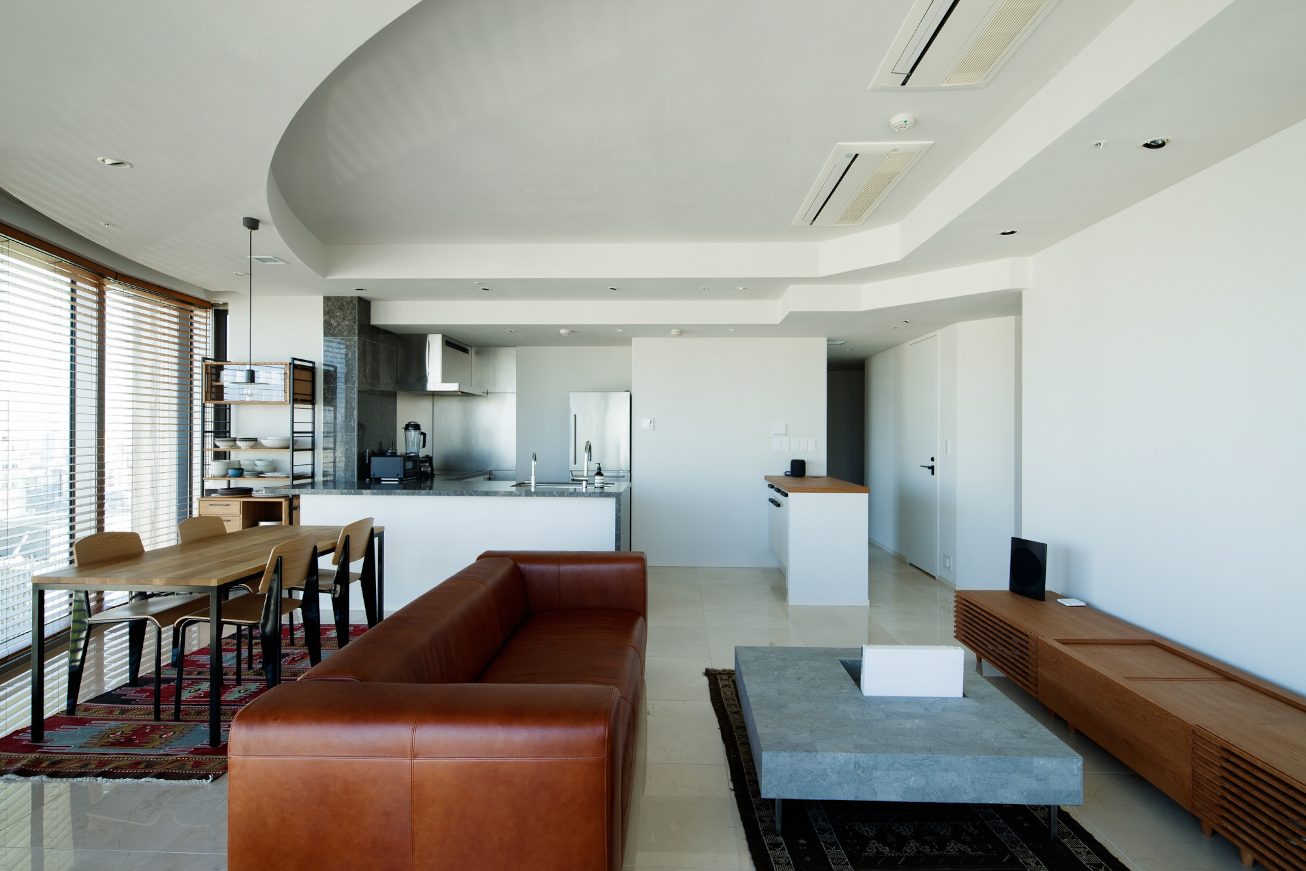
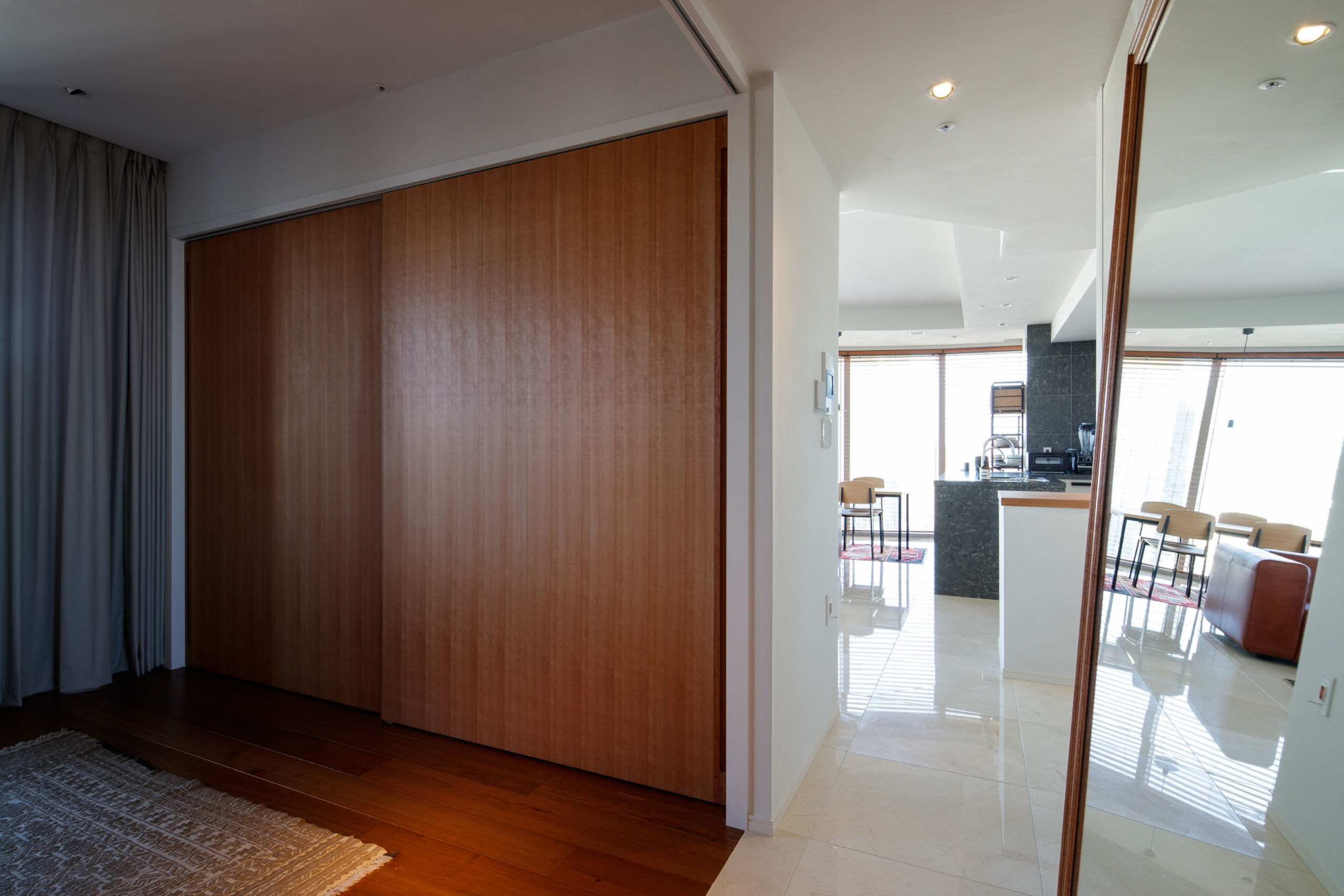
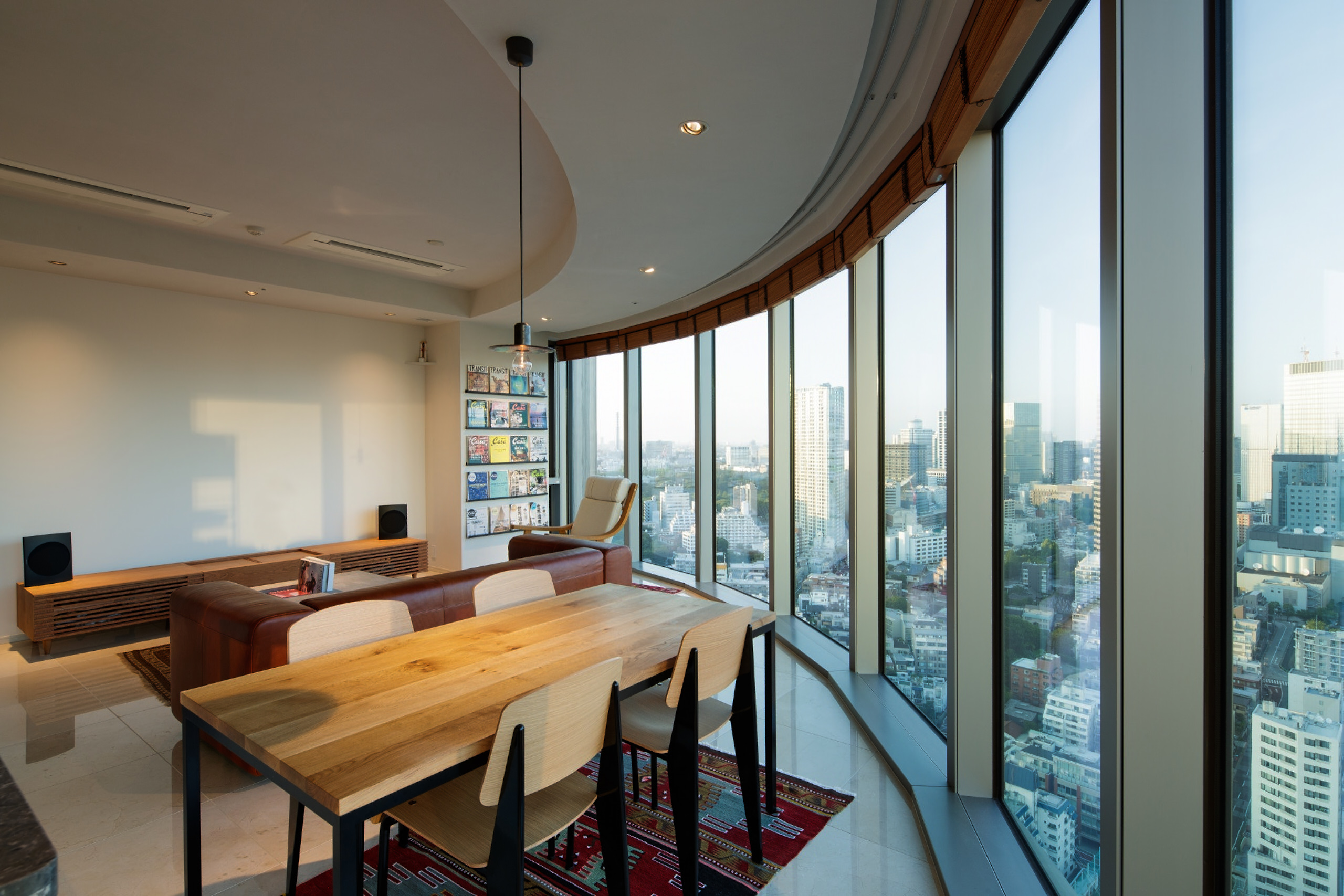
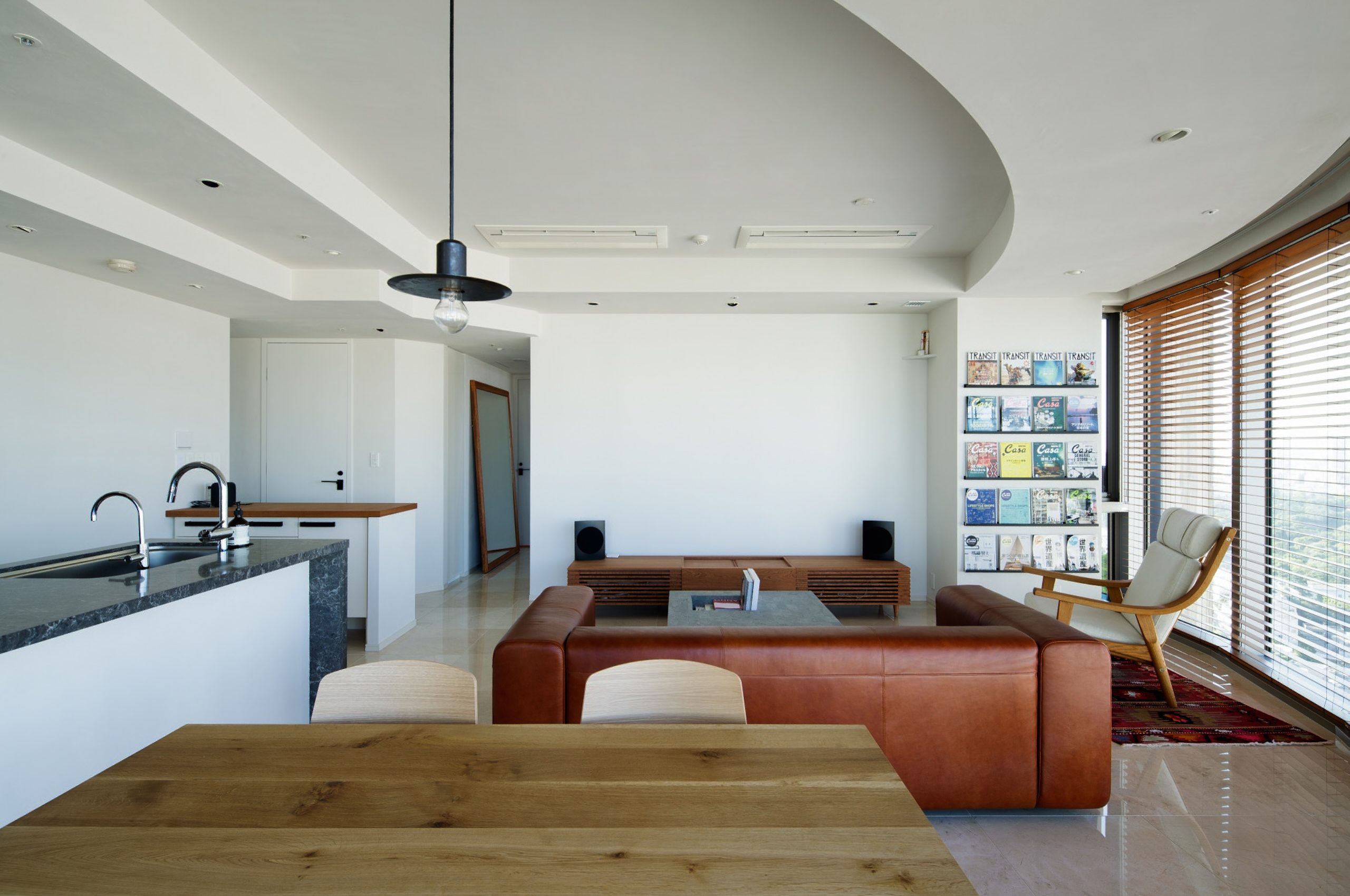
間仕切り壁の撤去や建具開口を拡張し、部屋ごとを連続させ広々とした空間にしました。
既存の大理石、フローリングの色や材質のバランスを考え、
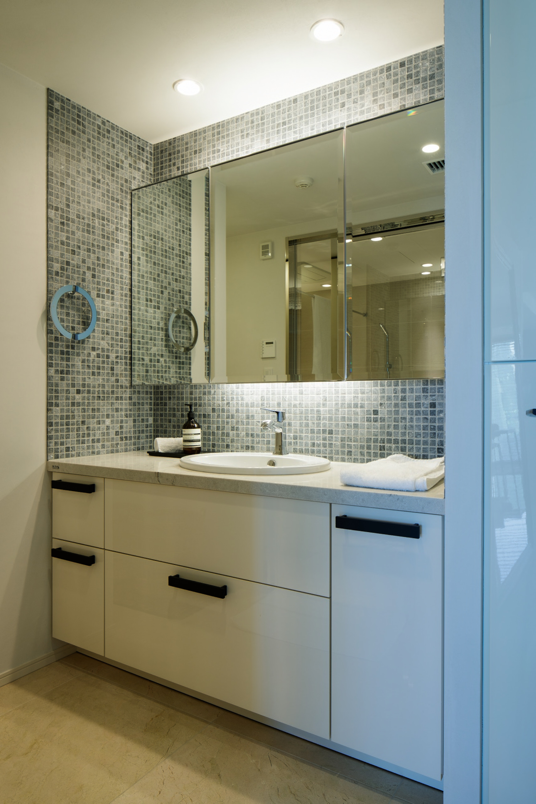
仕上げ、建具、製作家具、照明、金物、タイルなどをご提案させていただきました。
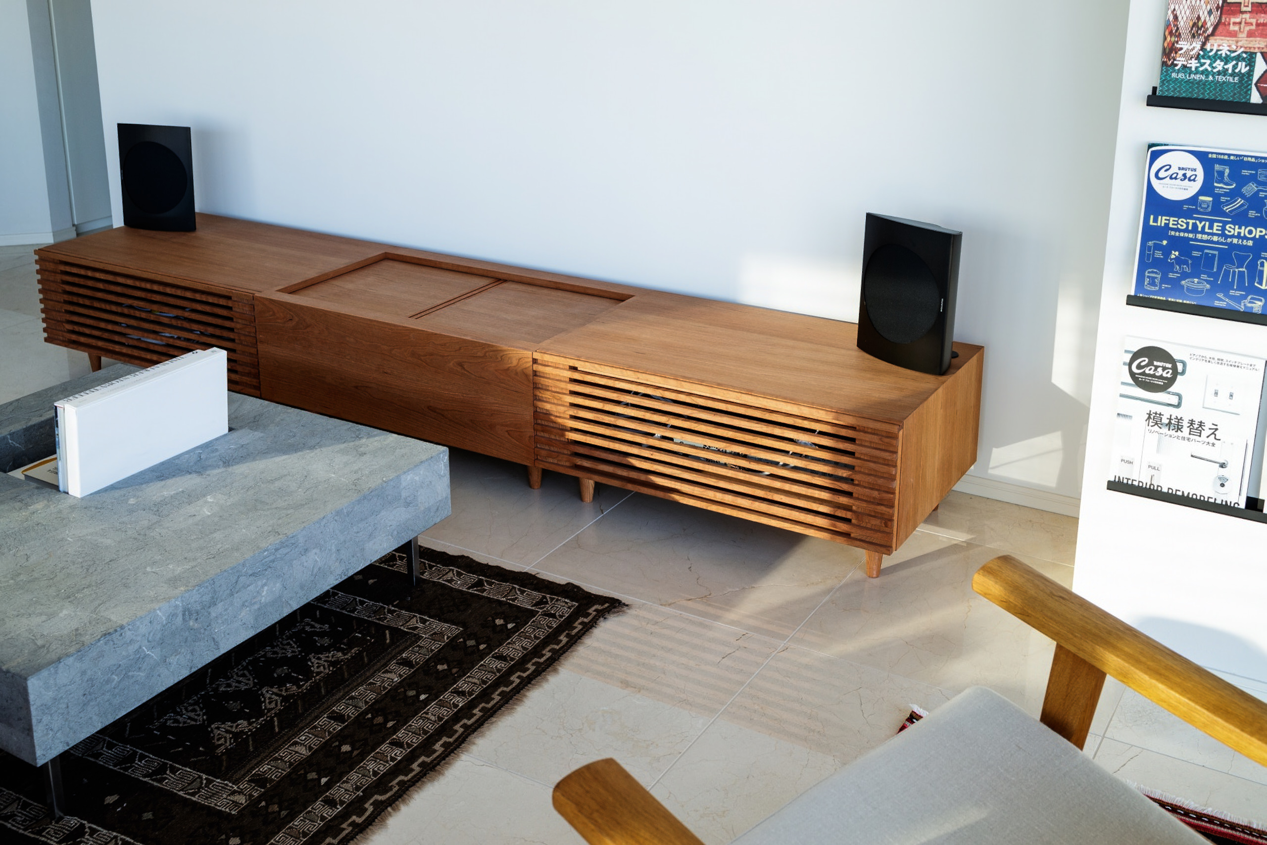
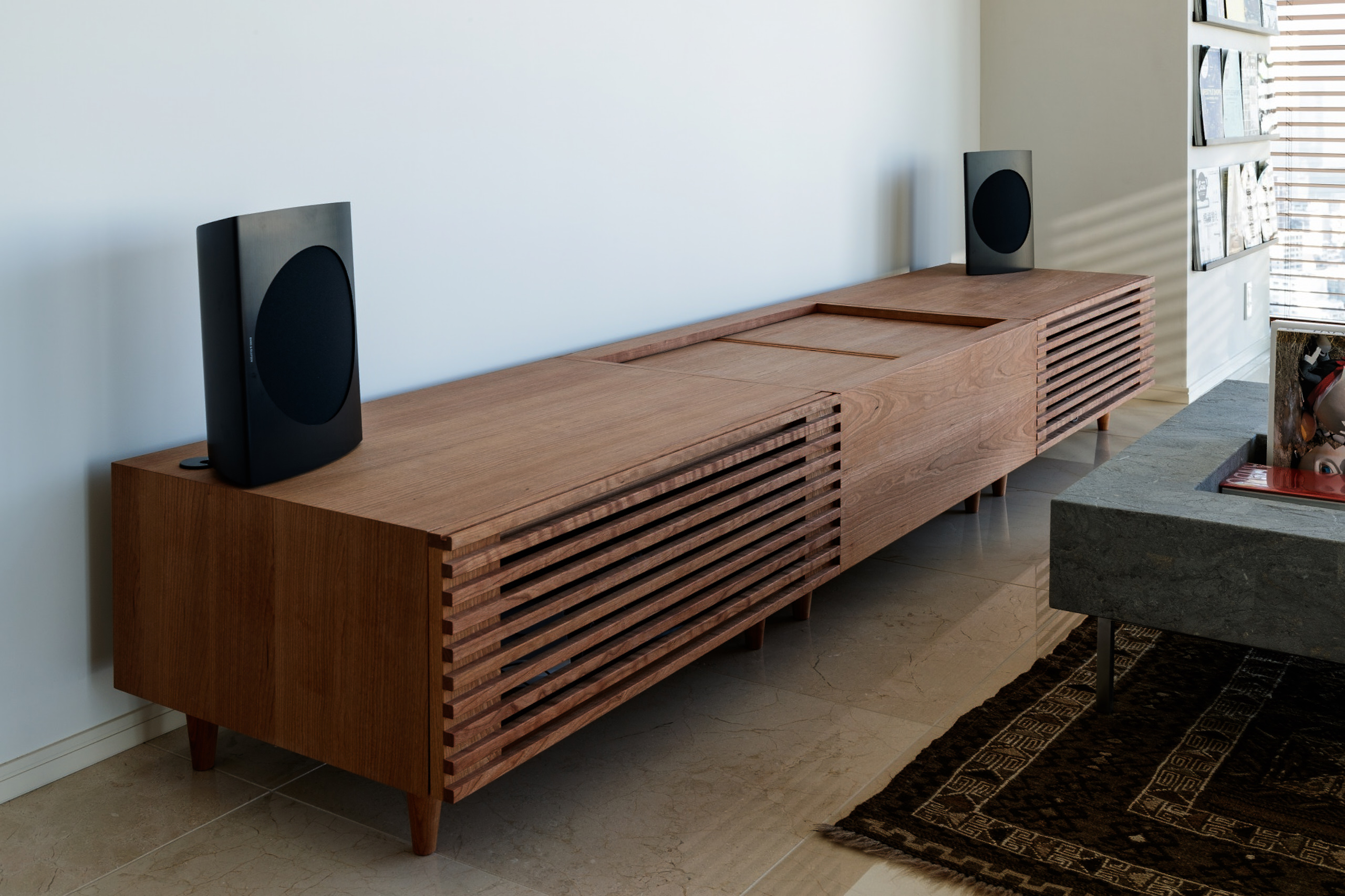
大きな建具や天板、鏡、超単焦点プロジェクター用のテレビボードを
チェリー材などで統一して製作しました。
ラグジュアリーな要素もありながら、心地の良い仕上がりをつくりました。
__________
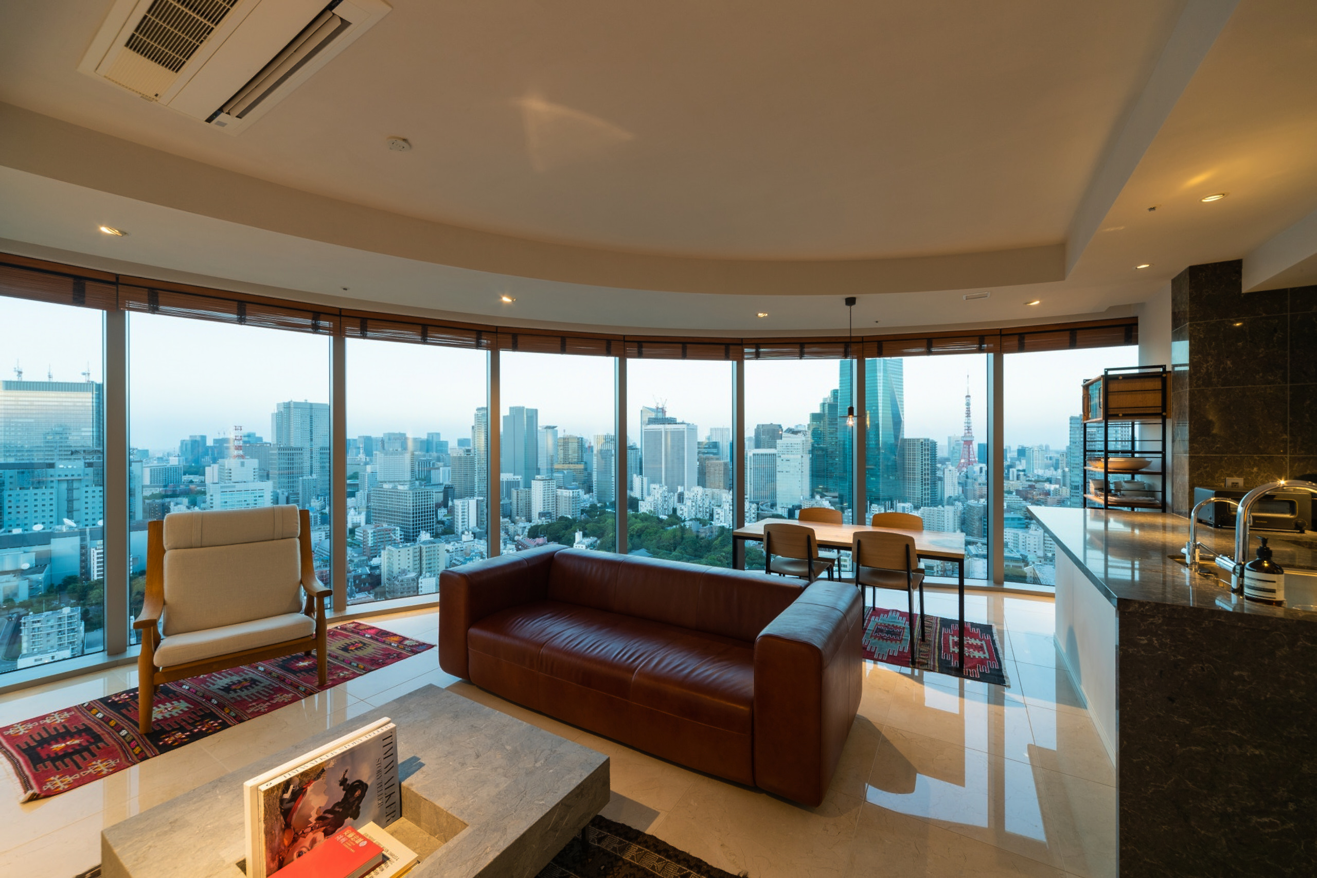
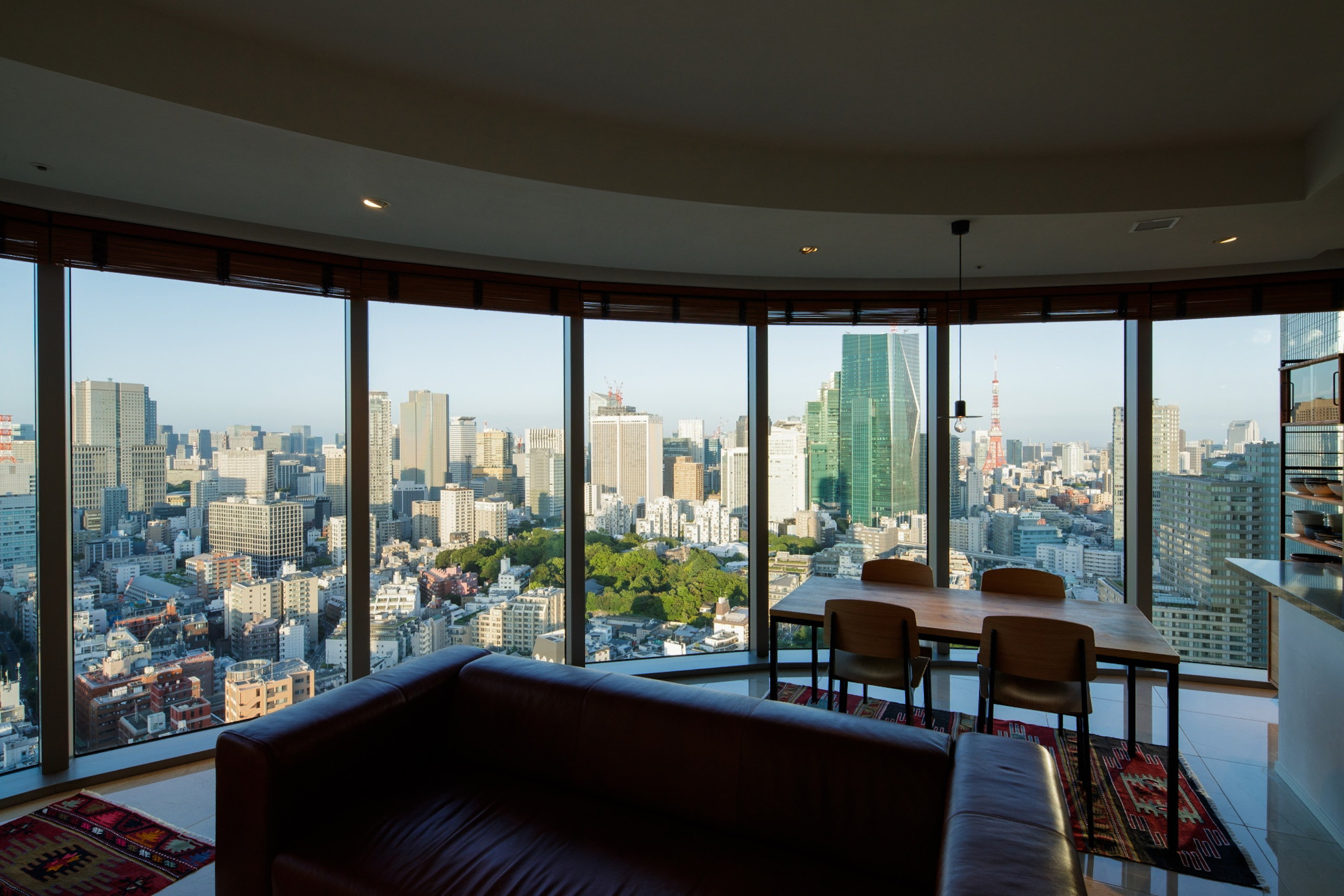
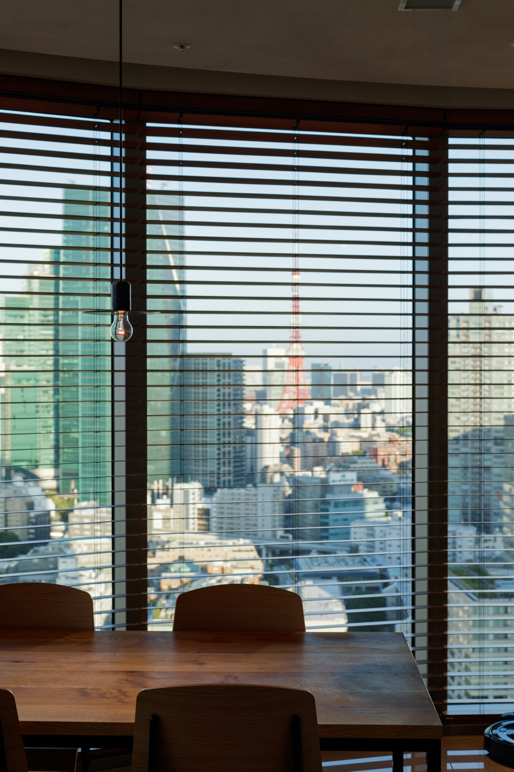
Located on the 30th floor of the Hinokicho The Tower in Akasaka, a central area of Tokyo, this project was the consultation for an interior apartment renovation.
All the 322 units and the communal spaces of the tower were completed by Kengo Kuma office in 2018, leaving the apartments customisable by the owner with outsourcing architects.
Considering how recent the whole construction is, the only necessary modifications regarded the layout disposition and the aesthetic of the materials used.
Hence, the project started from the requests of the client to add a projector space in the living room, while bringing more natural light in the rather dark hallway.
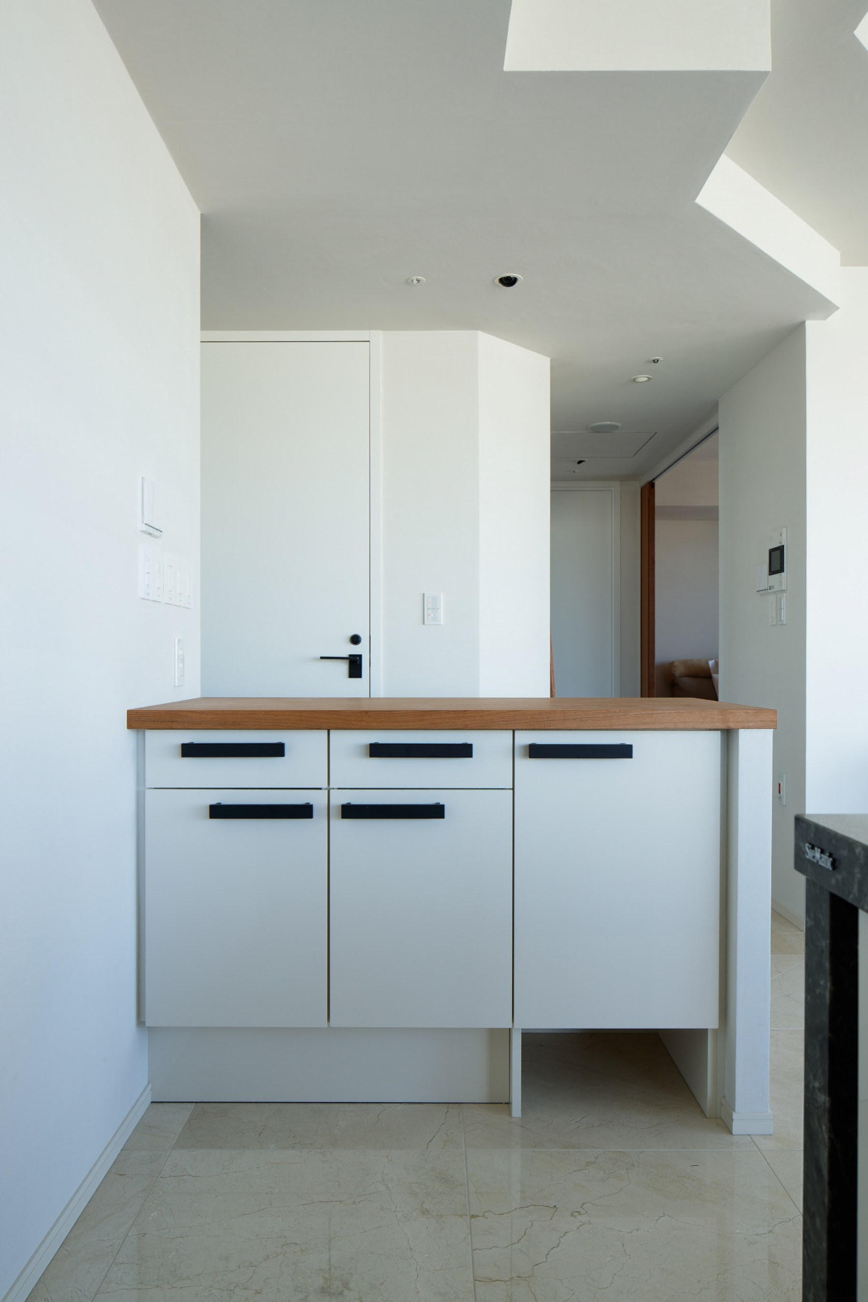
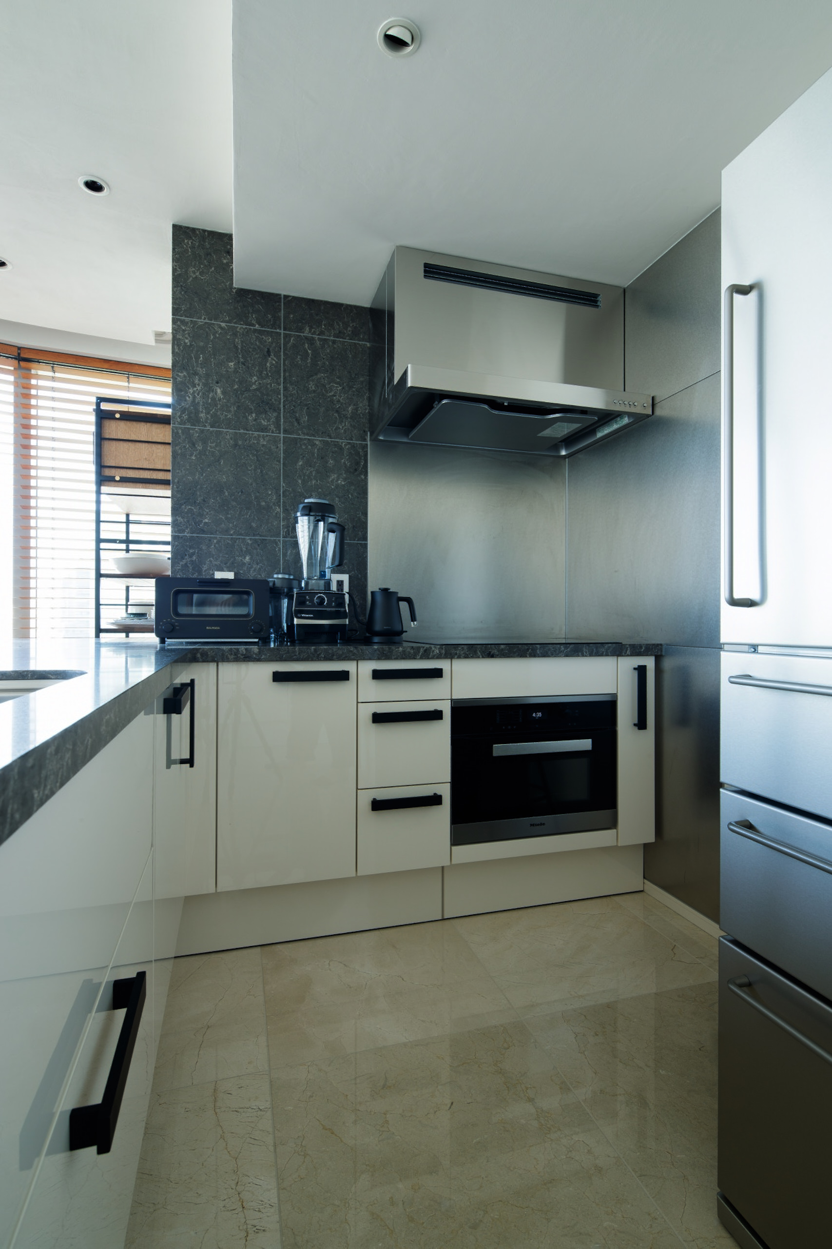
To enlighten the path as much as possible, the kitchen furniture wall and the door next to it have been removed. Originally, those elements enclosed the living and kitchen space from the night areas, but at the same time they caused a dark circulation inside.
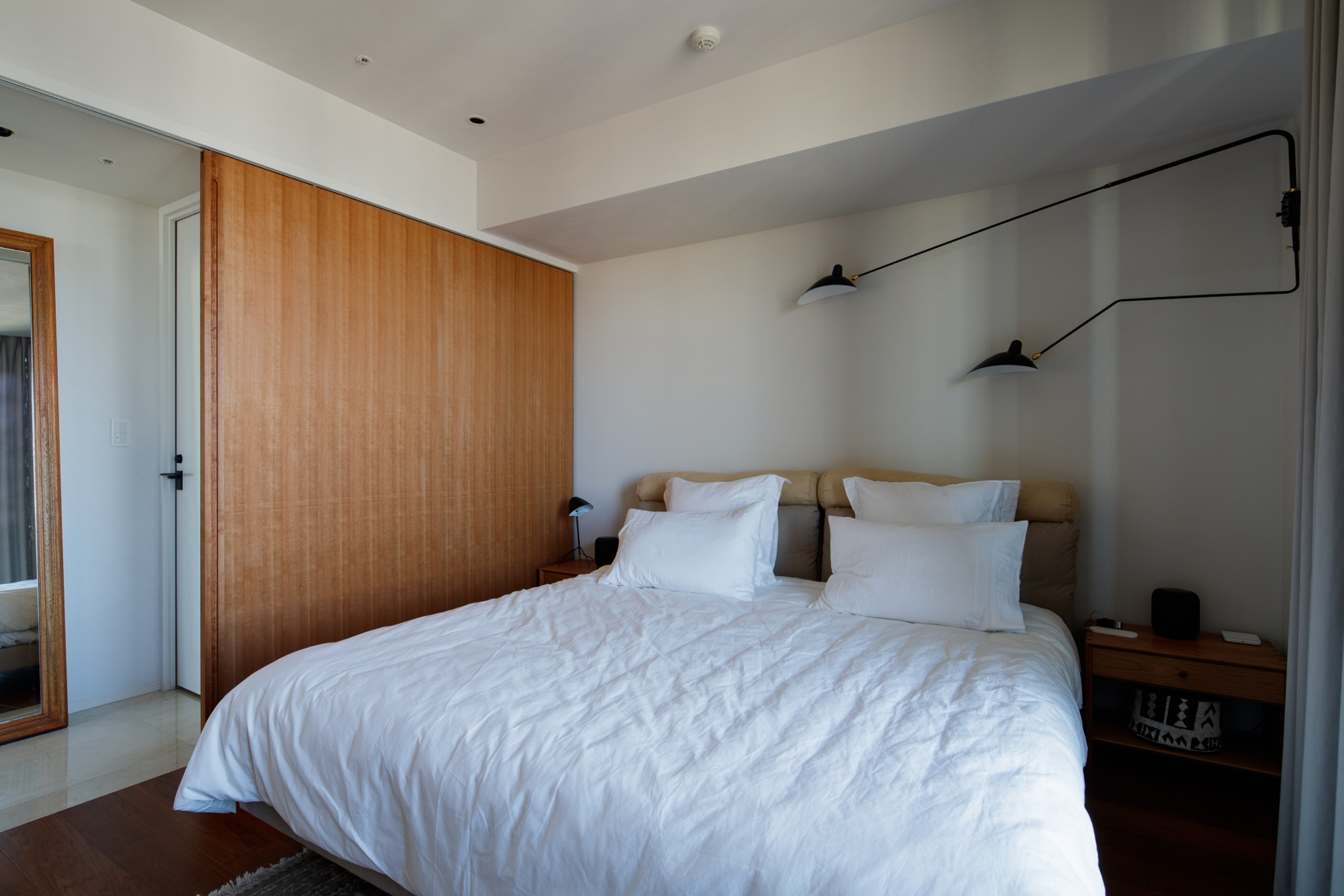
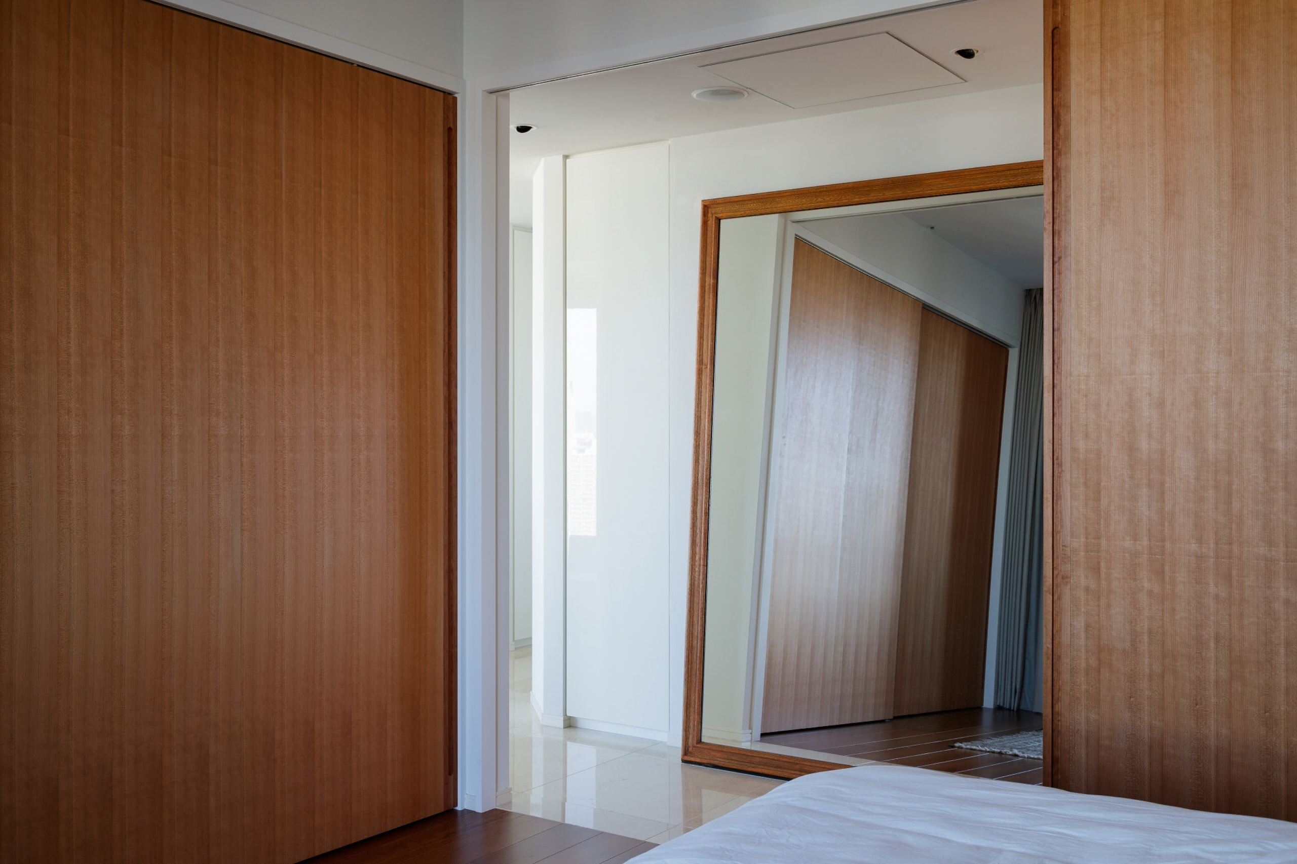
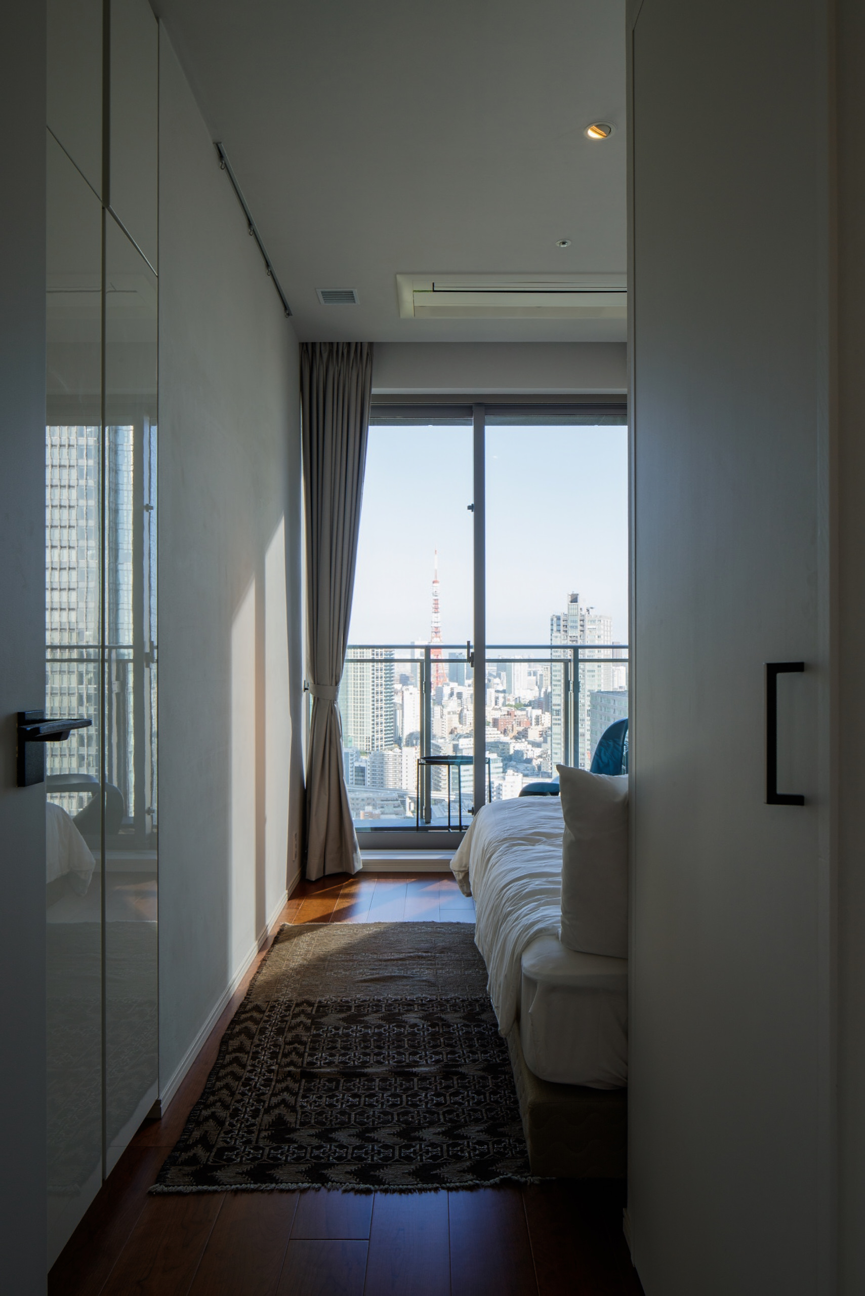
The first refurbishment applied to the two bedrooms placed on the opposite ends of the flat that didn’t modify their size. Since the existing in-wall closet wasn’t offering enough space in the smaller room, a new wardrobe was implemented right behind the entrance storage. For the master bedroom instead, the instalment of a wide sliding panel and an in-wall closet allows a more efficient use of the space.
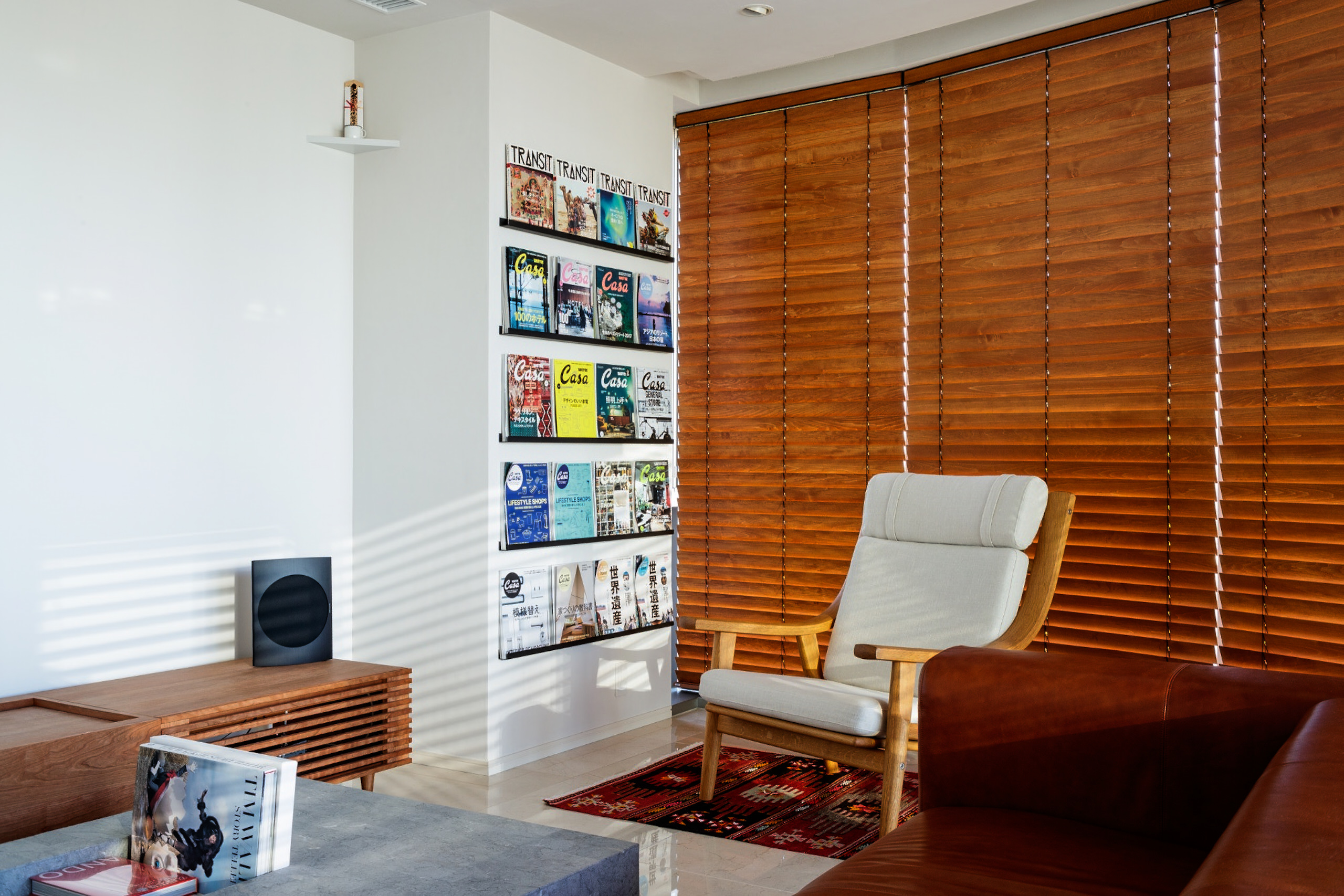
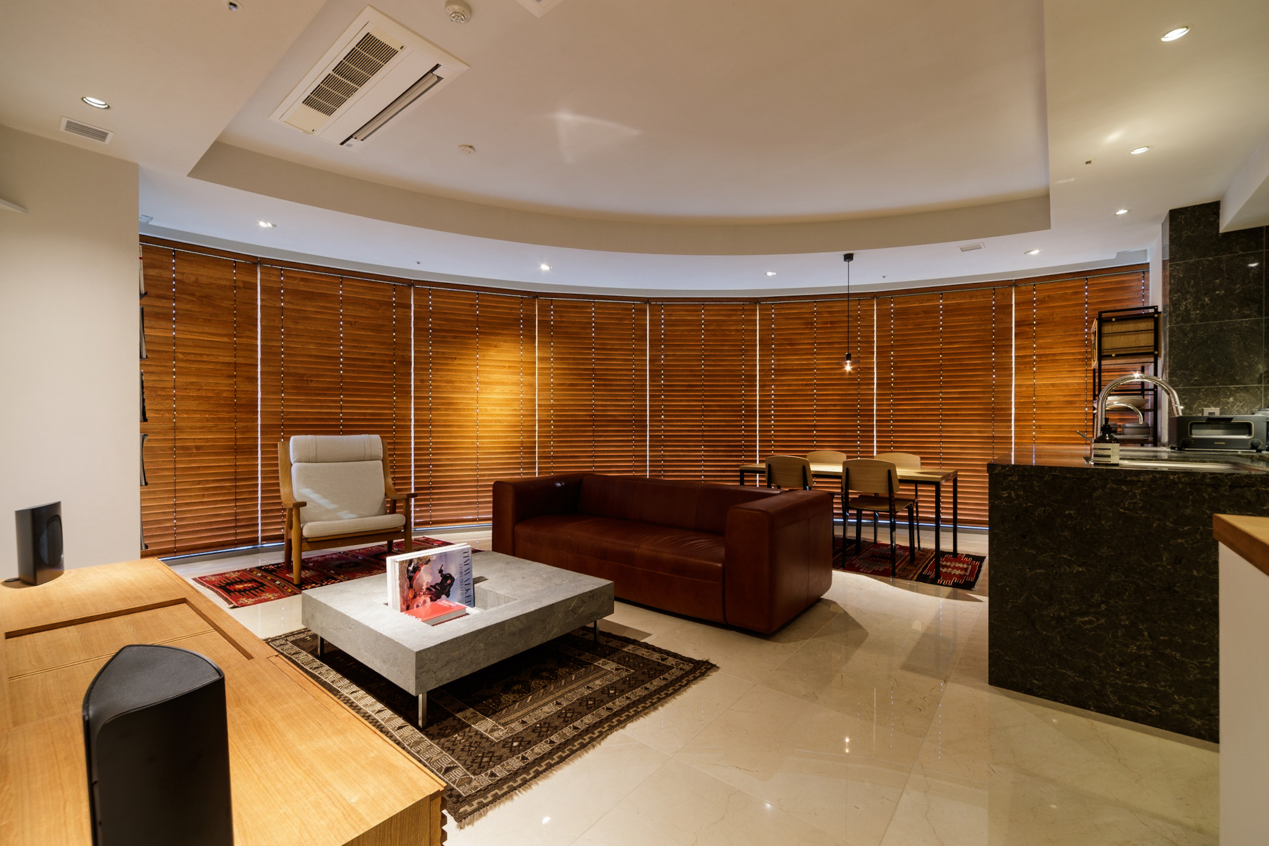
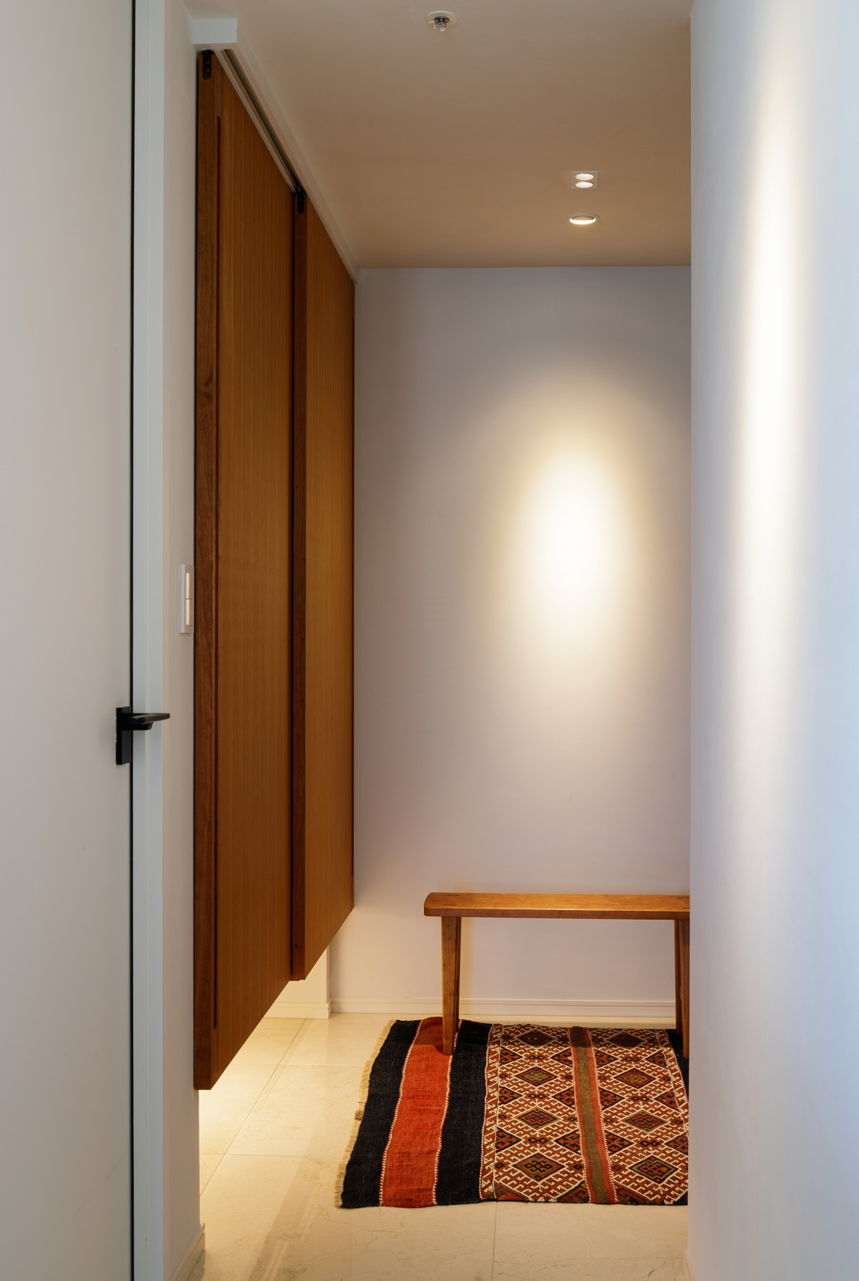
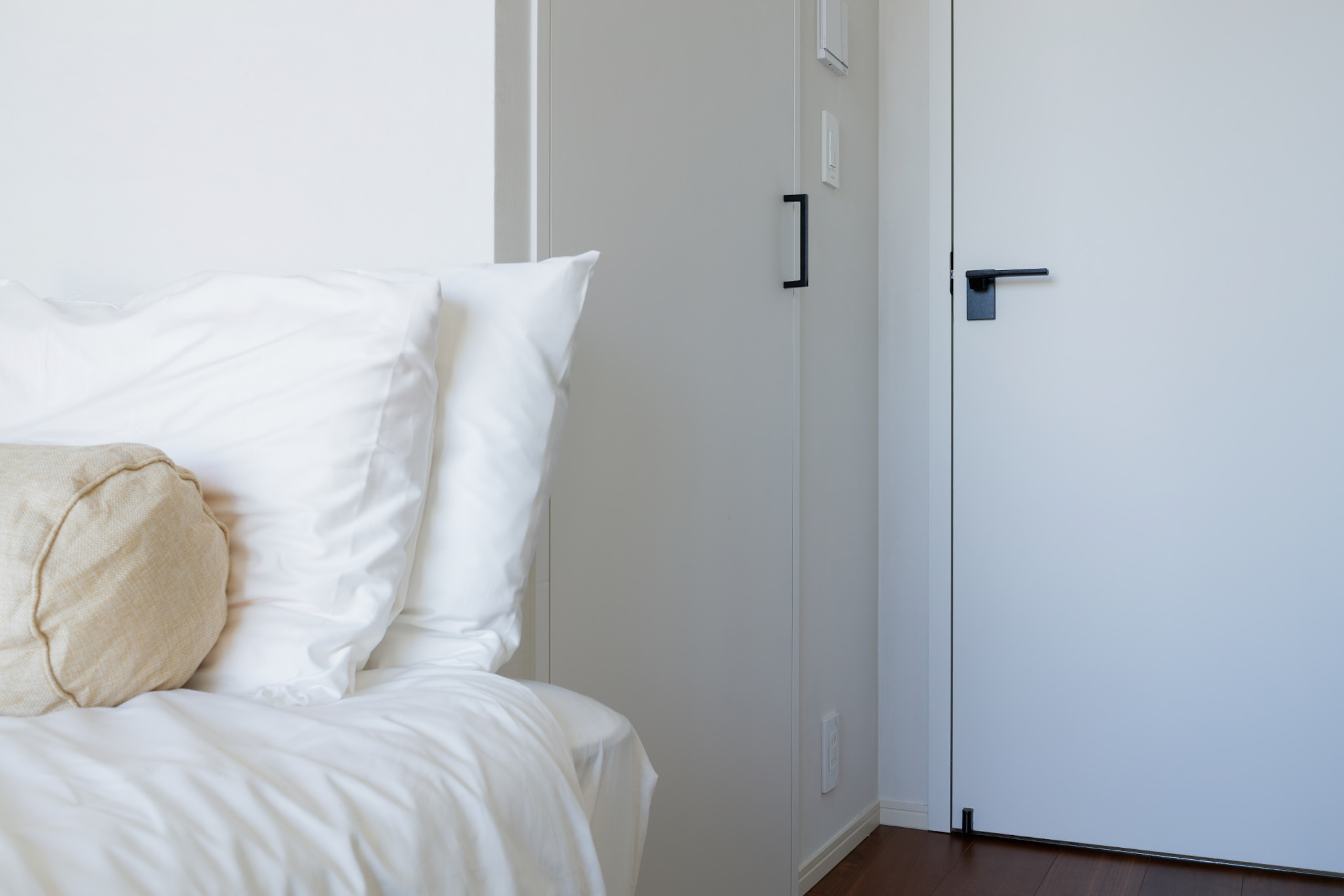
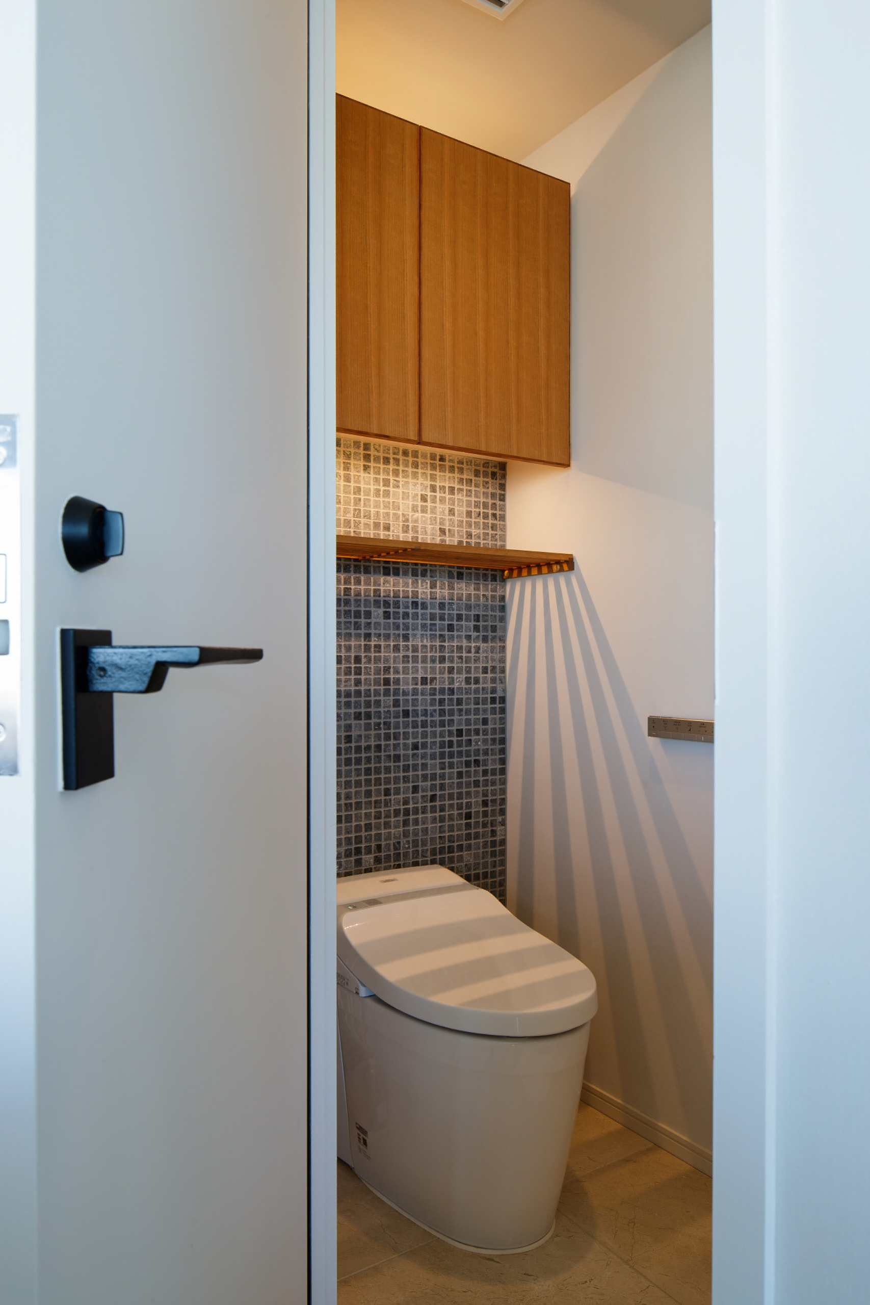
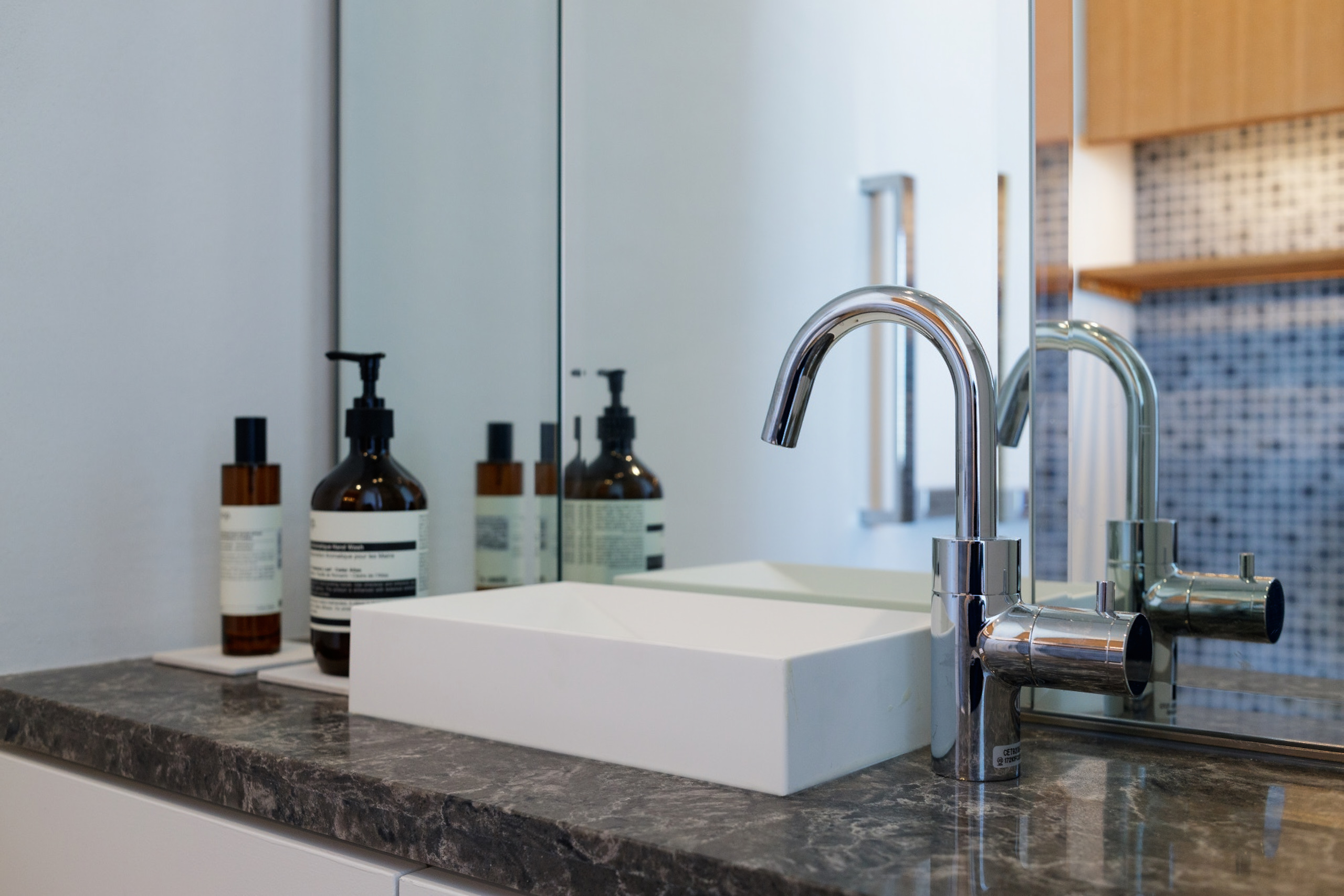
For the hallway, every door has been changed from the dark glossy melamine veneer in favour of a white matt tone. Meanwhile, the entrance closet replaced its original elements for the same cherry wood texture used also for the master bedroom’s new wide sliding door. This pattern is spread in minor details around the house: the toilet closets, the cupboard kitchen countertop and the living room furniture now share the same materiality. All together they create harmony throughout every space, showing how careful the choice of materials has been.
One of the requests of the owner was to provide a space for a projector in the living room. Thus, a custom-made TV board was designed and placed in front of the wall. This furniture was built precisely and exclusively for super single focus projectors, using the wide white wall behind as a screen. As mentioned above, this element is made with the same cherry timber of the other details of the house, thus increasing the sense of homogeneous atmosphere.
The rather small scale of intervention helped to keep the costs of the project low, despite the use of expensive elements with a declared research of a luxury image. At the same time, some balanced and minor changes solved all the requests made by the client, improving the overall quality of the space as well.
Just like previous renovations made by ROOVICE, also for this case it became clear that even a small change can have a huge impact on a project.


